
A Premium Design for A Set of Three Remarkable Wines
Medi Valley Winery has always managed to surprise the audience with its memorable and recognizable wines. This is a responsibility that they have managed to make a tradition over the years. The project I present is another addition to their growing list of successful wines.
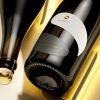
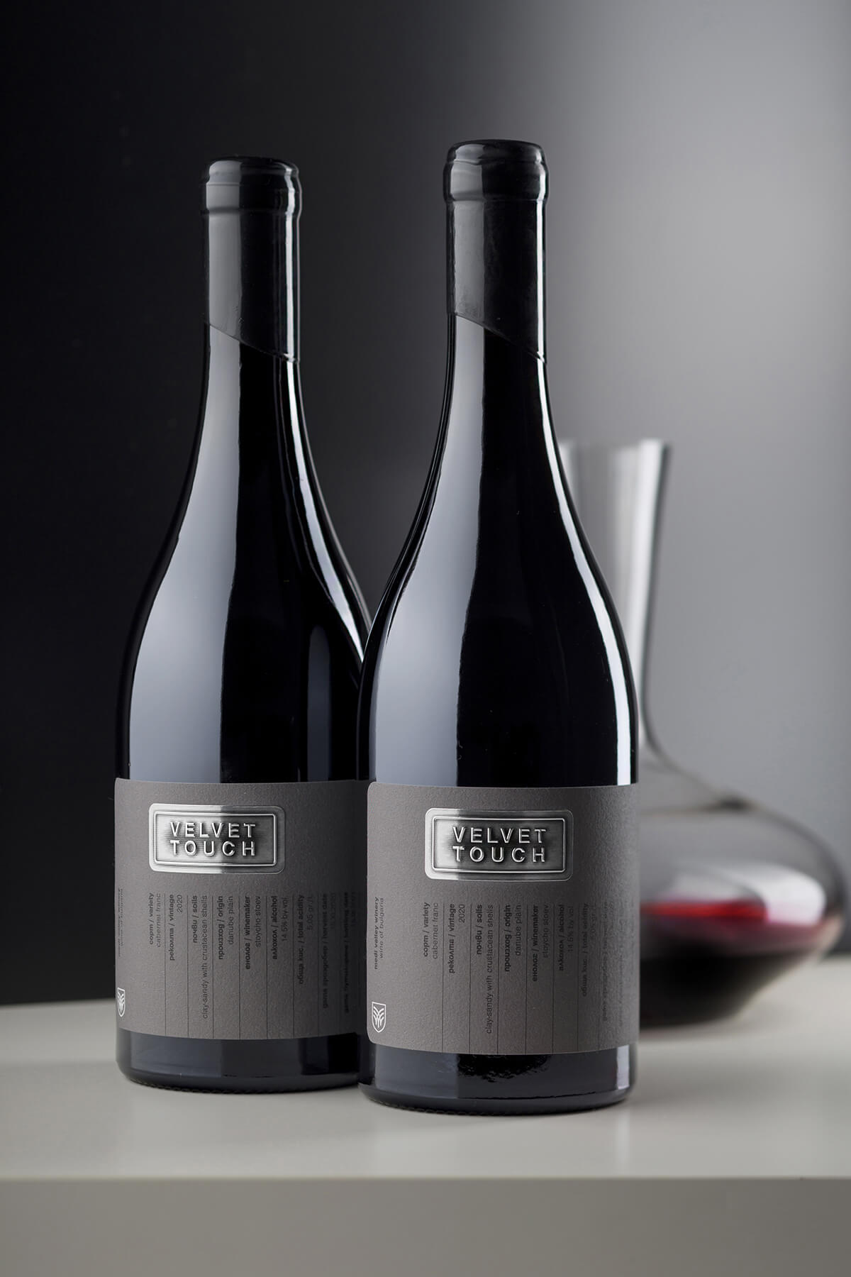
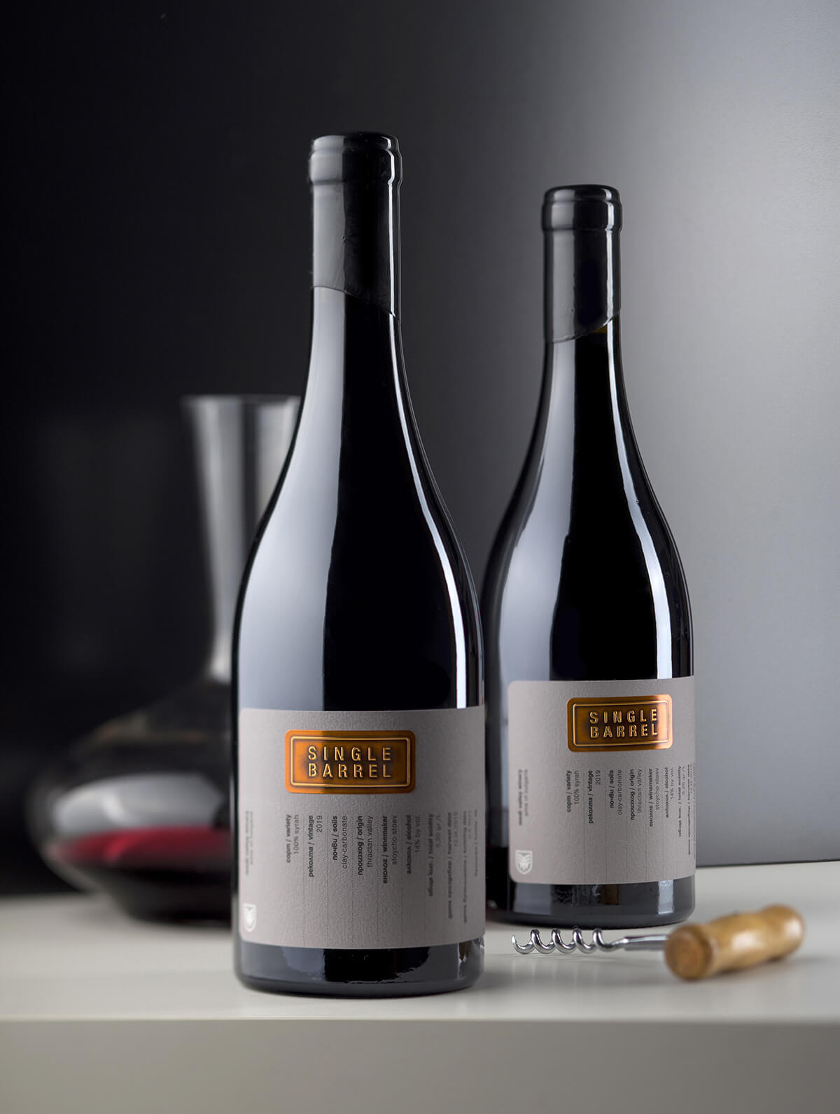
It is a selection of three wines for which I was commissioned to creating a memorable design for. The wines are positioned in the premium segment and are specially selected for the renowned chain of stores Casa Vino. My task was not easy at all. Over the years, I had made a lot of designs of Medi Valley wines and from one point on each one was a challenge to be different and at the same time competitive on the shelf. Fortunately, this design was born somehow easily and without tension. We decided to create a new interpretation of a classic draft label for wine, which would give enough specialized information about the product, dressed in an attractive and memorable vision. In Bulgaria, the shelves have recently been crowded with wines that use similar variants of draft labels. They all look alike and in no way provoke you to reach out to them. That’s why we decided to be quite different from the established tired cliches. As with all other designs for Medi Valley, I used a wider label that wraps around the bottle. I picked heavier and more solid paper, which I wanted to show clearly that this is a special and more expensive wine. From the very beginning, I had decided that this should be Fason’s White Cotton, which has always fitted into my notions of one of the highest quality papers on the market today. Throughout the width of the label I have placed a simplified table, which presents the main indicators of the wine itself – variety, harvest, acidity, soils, oenologist, producer, harvest date, etc. In the top half of the label I left a blank space in which we applied a separate metal label to each wine, on which name of the wine was stamped with very strong embossing. We chose three different names, each of them is associated with a certain specific feature of the wine itself – Bulgarian Oak, Velvet Touch and Single Barrel. On the metal label itself, we created shadows with an engraving effect, which aimed to enhance the contrast around the embossed letters, as well as to create a certain vintage effect, which would show that the wines were aged in wild barrels. All three wines are in one of my favorite bottles by Saverglass – Agape. The closure is with cork and it is sealed with wax. Printing these labels was a big experiment for me, as well as for my colleagues at Dagaprint.com, who had to use Label over Label technology to be able to apply a metal label on the paper base and deliver it on a roll for direct machine application at the winery. Despite all the challenges along the way, we managed to create a complete design that surpassed the desires we had at the very beginning.
Credits:
Client: Medi Valley Winery
Wine Label Designer: the Labelmaker
Print: Dagaprint.com
Photo: Jordan Jelev
Paper: White Cotton – Fasson, Avery Dennison
Bottle: Agape – Saverglass