


Excentric – Going for a Clean & Elegant Wine Label Restyle
The Project
Excentric is a project we started with Medi Valley some 6-7 years ago. The beginning was very successful and gradually the brand became very recognizable and preferred among others on the shelf or in restaurants. The old design was not out-of-date but we decided that it was time for significant change as we had already changed almost every other brand inside Medi Valley’s portfolio.
The Design
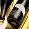
The old Excentric design based on a rosette featuring winery’s logo. I also used two different hot-foils along with raised varnish on the label border. The design looked clean and memorable but with this restyle, we were aiming at even cleaner look, with less colors and strong presence of minimalist paper embellishments like embossing and debossing.
The transformation started with picking a different paper. After several experiments we did with our printer DagaPrint, we were 100% sure that our new paper should be Constellation Jade Raster by Fedrigoni Self-Adhesives. We also used this stock for our brand A Good Year and this Excentric label restyle somehow inherited our exiting experience and lifted it to a higher level.
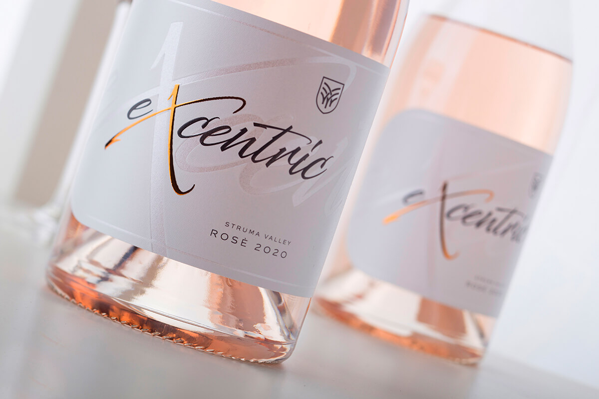
Our first step was to create solid white background with large Excentric heading that kept the natural paper color. Then I changed completely the writing style of the branding and decided to enhance it by using strong embossing on the letters, combined with copper foil doming effect on X letter. And while the letters of the heading were raised with embossing, I decided to use very strong debossing on all large letters in the background. The result was amazing as we had certain elements going up while the other were going down. All these effects looked great when you have the label applied on the bottle taking light from different angles and creating very authentic micro-3D look.
Another thing we decided to preserve from the old concept was the label size – it is a very wide label almost wrapping up around the bottle.
Great new moment in this restyle were the rounded corners I added at the left edge of the label.
The Result
At the end as e result we received very elegant and modern wine label restyle which shined mostly with its special embellishments we did like embossing, debossing, doming effect and of course – the amazing paper texture we had from Jade raster paper.
Last but not least – we preserved the bottle as we are still in love with Agape Borolaise style bottle by Saverglass.
Credits:
Client: Medi Valley Winery
Wine Label Designer: Jordan Jelev
Paper: Arconvert
Print: DagaPrint