New Authentic Look for B.O.V. Metal Wine Label Design
Metal wine labels are one of my passions – I love to see embossed pewter and hand brushed patina effect.
This is something that adds a lot of value and authenticity to the final product.
Speaking about wine this is something absolutely necessary especially for premium ones where metal wine labels find their real visual home.
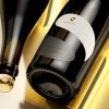
Best of the vintage is something we started with Medi Valley in 2019 with huge success. First, it was only one red blend in Bordeaux bottle but then in 2020 we decided to add a barrel fermented chardonnay to this premium wine brand. Of course, I did not want to change the label at first but after a while, I decided to use same die cut and change the typography of my artwork. I used the pre-release version of my Aureus font family*.
The geometry of the serifs was the first thing I noticed when I saw the embossed metal wine label – they looked amazing! Changing the typeface might sound like a minor thing but i real it completely refreshed the overall look of this metal wine label.
Another change was using silver material for this Chardonnay and a Burgundy style bottle – great improvements that made the whole packaging look even more classy and authentic.
At the end, we had a family of two wines that used same metal wine label design applied on two different bottles.
Positioned at the premium segment these two bottles have bold and serious look that is true reflection to the wines inside and their price on the shelf.
_________
* Aureus typeface is designed by Vassil Kateliev & Jordan Jelev for the Fontmaker type foundry.
Credits:
Client: Medi Valley Winery
Wine Label Designer: the Labelmaker
Photo: Jordan Jelev
Bottle: Saverglass