Modern wine label design telling the family story of Cantine Val di Luna
The Story
Monferrato, Southern Piedmont, Italy.
One of the most interesting Italian wine regions is the birth place of a family Dream. Antonio had always been wanting to have own vineyards and produce wine. Unfortunately his life path ended up before he could see his dream come true. Luigi, his grandson, brought his Grandfather’s dream to life. He purchased the vineyard which Antonio dreamed of and created Cantine Val di Luna paying tribute to his ancestor.
The Label
I knew this romantic yet sad story by Luigi and I wanted to reflect the happy part of it on this new label. We had number of discussions with him before we started work on this project and decided to incorporate two themes in this label design.
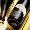
Romantic part was depicted by the blue moon image on top, while the historic line was represented by the winery’s logo – a capercaillie bird as a symbol of Antonio’s hunting passion.
We were decided to enhance the blue color use in our design and we picked very non-traditional blue hot foil to stamp the bird and the moon. We also used similar blue color for the bottle capsule to finish the whole idea.
Another interesting approach (I love to do this!) was the see-through moon effect. It was enhanced by the clear glass and the white wine so you actually really could see through the moon and catch the amazing reflections that light makes while passing through the wine & glass.
My ‘secret weapon’ in this project was the paper – I needed a certain stock that could also somehow ‘reflect’ the moonlight without being too shiny or glossy. My friends from Arconvert helped me instantly with probably one of the best papers I know – the Jade Raster. I use it for at least 10+ years and I rediscover it every time in every new project. For Val di Luna label it was probably one of the best choices possible.
Last but not least – I remember this as if it is happening now – we’ve spent maybe a week or two with Luigi, going back and forth trying to decide which bottle to use. I’ve always had great affinity to Estal’s glass and I suggested to use a bottle from their classy and elegant Sommelier selection. The bottle was so elegant and chick that I still keep one after I drank the wine.
The Result
We were trying to unite a family dream with a romantic story in this label. I was also truing to create very unique, very different label design for Val di Luna. I think the bottle, the blue color and the paper helped me a lot to capture and reflect all these emotions and transform them into a classy contemporary wine label design.
Credits:
Client: Cantine Val di Luna, Italy
Wine Label Designer: the Labelmaker
Bottle: ESTAL
Paper: Arconvert
Photo: Jordan Jelev