

A Classy New Look for VIDA wines
The Project
We started Vida wine brand in 2019 with only two wines in one category. A year later, all went well at the winery and I was commissioned to expand the portfolio with new wine label design featuring the same brand name.
Luckily, my first design was very non-traditional and different so with my second step I had more room for my creativity.
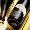
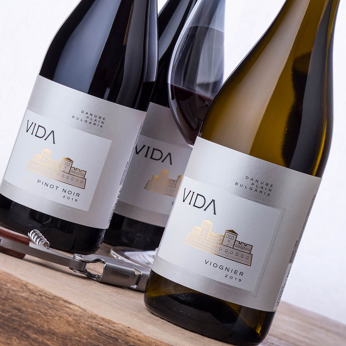
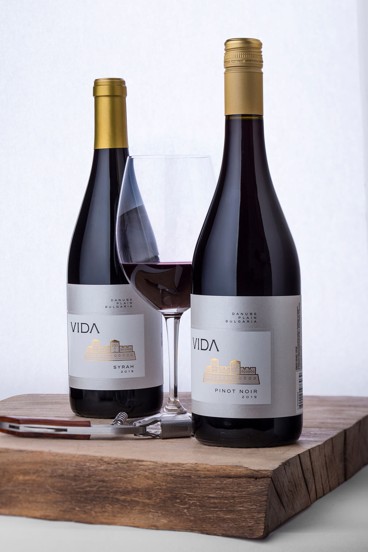
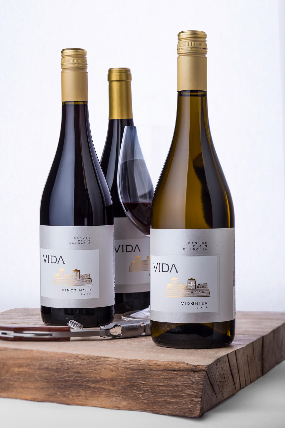
This time I decided to use more calm and classic forms of the label – a semi-wrapping design uniting front and back label in one piece. The main character is the VIDA brand along with the Vida fortress silhouette stamped with gold hot-foil.
Like in the first version of my work, I used my favorite Jade Raster paper as I found it very appropriate for this clean design – its mother of pearl surface is probably the best background for my composition. I always try to be myself in everything I do and decided to print a large white rectangle at the center where all info is placed and thus to achieve a two paper effect.
I also added a raised varnish border to enhance the border between the white background and the natural paper color.
We used three different types of Burgundy bottles depending on the wine and we also used screw cap or gold capsule depending on the bottle mouth.
The Result
As a result, we received a very sleek modern wine label design that is actually the same for all wines but it looks very different as we played with different types of bottles and sealing. We were trying to keep the brand very consistent yet absolutely recognizable in its early years. After a while, this visual foundation will be use for more non-traditional ideas and upgrades.
Credits:
Client: Vida Winery
Wine Label Designer: the Labelmaker
Printer: Daga Print
Paper: Arconvert
Photo: Jordan Jelev