Inspired by History, Embracing Modernity
Background: In the heart of South Sakar, Bulgaria, a new winery emerges onto the scene, captivating enthusiasts and connoisseurs alike with its ambitious brand new wine project. Bisante Estate Winery, led by the well-known winemaker Ekaterina Gargova, is on a mission to leave its mark in the world of Bulgarian wines. Inspired by history yet embracing modernity, they’re crafting wines that tell a fresh story with every sip.
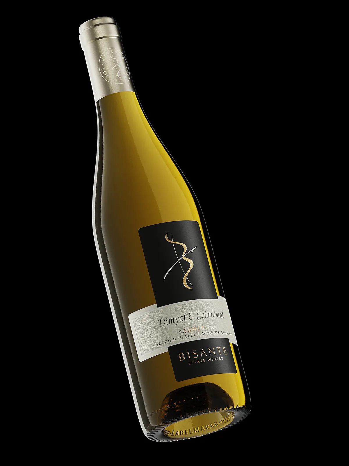
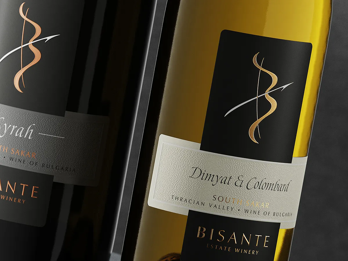
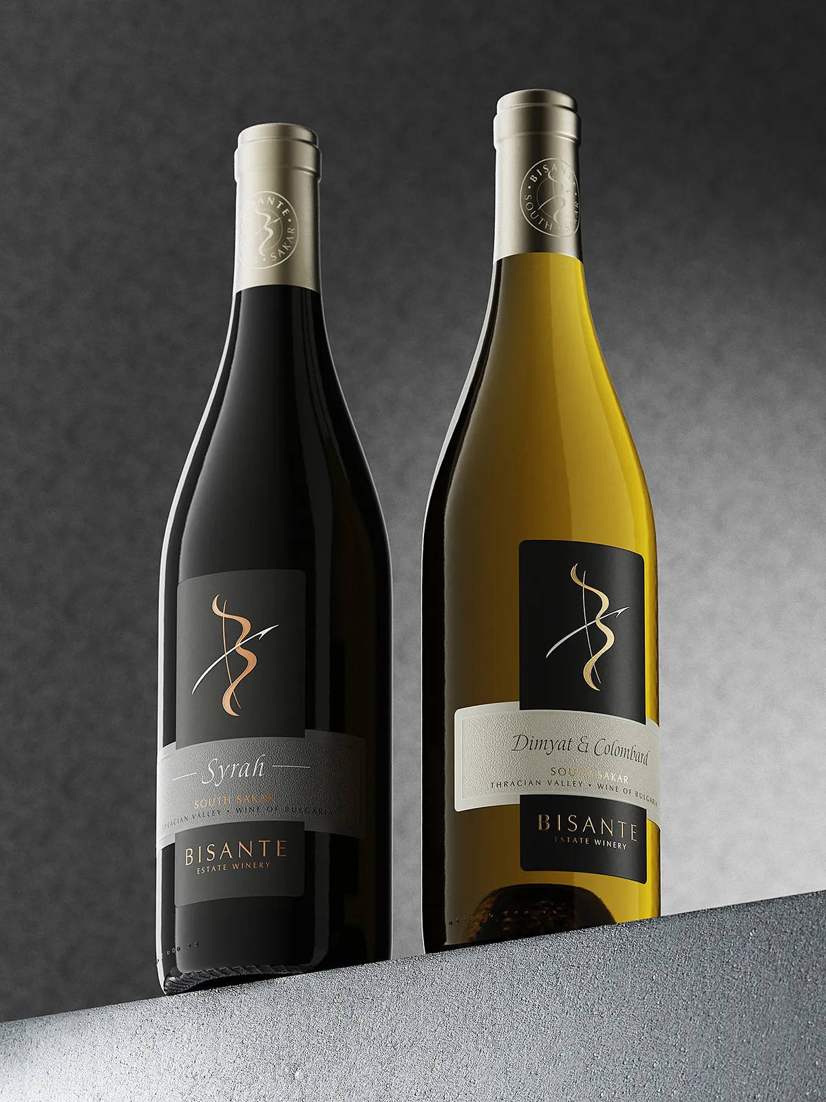
Design Thinking: Digging into Byzantine and Thrace history, I wanted Bisante’s brand to feel both classic and contemporary. Crafting a label that nods to tradition without feeling outdated was key. So, I went for a two-part label design, avoiding old-fashioned clichés while still honoring Bisante’s roots.
Using a classic burgundy bottle as my canvas, I aimed to create an immersive experience for wine lovers. By mixing historical themes with modern style, I wanted every bottle to invite people on a sensory journey.
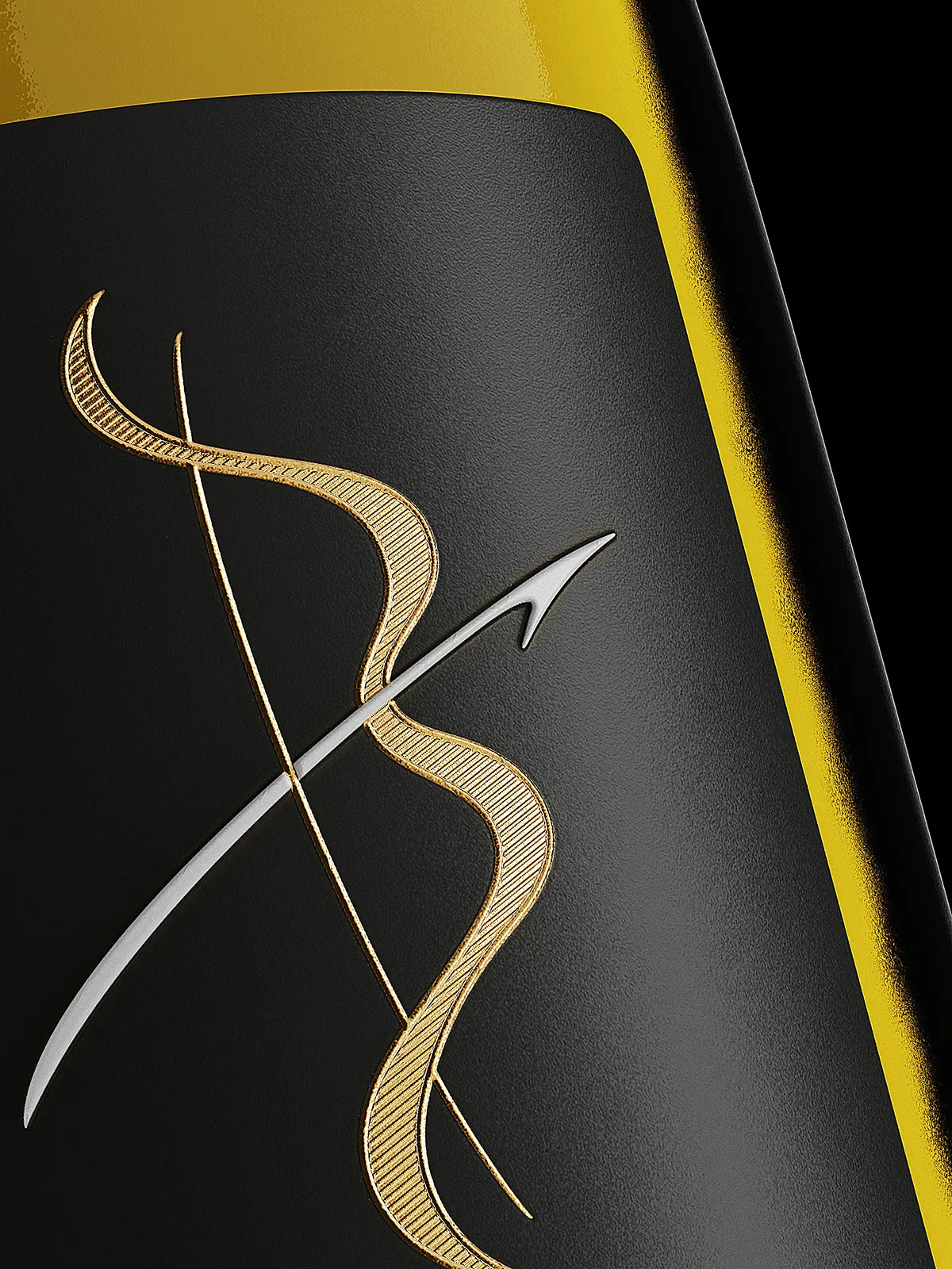
Challenges: I tried out different design ideas to capture Bisante’s essence. But one big challenge was making sure the Bisante brand stood out in a crowded market. After lots of tweaks, I landed on a design that blends an antique bow and arrow with the letter ‘B,’ creating a captivating focal point that reflects Bisante’s adventurous spirit.
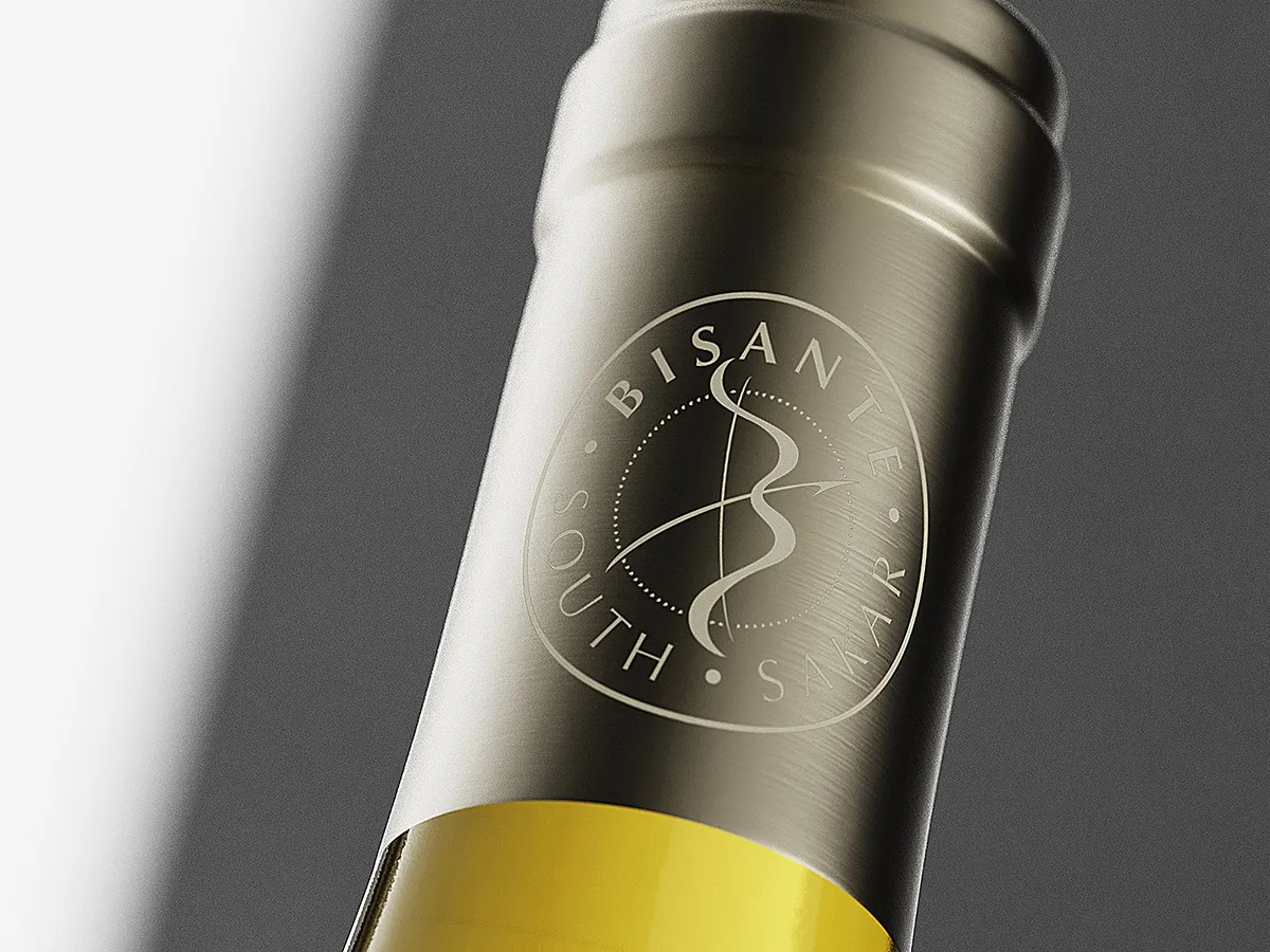
Favorite Details: In exploring the intricacies of Bisante’s label, one can’t help but marvel at the meticulous craftsmanship and precision that went into its creation.
The embossed bow and arrow aren’t just decorative—they add a tactile dimension to the label, inviting the consumer to run their fingers over the contours and feel the fine details come to life. Additionally, the microembossed texture delicately etched inside the bow’s stick adds an extra layer of sophistication, enhancing the overall sensory experience.
Adorned with different semi-matte hot foils, the bow catches the light in a mesmerizing display of elegance, reflecting the quality of the wine it represents.
Stamped with the bold Bisante brand, the label exudes confidence and authority, standing as a testament to the winery’s identity and heritage.
Moreover, the debossed second texture in the center of the label adds depth and richness, seamlessly integrating different paper materials into one cohesive design.
It’s worth noting that the meticulous execution of the label print, carried out with remarkable precision by Dagaprint.com, further elevates the overall presentation of Bisante’s wines, ensuring that every bottle is a masterpiece in its own right.
Credits:
Client: Bisante Estate Winery
Design: the Labelmaker
Print: Dagaprint.com
CGI Photo: Jordan Jelev