

A Study in Textural Depth
The Concept: Designing for Discerning Palates and Decision-Makers
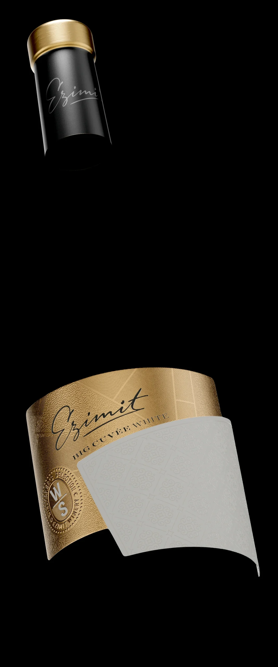
My collaboration with Ezimit Winery in North Macedonia has always been focused on creating powerful visual narratives that resonate with the brand’s ambitious vision. Unlike previous Ezimit projects, where we explored bolder, more direct visual communication, the Winemaker’s Selection line required a profound sense of prestige and depth.The challenge was to communicate complexity, tradition, and terroir, all while maintaining modern elegance. My core solution was to design a single label that visually and conceptually mimics the look of two distinct, overlapping layers of paper, much like a fused label. This unconventional shape immediately signals to the market that this is a wine outside the standard portfolio, inviting closer inspection from discerning winery owners and marketing directors.
Layer One: Mapping Terroir with Micro-Embossing
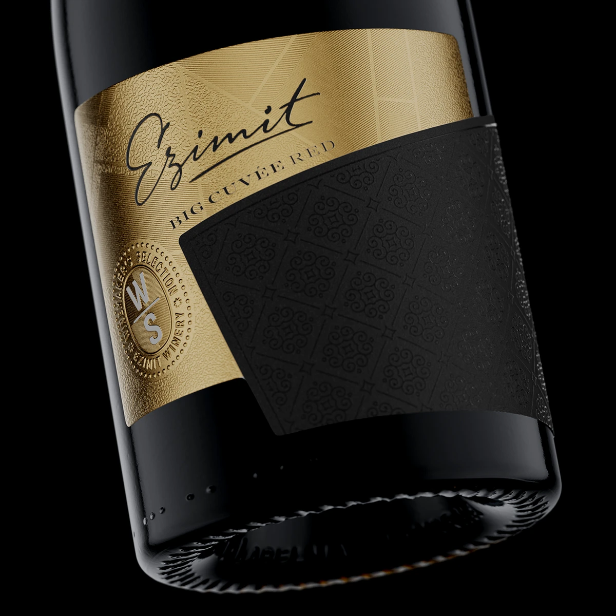
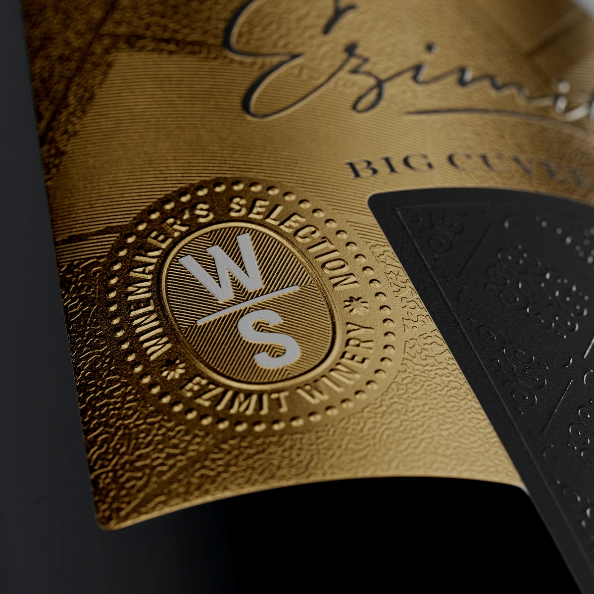
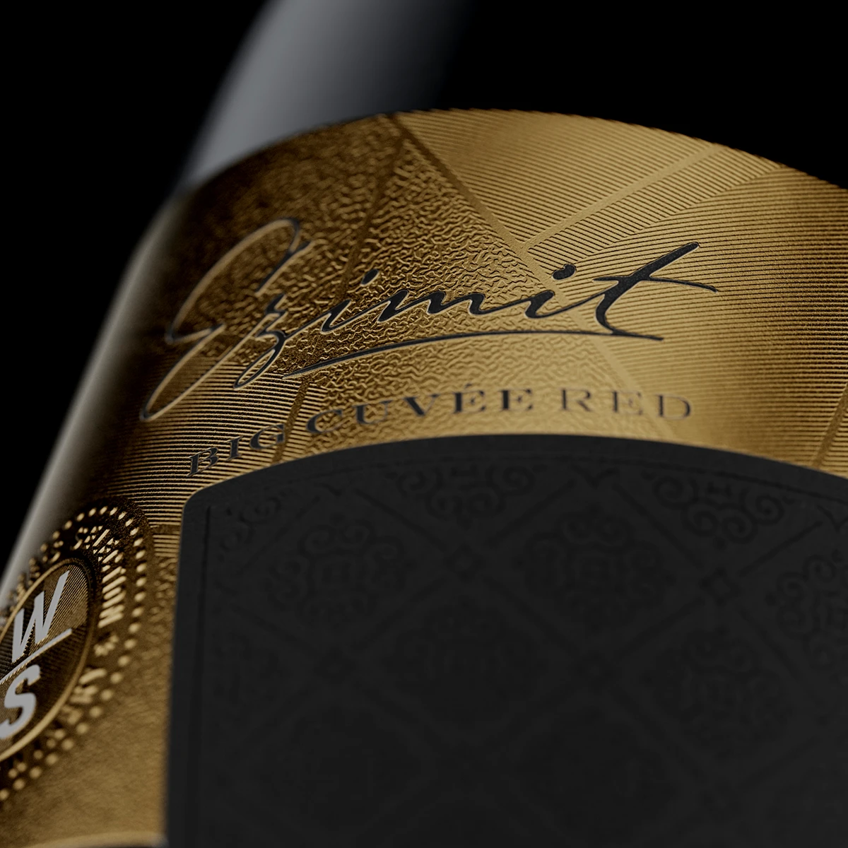
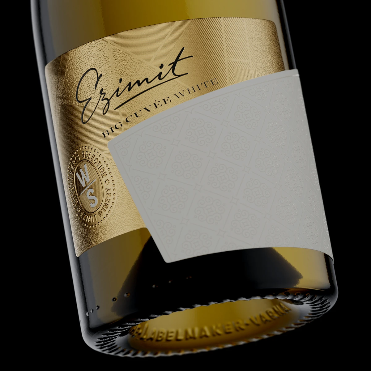
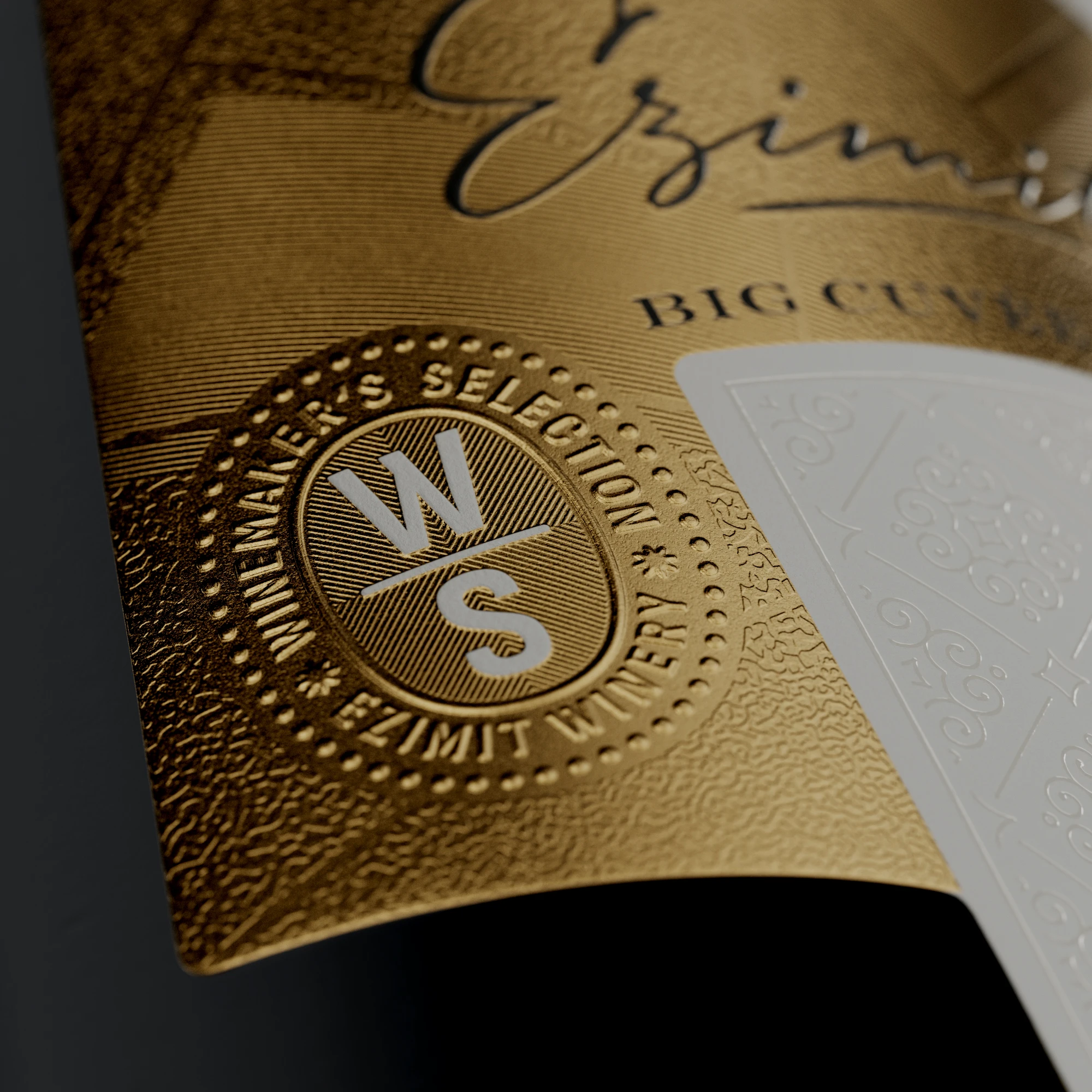
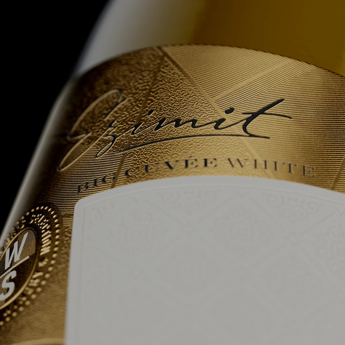
The initial, dominant section of the label is a dramatic field of solid gold hot foil. This is where the concept of terroir is translated into a hyper-sensory visual experience.
The gold foil is not flat; it is entirely covered by a specific micro-embossing texture. This texture is an abstraction inspired by aerial topography, soil patterns, and vineyard plot layouts. It suggests ultra-detailed information about the land, communicating richness and origin in an almost subconscious way. The final effect is a vibrant, intricate canvas that makes the gold appear rich, active, and alive.
Over this brilliant backdrop, the main “Ezimit” signature is exposed. It is given prominence through a clear, tactile high-build spot UV varnish rather than foil, allowing the gold beneath to shine through, but adding a crucial layer of dimensionality.
Layer Two: Tradition, Restraint, and Tactility
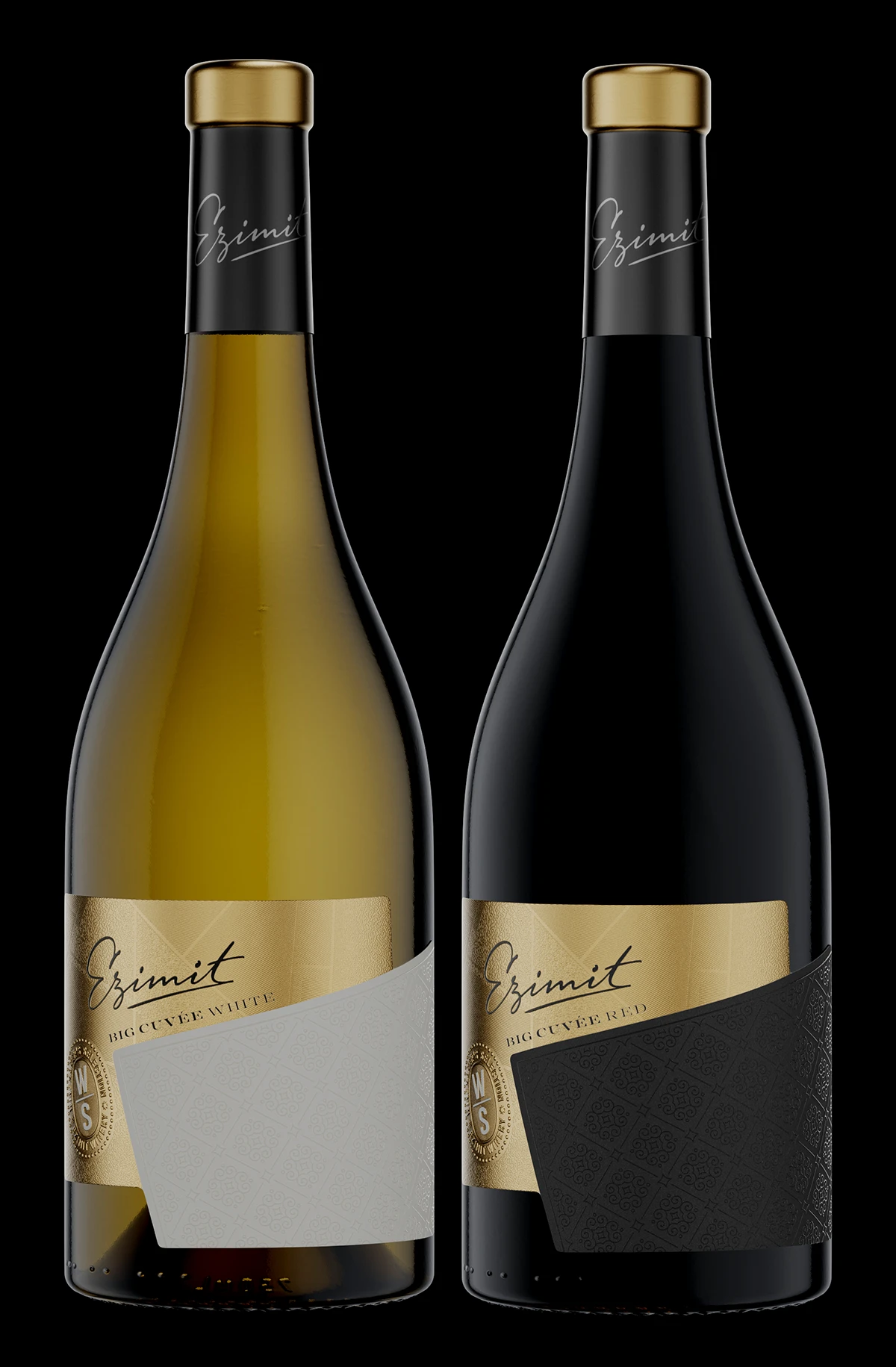
The second ‘layer,’ the overlapping element, serves as a counterpoint, introducing restraint and tradition to the label’s energy. This section is rendered entirely in a single colour—matte black for the Big Cuvée Red and a subtle, soft white for the Big Cuvée White.
This area introduces a crucial element of cultural depth: a traditional, folkloric pattern is integrated onto the surface. This motif is not printed; it is created using deep, high-relief embossing, transforming the pattern into a physical, palpable structure. This was my way of demonstrating that the modern practice of winemaking exists in harmony with the region’s rich heritage, conveying a sense of rootedness and continuity.
The Seal of Quality: Winemaker’s Selection Logo
To anchor the prestige of the line, the “W/S” (Winemaker’s Selection) logo is designed to resemble a wax seal or medal. Positioned at the overlap, this circular emblem is executed with superb technical detail.
It features intricate relief and micro-textures applied over the gold hot foil, giving it the appearance of a weighty, official stamp. This seal reinforces the premium positioning and acts as a focal point, drawing the eye to the key branding message.
Beyond the Label: Customizing the Premium Experience
A project of this level necessitates a holistic approach to the packaging. The wine is bottled in a specially commissioned Burgundy bottle with a bartender-friendly Bartop finish.
The closure system itself is a study in detail:
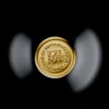
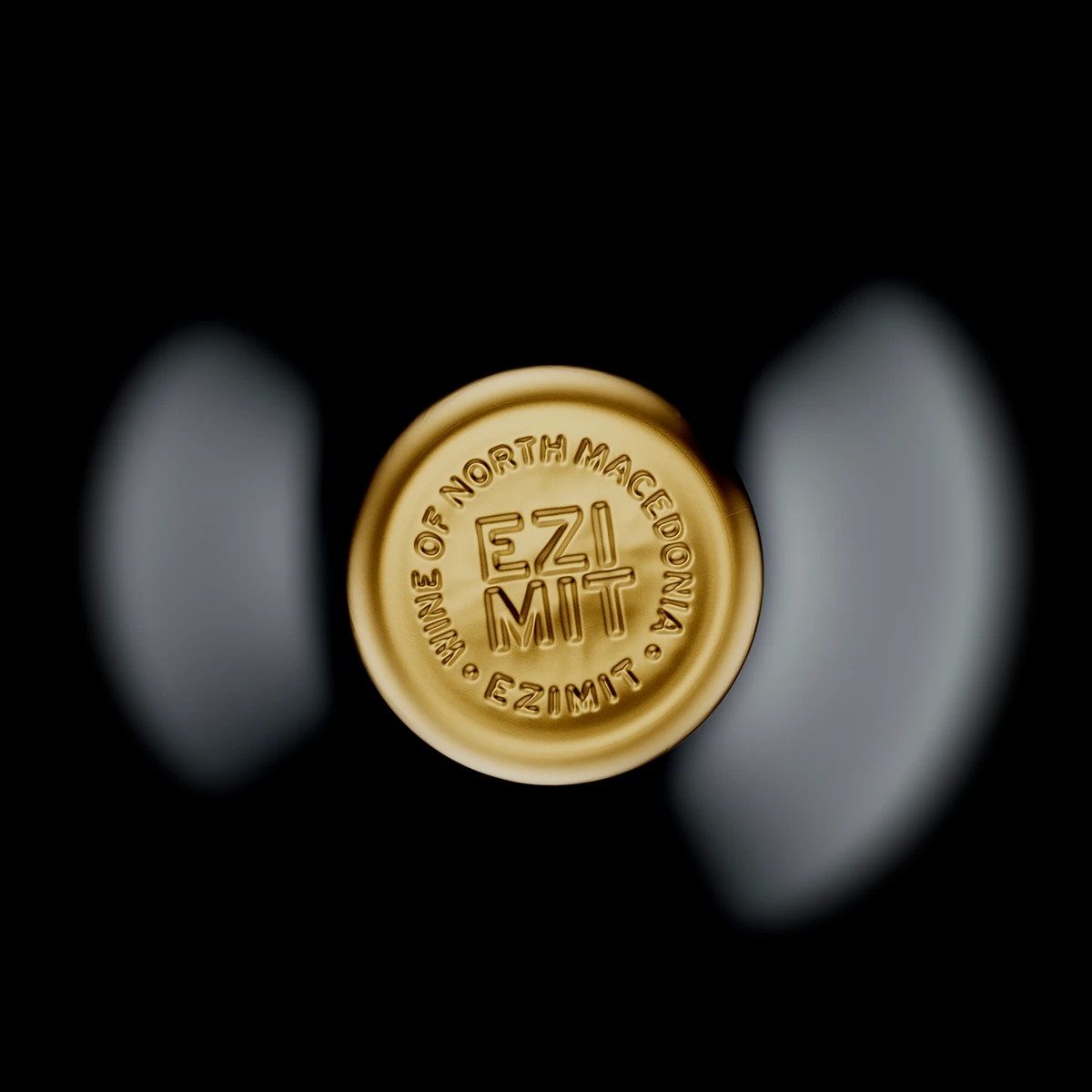
- The capsule is two-tone: solid gold on the top disc, with a matte black skirt below, featuring the “Ezimit” name printed in silver-bronze.
- Crucially, the top disc is personalized with “EZIMIT” in all caps, achieved with deep embossing on the gold surface. This attention to customization on the capsule finalizes the premium feel and reinforces the brand’s identity across the entire product surface.
Flawless Execution: Partnering with Dagaprint.com
For a design concept reliant on the perfect execution of complex textural elements—the micro-embossing on the gold, the deep pattern debossing on the second layer, and the precise registration of high-build varnish—there is no room for error.
I must commend Dagaprint.com for their exceptional technical prowess. The ability to render the hyper-detailed micro-texture on the gold foil and, simultaneously, achieve such clean, deep relief on the overlapping section is a mark of true mastery. The final labels are a testament to their dedication to achieving perfect registration and material finish, proving once again why they are the undisputed leaders in advanced wine label printing.
The Outcome: A Statement Piece for Strategic Packaging
The Ezimit Winemaker’s Selection label is more than packaging; it is a strategic asset. By using layered elegance, textural depth, and unconventional form, the design achieves high shelf-impact and communicates an immediate premium value. For winery owners and marketing decision-makers evaluating their next high-end release, this project demonstrates how cutting-edge printing technology and conceptually rich design can redefine market positioning.
Previous projects for Ezimit:
Ezimit’s ‘the Grape’ Wine Label
Ezimit Embossed Wine Label
Stardust Wine Label
Credits:
Client: EZIMIT winery
Design: the Labelmaker
Print: Dagaprint.com
CGI Photo: Jordan Jelev