A Contemporary Expression of Elegance
First Impressions
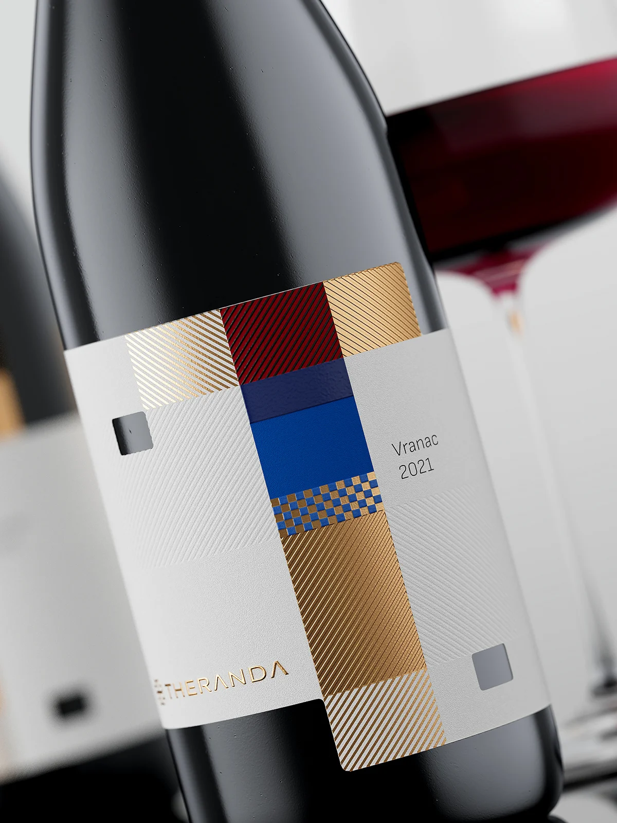
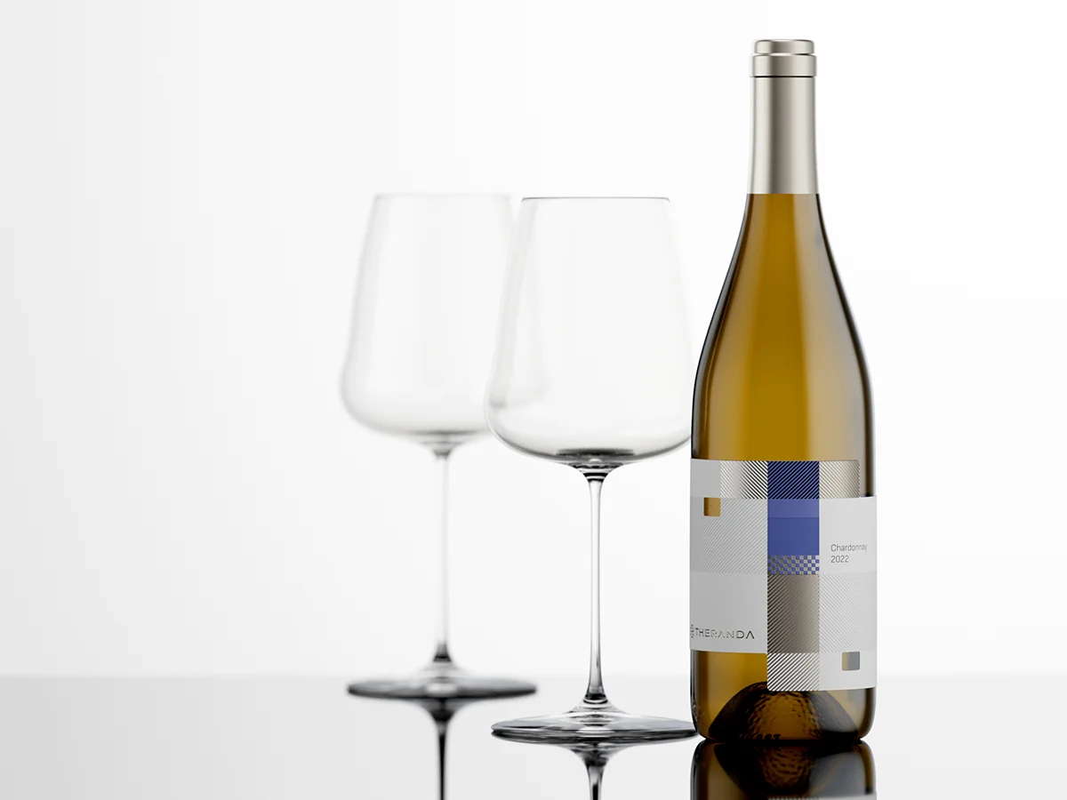
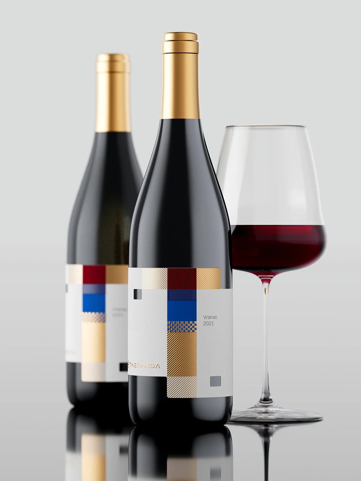
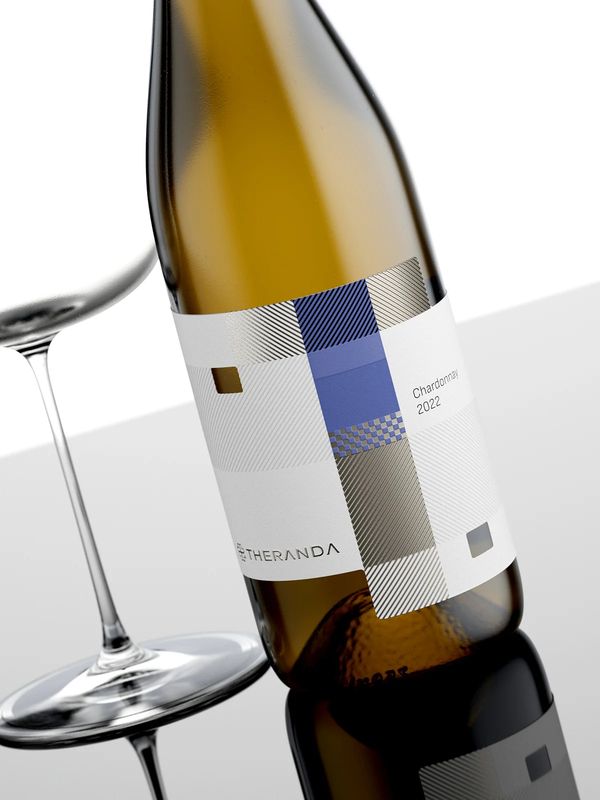
The Theranda wine label immediately captures attention with a design that feels both modern and refined. It stands apart from the traditional wine aesthetic by embracing bold geometry, vivid color blocking, and luxurious metallic finishes. The visual balance between restraint and expression is remarkable: the minimal white background allows the carefully orchestrated blocks of gold, crimson, and deep blue to stand out, while subtle patterns add movement without overwhelming the composition.
Aesthetic & Design Language
This label is an ode to contemporary graphic design principles. Instead of relying on figurative imagery or elaborate illustrations, it communicates through abstraction — clean lines, grids, and interplay of textures. The geometric blocks echo a Bauhaus-inspired style, yet the metallic embossing and interplay of matte and glossy surfaces lend a distinctly premium feel. This blend of modernist purity and luxurious detailing makes it a statement piece on the shelf, appealing equally to design enthusiasts and discerning wine lovers.
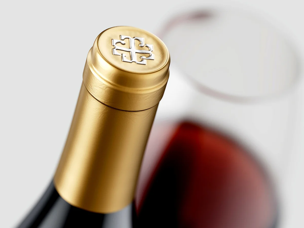
The New Logo Identity
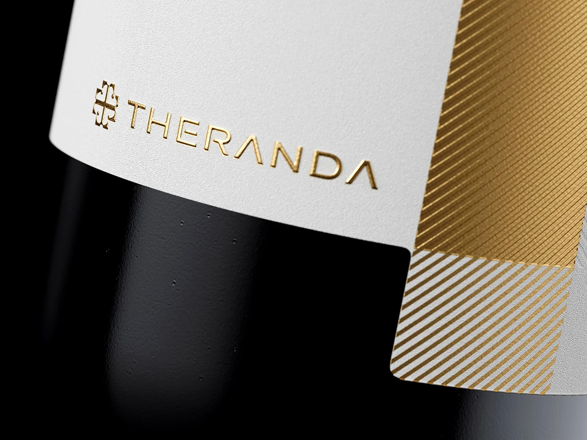
One of the most exciting elements of this project is the debut of the new Theranda logo, positioned proudly before the brand name. Created specifically for this wine series, the emblem carries a contemporary elegance that resonates with the design of the label itself. It reflects both heritage and modernity — crafted to symbolize the future direction of the winery. From now on, this emblem will serve as the official mark of the Kosovo-based estate, ensuring instant recognition and brand cohesion across future vintages.
Materials & Finishing Touches
The choice of materials elevates the label into an experience of tactility. A high-quality textured paper stock provides a matte foundation, contrasting beautifully with the hot-foil stamped gold details. The gold areas are not flat but treated with fine diagonal striations, which catch light dynamically as the bottle turns. Paired with embossed lettering and debossed elements, the label becomes a three-dimensional surface designed to engage both sight and touch. The typography—minimal and understated—reinforces the clean elegance without detracting from the visual rhythm of the colored grid.
Technological Innovation
What truly sets this label apart is the sophistication in its production techniques. The combination of multi-layer foiling, precision embossing, and matte–gloss contrasts showcases the highest standards of label manufacturing technology. The metallic areas are carefully registered to align with the underlying patterns, demonstrating meticulous technical execution. Even the micro-patterns within the foil areas reflect cutting-edge printing technology, pushing the boundaries of what is achievable in contemporary wine packaging. It’s not just decoration; it’s a showcase of craftsmanship and innovation – the latest visual statement by our trusted printer Dagaprint.
Conclusion
The Theranda label is more than packaging—it is a visual manifesto. By merging geometric abstraction with luxurious finishes, it reflects a wine positioned for a modern, design-conscious audience while retaining the artisanal gravitas expected of a premium vintage. The result is a striking balance of aesthetic boldness, tactile richness, and technological mastery, making this one of the most memorable label designs in recent years.
Credits:
Client: Theranda Winery
Design: the Labelmaker
Print: Dagaprint
CGI Photo: Jordan Jelev