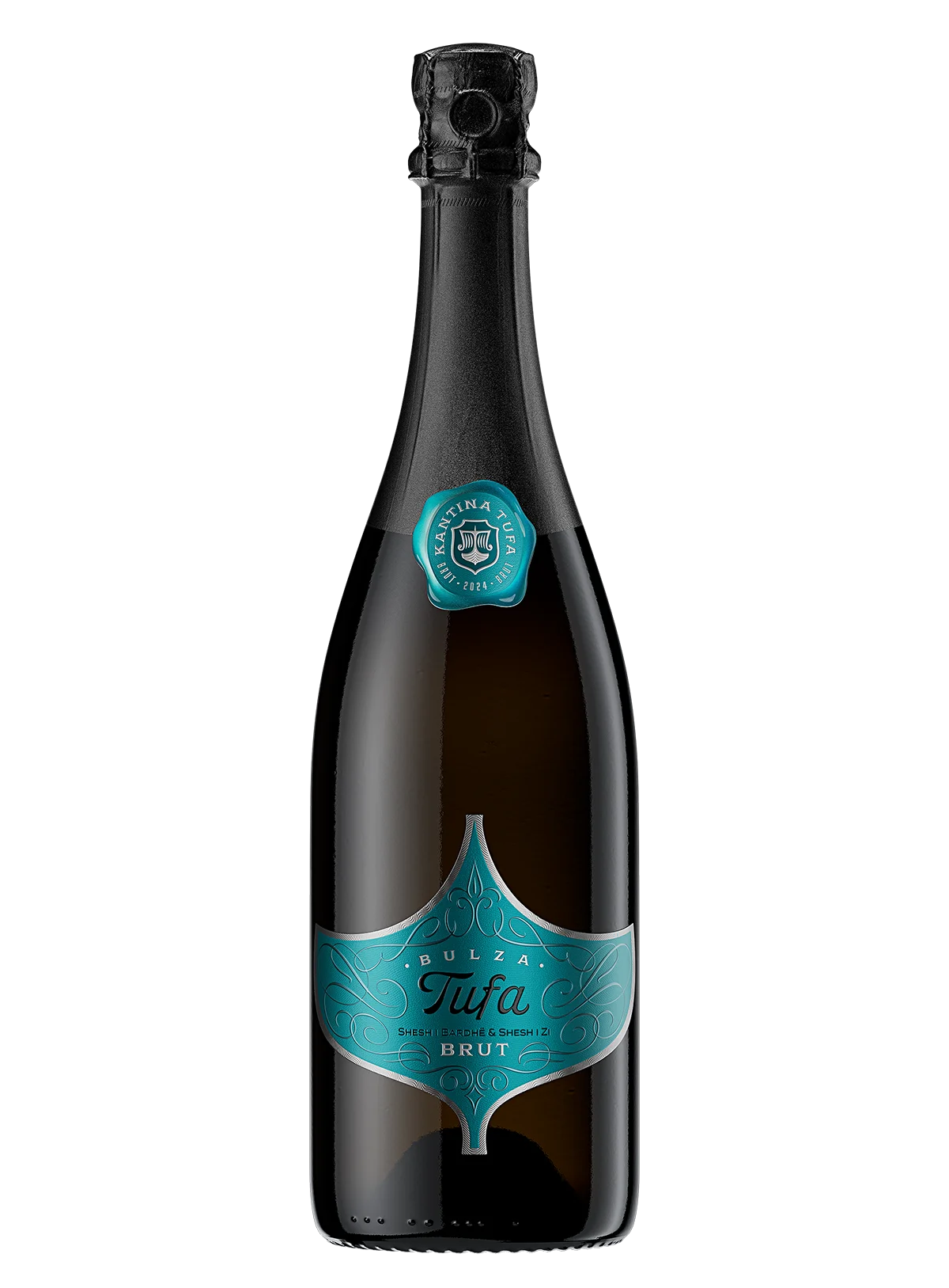
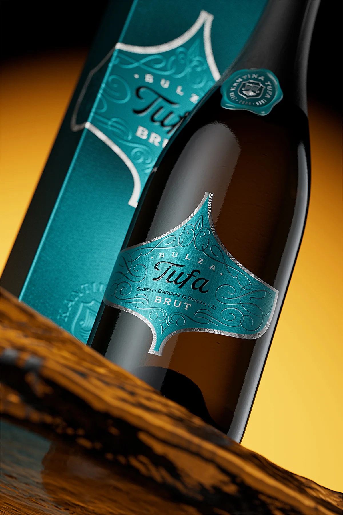
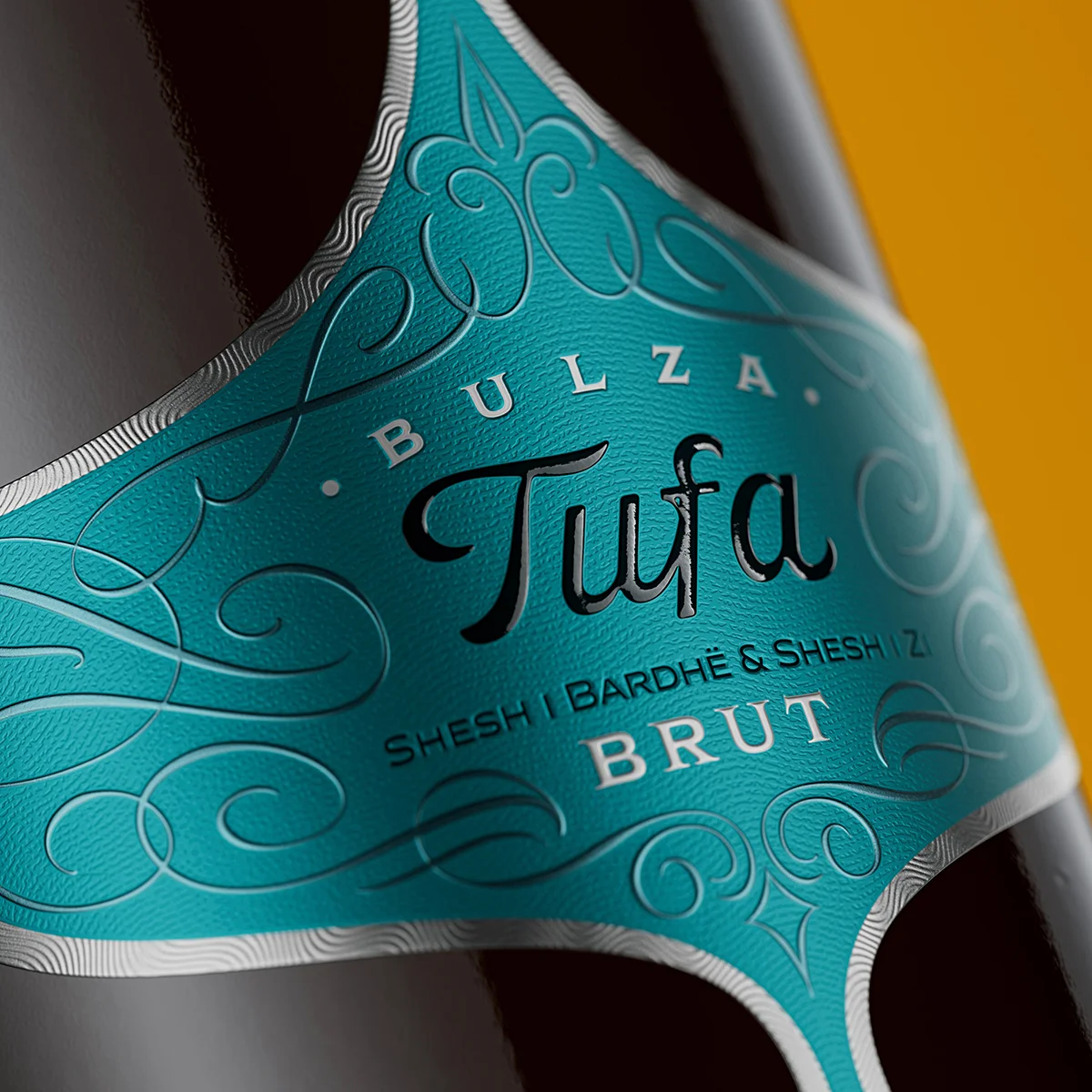
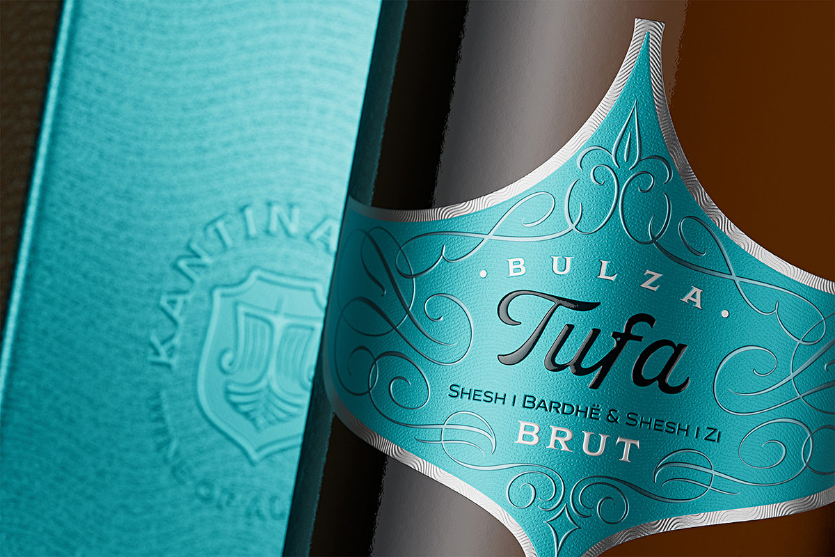
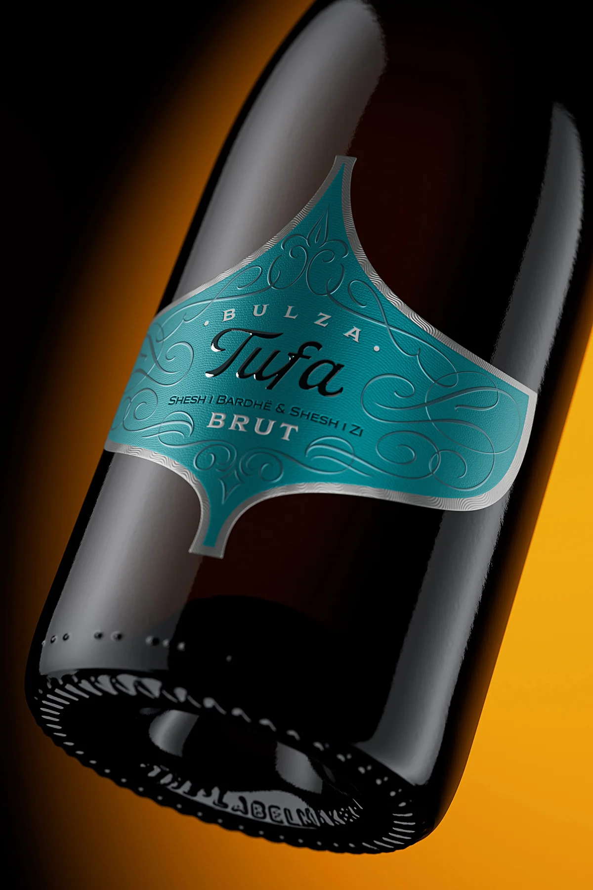
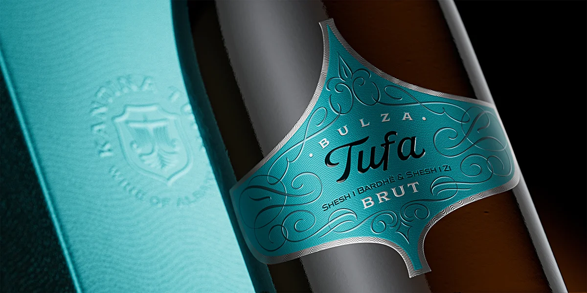
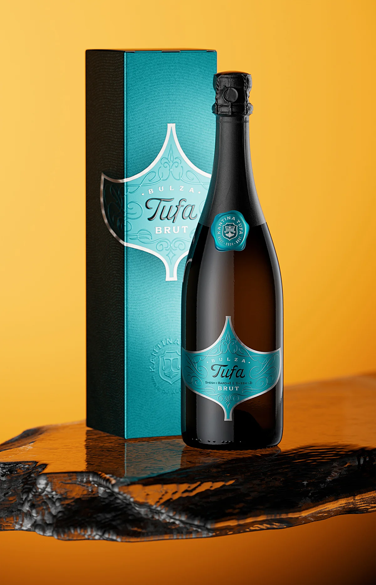
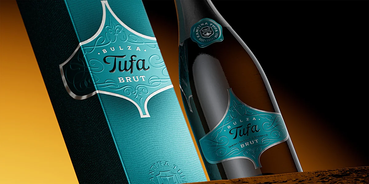
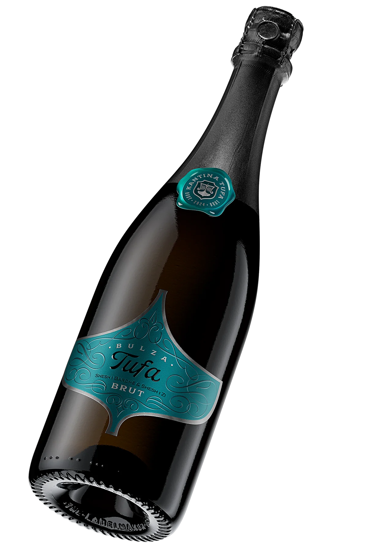
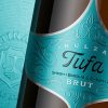
A new Albanian sparkling wine enters the premium segment – with a design confident enough to stand next to Champagne.

There is a particular kind of pressure that comes with a genuinely blank canvas. When Kantina Tufa approached me about this project, the brief was both thrilling and demanding: this was to be their very first sparkling wine – a brand-new product, never made before, entering the market in the premium boutique segment. There was no existing visual language to evolve, no established label system to respectfully update. Everything had to be invented from the first principle, and it had to be right immediately. That is, in my experience, exactly the kind of brief that produces the most honest design work – because there is nothing to hide behind.

Design at a Glance

A Material Unlike Any Other The substrate doesn’t exist in any catalogue. It was developed from scratch for this project – because nothing available was good enough.

Every Ornament Drawn by Hand No stock vectors. No shortcuts. Each element built one stroke at a time, using the same discipline as traditional calligraphy. It shows.

A Label That Makes People Reach for the Bottle The embossing, the relief, the texture – none of it is decoration. It is a calculated sequence designed to pull someone closer before they have decided to buy.

A Colour With an Argument Teal was not chosen because it looks good. It was chosen because it says exactly where this wine comes from and where it belongs.

A Shape That Needs No Name Strip every word off this label and the silhouette alone will still lead you back to Kantina Tufa. That is the goal of every shape I design.

The Box Closes the Deal Most premium wines invest in the label and forget the box. Here the box arrives as a promise – and the bottle fulfils it.

Tufa Bulza Brut luxury sparkling wine bottle with custom teal die-cut label and wax-seal capsule badge, Kantina Tufa Albania

1. A First: The Brief That Had No Template

There is a particular kind of pressure that comes with a genuinely blank canvas. When Kantina Tufa approached me about this project, the brief was both thrilling and demanding: this was to be their very first sparkling wine – a brand-new product, never made before, entering the market in the premium boutique segment. There was no existing visual language to evolve, no established label system to respectfully update. Everything had to be invented from the first principle, and it had to be right immediately.

The overarching mandate was clear: this bottle needed to stand apart from every other sparkling wine on the shelf, yet yield nothing – not a single point of prestige – to the established houses of Champagne. That is a genuinely difficult balance to strike in luxury branding for sparkling wine. The temptation, whenever a brief mentions Champagne, is to reach for gold leaf, classical serif typography, and a quietly apologetic restraint. I deliberately resisted that impulse here. If your wine has a story worth telling, the label should tell it – not borrow someone else’s.

Kantina Tufa’s Bulza is made using the traditional method – the same labour-intensive secondary fermentation in the bottle practised in Champagne – and that craft deserved a label with equivalent ambition. What I wanted to create was something that a sommelier in a fine-dining restaurant could place beside a Blanc de Blancs without the bottle feeling like an outsider. At the same time, it had to speak with its own voice; a voice that could only belong to Albania, to this specific winery, and to these particular indigenous grape varieties. That specificity is not a limitation – it is the most powerful branding asset a winery can have.

The design philosophy that guided every decision was what I think of as the slow reveal. From across the room, the bottle communicates colour and silhouette – enough to make someone curious. As they approach, ornamental detail begins to emerge. By the time it is in their hands, they are running a thumb across micro-embossed texture without even deciding to do so. That progression – from visual interest to physical engagement to emotional connection – is, in my view, the genuine purpose of luxury branding for sparkling wine. Not to sell loudly, but to seduce quietly. And a customer who reaches for the bottle before they have decided to buy it is already halfway there.

Tufa Bulza premium sparkling wine bottle on dark wood surface, teal label with silver foil contouring and calligraphic ornaments

2. Ornaments Hand-Drawn One by One: Calligraphy as Cultural Bridge

Every decorative ornament on this label was drawn by hand – not in the conventional sense of pencil on paper, but meticulously constructed one element at a time on my iPad Pro, using the same deliberate, pressure-sensitive stroke I apply when I work in traditional calligraphy. That distinction matters. Calligraphy is not simply lettering; it is a discipline that has historically connected civilisations, carrying meaning across the boundary between East and West with a shared aesthetic language that predates the nation-state itself.

I am deeply invested in calligraphy as a craft, and I believe it carries a unique authority in this context. Albania sits precisely at that crossroads – geographically, historically, and culturally – between the decorative traditions of the Orient and the classical sensibility of Western Europe. Using calligraphic ornament as the primary visual language of this label felt not like a styling choice, but like an accurate statement of identity. It is, in the truest sense, a conceptually honest design decision. And in my experience, conceptually honest design is the only kind that builds lasting brand equity.

The ornaments do not merely decorate. They function as an ideational frame – a visual boundary within which all the text elements of the label are situated. The typographic hierarchy flows through them: the winery name at the top, the product name commanding the centre, the varietal information below, all held within this hand-drawn architecture. This creates a reading experience that has depth and direction, guiding the eye without commanding it – which is precisely the quality I find most important in luxury branding for sparkling wine.

“The ornament is not decoration applied on top of the design. It is the structure from which the design grows.” ~ the Labelmaker

There is also something important that happens psychologically when a person realises – even subconsciously – that an element was drawn by a human hand. It shifts the quality of attention. Mass-produced graphics are processed and forgotten; hand-crafted marks are felt. This is central to sensory branding at the luxury tier: the design must communicate not just with the eye, but with something older and less rational. When someone reaches for a bottle of Bulza, I want the label to feel as though it was made specifically for them. That feeling – unreasonable, instinctive, real – is what converts a first-time buyer into a returning one.

Hand-drawn calligraphic ornaments and deep-press embossed Tufa lettering on teal metallic luxury sparkling wine label, Bulza Brut

3. On Choosing Teal: Colour as a Geographical Argument

I do not always arrive at a colour palette through a purely rational process. There is an intuitive dimension to it – a kind of inner conversation that happens before I begin to justify any decision analytically. With Tufa Bulza, that inner voice spoke clearly and early: it told me this label belonged in teal. Understanding why came later, but the conviction came first, and in my experience, that is usually the sign of a correct instinct.

When I interrogated that instinct, the argument became straightforward. Teal occupies a remarkable position in the colour spectrum: it carries the cool authority of blue – the traditional colour of trust, depth, and the classic wine world – while simultaneously pulling toward the warmth and vitality of the Mediterranean through its green-aqua register. For a sparkling wine from Albania, this is not a cosmetic choice. It is a chromatic argument about where this product comes from and what it aspires to. A colour that does not need to explain itself is worth more than a colour that merely looks correct.

The same rationale that drove the calligraphic ornaments drove the colour selection. Albania is a country that sits between worlds – between the Adriatic and the Ionian, between European and Ottoman heritage, between the classical traditions of the West and the rich decorative legacy of the East. Teal, in this context, becomes a visual geography: it is precisely the colour that could belong to both Champagne and the Mediterranean coast, without being dishonest to either. In luxury branding for sparkling wine, this kind of thematic coherence between concept and colour is what separates a considered design from a merely attractive one.

It is also worth noting the practical dimension of this choice. In a refrigerated retail display dominated by gold, black, white, and pale green, a deep teal label with silver metallic contouring has immediate visual weight. It does not shout. It simply occupies its space with an unusual, quiet confidence – which is precisely the register I was aiming for in every aspect of this design. Differentiation at the point of sale is not a marketing problem. It is a design problem. And it starts with colour.

Custom die-cut sparkling wine label with silver foil border and wax-effect resin capsule badge, Tufa Bulza luxury wine branding

4. The Substrate, the Techniques, and the Tactile Response

The material that carries this design is not a stock item. The colleagues at Dagaprint developed a bespoke metallic media specifically to meet the requirements of this project – a substrate that behaves differently from anything available through standard suppliers. I want to be precise about what that means in practice, because the distinction is not merely a marketing claim; it fundamentally changes what the finished label is capable of doing. When a client invests in a premium product, the label material should be held to the same standard as everything else in the bottle.

A standard metallic paper reflects light uniformly. It has a single visual register. What makes this substrate remarkable is that it responds to the embossing and micro-texture work applied over it in a layered, almost contradictory way: the recessed background areas gradually take on a matte quality – the relief compressing the surface just enough to diffuse the light – while the raised embossed elements become comparatively glossier, more luminous, as though they are pushing toward the viewer. The result is a label with genuine visual depth. It breathes.

Technical Specification Summary:

Substrate: Bespoke metallic media – Dagaprint exclusive
Background: Texture Micro-texture (shagreen / fine-grain relief pattern)
Contour Detail: Silver foil with micro-embossed wave pattern
Lettering – “Tufa”: Round deep-press embossing (high-pressure, elevated relief)
Capsule Badge: Resin label – wax effect finish, same embossing programme
Die-Cut Shape: Custom – echoing the Kantina Tufa ship logo silhouette

The word TUFA in the centre of the label carries a special round embossing – achieved through significantly higher press pressure than the surrounding relief work. The effect is a raised letterform with a distinctly three-dimensional quality, almost sculptural, that invites the finger. This is not accidental. Every decision about embossing depth and technique on this label was taken with the tactile response in mind – the precise physical sensation a person experiences when they first handle the bottle. That moment, when touch confirms what the eye has suggested, is where the emotional connection solidifies. It is also, in my experience, the moment a purchasing decision becomes a certainty.

The neck label – the small Kantina Tufa badge at the top of the bottle – is produced using resin label technology, which achieves a distinctive wax-like surface. It is printed on the same metallic substrate as the main label, and carries the same micro-texture and embossing programme in miniature. This continuity of material language across every touchpoint on the bottle is deliberate: it signals that nothing was left to chance, and it ensures that the first impression holds at every scale, from a distance of three metres to the moment it is held against candlelight at a restaurant table.

Luxury sparkling wine label detail showing embossed Tufa Brut typography and custom die-cut silhouette, Kantina Tufa Albania
Teal wax-effect resin label badge on Tufa Bulza sparkling wine capsule, luxury wine branding detail, Kantina Tufa

5. The Die-Cut Shape: Proprietary Silhouette as Brand Signature

A rectangular label is invisible. Not literally, of course – but the human eye is so thoroughly conditioned to expect a rectangle on a bottle that it stops registering the shape and moves immediately to the printed content. One of the most underused tools available to a luxury label designer is the die-cut form: the freedom to define the label’s own boundary, and in doing so, to create a silhouette that is inherently brand-owned. No other winery can use it. No other bottle can wear it.

For Tufa Bulza, the shape of the label was not designed in isolation. It was derived directly from the ship motif in the Kantina Tufa logo – a form that appears in its complete version on the presentation box and is echoed in the resin badge at the base of the capsule. The label silhouette is a deliberate translation of that nautical form into a two-dimensional border: curved, distinctive, and entirely proprietary. It carries meaning without explaining itself.

This is the kind of visual consistency that builds brand recognition over time in ways that no amount of advertising spend can shortcut. You can strip every word off this label – remove the winery name, the product name, everything – and the shape alone, after enough time in the market, will lead the consumer back to Kantina Tufa. That is the ultimate ambition of this approach to luxury branding for sparkling wine: to create a form language so distinctive that it functions as a signature. Most wineries rent their visual identity. This one owns it.

There is also a practical dimension to the die-cut that is easy to overlook. When a bottle with an unconventional label shape is placed among bottles with standard rectangular labels, it creates a kind of visual interruption – a pause in the expected pattern – that draws the eye. It is not aggressive. It does not compete through volume. It competes through difference, which is a far more durable strategy at the premium tier, where the audience is self-selecting for exactly this kind of quiet distinction.

Micro-embossed shagreen texture and silver foil contouring detail on bespoke metallic substrate, Tufa Bulza sparkling wine label

6. The Presentation Box: Where the Brand Experience Begins

A bottle does not exist in isolation. When a product is positioned at the boutique premium tier – when it sits in the window of a specialist wine shop or arrives as a considered gift – the packaging is not an afterthought. It is the first handshake. And if that handshake contradicts everything the label has communicated about quality and care, the entire value proposition collapses before the cork is drawn. I have seen this happen too many times with otherwise excellent wines.

The presentation box for Tufa Bulza was developed with this in mind, and it is finished using the same materials as the label itself. The same metallic substrate. The same embossing language. The same teal and silver colour register. Opening the box should feel like an amplified version of picking up the bottle – the same tactile response, the same visual world, but at a larger scale and with more presence.

This material continuity is one of the most effective tools in luxury packaging design, and also one of the least commonly executed at genuine depth. Many premium wines invest heavily in the label and treat the box as a cost-optimised container. The result is a moment of deflation – the eye expects one thing and receives another. Here, the opposite is true: the box arrives as a promise, and the bottle fulfils it. That alignment of expectations across every physical touchpoint is what transforms a premium product into a genuinely luxury brand experience.

For a wine that is intended for premium restaurants and specialist retailers – environments where the product is often presented before it is poured – this kind of packaging integrity carries direct commercial value. It gives the sommelier something worth showing. It gives the retailer something worth displaying. And it gives the gift-giver the confidence that what they are presenting reflects the quality of the gesture itself. The box is not packaging. It is the first chapter of the brand story.

Tufa Bulza luxury sparkling wine bottle and presentation box on dark marble surface, premium boutique wine packaging design

7. Design as the Beginning of a Relationship, Not the End of a Transaction

I have designed labels for sparkling wines before – including the Zitara Crémant project – and across all of them, my core conviction has remained the same: the purpose of a label is not to sell a bottle. A label that advertises too loudly is a label that has already given up. It has decided the first impression is the only impression, and so it spends all of its energy on the opening line of a conversation it has no intention of continuing.

The Tufa Bulza label operates on a different premise entirely. It is designed to be discovered incrementally – to offer something new each time a person encounters the bottle, whether that is the first time they see it across a room, the second time they pick it up and notice the relief detail, or the hundredth time they recognise its silhouette on a restaurant shelf and feel a small, familiar warmth toward it. That last moment – the warmth of recognition, the almost involuntary positive association – is what luxury branding for sparkling wine ultimately exists to create. And it cannot be faked, rushed, or bought with a bigger print budget.

Tufa Bulza Brut sparkling wine bottle with matching luxury presentation box, teal metallic embossed packaging, Kantina Tufa Albania

The commercial argument for this approach is, in my experience, more robust than it might initially appear. A design that builds genuine emotional connection does not need to be supported by constant advertising investment to maintain its effect. The label itself becomes the marketing – it carries the brand story on every table it sits on, in every photograph taken of it, in every moment a guest asks the sommelier what that bottle is. That is a form of reach that no media budget can replicate, and it compounds over time. For a winery building a long-term brand rather than a short-term sales spike, this is the only strategy that makes sense.

There is also something I find quietly important about working in this register: it is a form of respect for the product itself. Kantina Tufa has made a serious wine using a demanding method with varieties that are genuinely their own. That deserves a design that meets it at the same level of seriousness – one that communicates quality through restraint and craft, rather than through volume and spectacle. Aesthetic restraint, executed with real technical ambition, is in my view the most honest language available to luxury label design.

What I wanted most, at the end of this project, was for someone to taste Tufa Bulza for the first time and feel – even without articulating it – that the wine and the label are part of the same story. That the teal and the calligraphy and the relief and the shape all belong to the same world as the wine inside the bottle. When that coherence is achieved, the design has done its deepest work: it has made the product memorable in a way that outlasts the tasting note and survives the passage of time. That, ultimately, is what builds a loyal audience – and what builds lasting, sustainable sales without the need to shout.

Tufa Bulza Brut sparkling wine bottle - custom teal die-cut label with calligraphic ornaments and Kantina Tufa wax-effect resin embossed metal label