How sophisticated minimalism and tactile engineering build lasting emotional bonds and drive market success.

The Birth of an Ambitious Vision

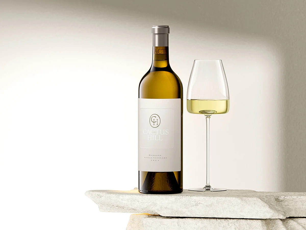
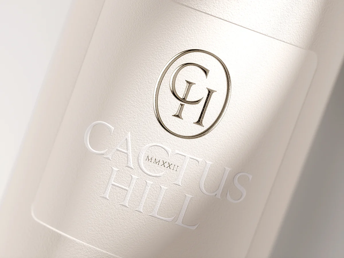
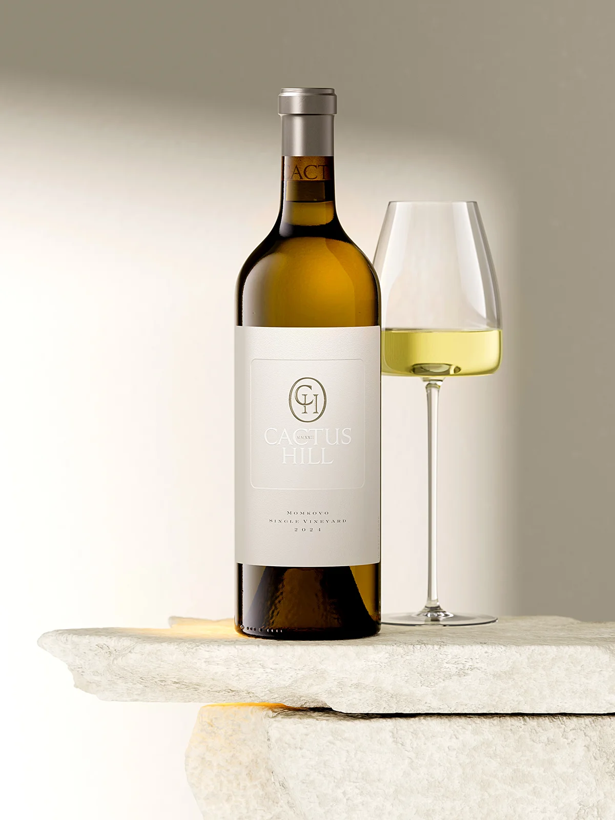
Cactus Hill is not just a winery; it is a bold, new investment and an incredibly promising project located in the village of Momkovo, near Svilengrad. The name itself is a tribute to the unique landscape – a picturesque hill where cactuses grow freely in the wild, a rarity in Bulgaria found in perhaps only two or three other locations. The winery is a masterpiece of modern architecture, a concrete facility semi-buried into the base of the hill to maintain a natural, constant temperature year-round. Orchestrating this ambitious symphony of soil, vessels and wines is Petar Iliev, one of Bulgaria’s most proven and renowned winemakers. To match this level of viticultural excellence, the project required an ultra premium wine label design that didn’t just sit on the bottle but lived as part of the brand’s soul.

Why Ultra Premium Design is Your Strongest Sales Tool

For a brand owner, an ultra premium wine label design is not an expense – it is the engine of your commercial success. Here is why this specific approach transforms your business:

  • Forging Emotional Bonds: Beyond the first sip, the tactile journey of debossing and embossing creates a physical memory of your brand.
  • Commanding Shelf Authority: The use of cobalt gray accents and custom 38mm capsules ensures your bottle stands as a silent icon of quality.
  • Driving Sustainable Sales: By avoiding “loud” trends and focusing on sophisticated harmony, we attract a loyal, high-spending audience that seeks out your wine repeatedly.
  • Technical Mastery: We utilize roof and round embossing on Fasson Cotton Touch paper to communicate luxury without saying a word.
  • Precision Execution: From the Vetreria Etrusca glass to the precision foil work by Dagaprint, every detail is engineered to convert a browser into a buyer.
Full bottle shot on stone base

Masculine Elegance and Italian Craftsmanship

When we set out to launch the Chardonnay and Viognier, the first step was choosing a vessel that commanded respect. We selected a Bordeaux Cru bottle from Vetreria Etrusca, Italy – a classic, solid, and undeniably masculine silhouette. A high-end wine branding concept must respect the geometry of its bottle, and this heavy glass demanded a closure of equal caliber: a top-quality whole cork, uniquely identified and branded so the Cactus Hill logo peeks through the glass just below the capsule. This subtle detail is the first handshake between the producer and the connoisseur, signaling that no element has been overlooked. By integrating the branding into the cork itself, we create a layer of discovery that begins before the bottle is even opened. It is this level of intentionality that transforms a simple beverage into a luxury experience.

Close-up of the bottle neck and capsule

The Cobalt Gray Signature: Custom Capsule Engineering

The capsule is often an afterthought in design, but here, it is a pillar of the brand identity. I chose a polylaminate material and a non-standard 38mm height to reinforce the bottle’s character. The color is a bespoke cobalt gray, providing a deep, serious foundation for the silver-toned top-disk, which features the CH monogram in a sharp roof embossing. This specific capsule size, combined with the clean design and the exposed cork beneath, creates a highly individual presence on the shelf. It is a “signature stroke” that makes the product instantly recognizable without being loud. In this bespoke viticultural packaging, the goal is to be remembered for your character, not your volume. This approach ensures the consumer recognizes the “hand” of the creator in every millimeter.

Angled view of the label showing the debossed frame

Tactile Minimalism: The Power of Cotton Touch

For the label itself, I turned to one of my favorite materials: Fasson Cotton Touch. The shape is a classic rectangle, but the execution is strictly minimalist, stripped of all unnecessary text and cluttered elements. The heart of this ultra premium wine label design is a large, central rectangular zone created with a deep debossing technique. By flattening the paper fibers with a special die, the texture becomes smoother and the area sinks, creating a “passpartout” or framed effect within a single layer of paper. This creates a sophisticated play of two levels and two textures without adding a single drop of ink. It is a testament to the idea that true luxury is felt as much as it is seen. The tactile feedback of the cotton paper invites the hand to linger, building that crucial physical connection with the consumer.

Extreme close-up of the "ACT" on the capsule

A Hierarchy of Whiteness and Roman Charisma

Inside that debossed zone sits the Cactus Hill logo, rendered in a white that is just a shade brighter than the paper itself and lifted with a strong round embossing. My vision was to create a hierarchy of whites: the natural finish of the paper, the smooth debossed center, and the brilliant, raised lettering of the brand name. Discretely tucked within the typography is the founding year of the winery, written in Roman numerals. I chose Roman over Arabic numerals because they possess a certain charisma; they require the viewer to pause and decode them. This is how the design communicates – it doesn’t intrude, but it demands a moment of genuine attention. This subtle engagement is the foundation of a luxury wine aesthetic that seeks to be discovered rather than merely noticed.

Top view of the capsule and the "CACTUS" lettering

Harmonizing Cobalt Gray and Light

To bring a touch of contrast to the minimalist white, I utilized a special hot foil stamping from KURZ, featuring elegant cobalt gray undertones that harmonize perfectly with the capsule. This foil was applied to the CH monogram within its ellipse, using the same high-detail roof embossing found on the top-disk. Our partners at Dagaprint executed this with impressive precision, ensuring that the metallic glint remains sophisticated and serious rather than flashy. This ultra premium wine label design avoids “screaming” with wild contrasts or overloaded forms. Instead, it relies on the harmony between paper texture, the finesse of the embossing, and the wine inside. When a label achieves this level of balance, it attracts a discerning audience that doesn’t just remember the image, but falls in love with the product’s identity.

Label detail showing the "CH" monogram and "CACTUS HILL" text

The Emotional ROI: Design as a Long-term Asset

In the end, my goal was to create an ultra premium wine label design that acts as a bridge to the consumer’s emotions. By utilizing technical possibilities like round and roof embossing, hot foil stamping, and deep debossing with such restraint, we create a product that is both recognizable and highly sellable. When a design communicates with such quiet authority, it fosters a stable and sustainable emotional connection with the wine lover. Once they taste the quality of the wine and feel the quality of the label, the brand becomes etched into their memory. This isn’t just about aesthetics; it’s a strategic realization that leads to long-term success. A label that is searched for and desired is the ultimate goal of any premium project, turning a first-time buyer into a lifelong advocate.

Ultimately, to honor the rarity of this terroir and the hands that crafted it, every single bottle carries its own unique number – a silent promise that you are holding a singular, unrepeatable moment of Cactus Hill history signed by Petar Iliev, winemaker.

Final full bottle shot with glass

Credits:
Client: Cactus Hill Winery
Design: the Labelmaker
Print: Dagaprint
Photo CGI: Jordan Jelev