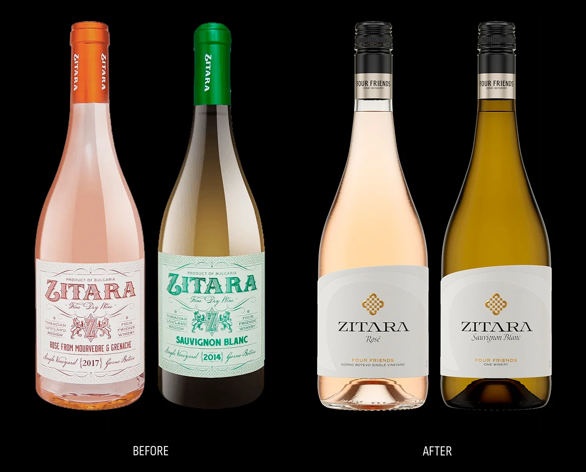
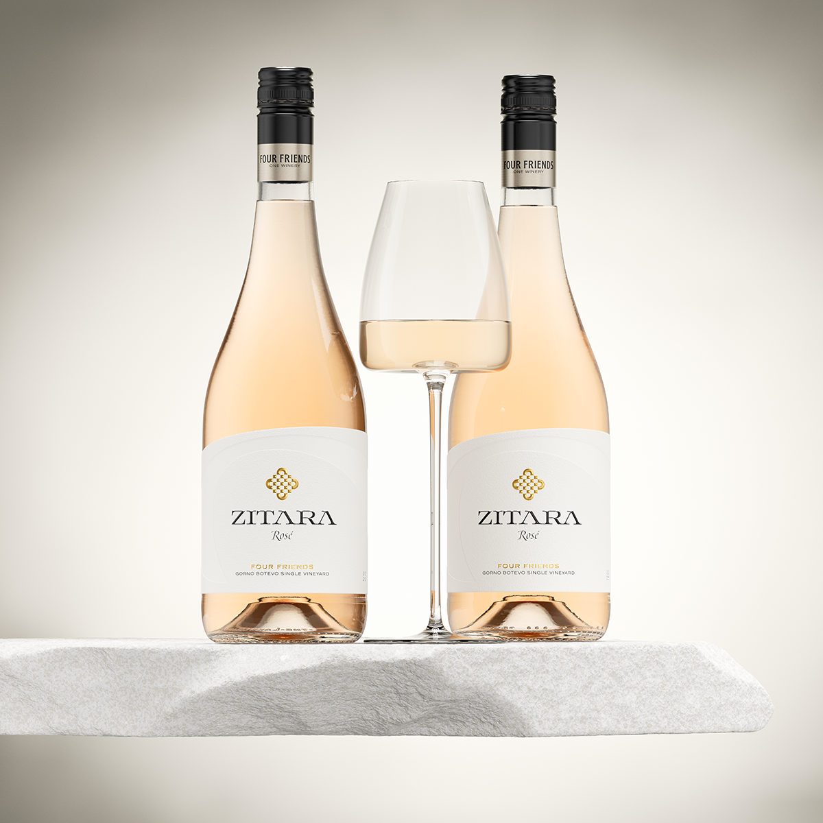
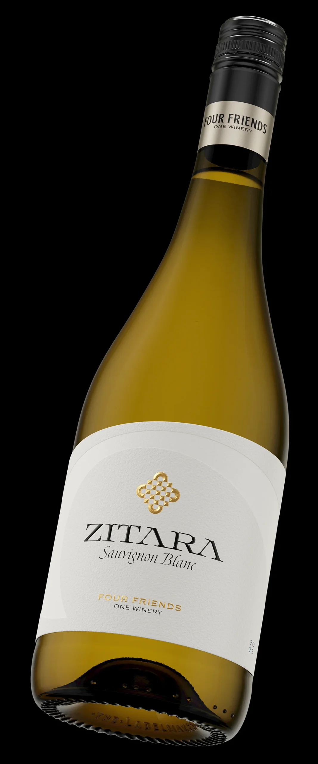
When the wine outgrows its label, everything has to change

There are projects where the brief is clear from the first conversation. Thanks to their ambitious chief-winemaker Petar Iliev Four Friends Winery had built something real – serious wines, genuine recognition, a loyal audience – and their visual identity had stopped keeping up. The Zitara series, their flagship premium range, was wearing a label that belonged to a different era and a different ambition. The decision was not whether to change it. It was how far to go.

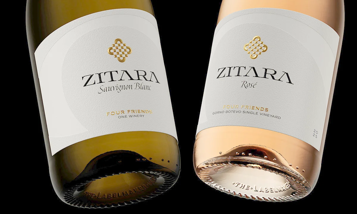
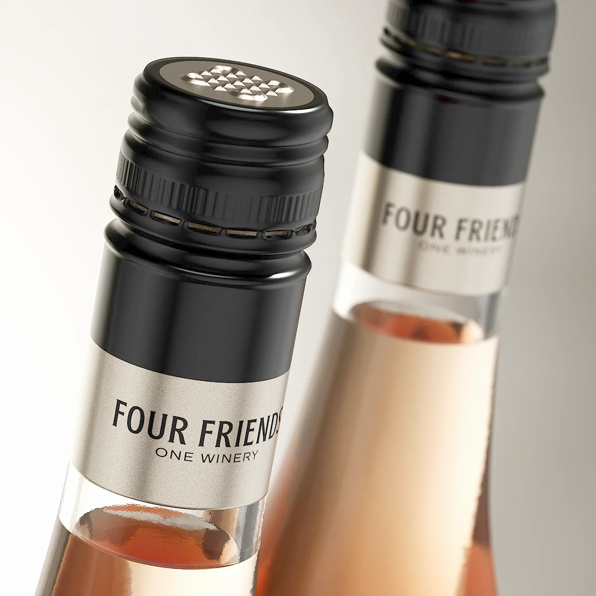
The answer was all the way. New logo, new label system, new capsule, new slogan. Not a refresh – a complete wine brand redesign that starts from the founding story of the winery and builds outward from there, one decision at a time.

Four Friends Winery logo redesign before and after - old decorative script logo versus new geometric abstract logo with One Winery slogan
Four Friends Zitara wine brand redesign before and after - old bourbon-style vintage labels versus new contemporary Zitara label design, Bulgaria

Design at a Glance

A Logo With a Story Built In The new Four Friends logo is a stylised table seen from above – four chairs gathered around it, each rendered as a half-arc. Abstract enough to work as a pure graphic mark. Specific enough to carry the founding story of the winery in a single form.

One Slogan, No Explanation Needed “Four Friends – One Winery.” Five words that say everything the brand needs to say. Arrived at naturally during the design process, unplanned and therefore completely right.

Contemporary, But Not Rootless Clean and restrained on the surface, with discreet classical references woven into the structure – because modernity that has no memory is just fashion.

Gold Foil and Roof Embossing The Four Friends logotype in rich gold hot foil, finished with hand-crafted roof embossing. Under any light, the form has genuine sculptural presence.

A Capsule Worth a Second Look Matte black, smoked silver frieze, deeply embossed logo on the top disk. The most considered screw cap I have designed.

The Aureus Typeface – A First Zitara is the debut appearance of the Aureus type family, developed with Vassil Kateliev for The Fontmaker Type Foundry.

1. The Problem With the Old Design

The old Zitara label was not without merit – for its time and its audience, it communicated something. A bourbon-inspired vintage aesthetic, decorative typography, heraldic ornaments. There was a visual logic to it, even if that logic led somewhere generic. The deeper problem was not the style. It was the absence of any meaningful connection between the name of the winery, its logo, and the label it put on its bottles. Three elements that should form a single coherent statement were operating independently, without a shared idea to hold them together.

A wine brand redesign that addresses only the surface – new colours, new typeface, cleaner layout – would have solved the wrong problem. The visual identity of Four Friends Winery needed a foundation, not a renovation. That meant starting with the logo, which meant starting with the question that the logo had never properly answered: what does Four Friends actually mean, and how do you show it?

2. The Logo: Where the Redesign Begins

The answer to that question took the form of a table. Not literally – there is no illustration of furniture anywhere in this identity. But the concept is precise: a square table viewed from above, with four chairs gathered around it, each rendered as a half-arc of a circle. The four founders of the winery, seated together, sharing the same surface. The moment the winery began.

What makes this logo work beyond its concept is that it does not need the concept to be beautiful. The form stands entirely on its own – balanced, geometric, with an inner complexity that reveals itself slowly. People who know the story see a table and four chairs. People who do not see something they cannot quite name but find themselves drawn to regardless. That dual quality – immediate visual appeal and deeper conceptual reward – is what separates a logo that lasts from one that dates.

The slogan completed the picture without being planned. “Four Friends – One Winery” arrived during the process the way the best ideas usually do – suddenly, and obviously right. It required no discussion and no alternatives. When a line of copy describes something so precisely that explaining it further would only diminish it, you leave it alone.

Four Friends Winery logo concept - stylised table viewed from above with four chairs as half-arcs, before and after logo comparison

3. The Label: Earned Modernity

The Zitara label looks contemporary. That is intentional and also, in a sense, beside the point – because the more important quality is that it looks contemporary in a way that does not feel arbitrary. The restraint is earned. The classical references are specific. The modernity is the result of something, not just a stylistic preference.

The structure of the label is classical in its proportions and central in its composition, but the asymmetric arc at the top edge introduces a deliberate disruption – a movement from lower left to upper right that animates the format without breaking it. That same arc is echoed in the background of the label as a debossed motif, described in the paper itself rather than in ink. Dagaprint applied a special emulsion to this area that renders the surface marginally smoother and more even than the surrounding structured paper – the difference is not visible so much as felt, two textures coexisting in a single material plane. It is one of the more refined details I have worked on, and one of the least likely to be noticed consciously by anyone who picks up the bottle. That is exactly the point.

Working with Dagaprint allowed us to push the boundaries of roof embossing without compromising technical excellence. As the industry moves toward sustainability, balancing premium aesthetics with PPWR-compliant solutions is the next frontier for Zitara.

At the centre sits the Four Friends logotype in rich gold hot foil, finished with roof embossing – a technique I have developed and refined across multiple projects to give genuine three-dimensional volume to complex graphic forms. Below it, the Zitara wordmark is set in a custom version of the Aureus type family, currently in final development with type designer Vassil Kateliev for The Fontmaker Type Foundry. A tactile varnish over the letters adds a further layer of depth – under raking light, the wordmark seems almost to lift off the paper. The total effect, when the label is held at an angle, is of something assembled from multiple materials that are in fact a single surface. That is the standard I was working to.

Zitara Rosé and Sauvignon Blanc wine label detail - gold foil Four Friends logo with roof embossing and Zitara wordmark in Aureus typeface, wine brand redesign Bulgaria

4. The Capsule: The Detail That Changes Everything

I spent more time on the screw cap than most projects spend on the entire label. That is not an exaggeration and not a complaint – it is simply the reality of working through a problem that has no obvious solution. Standard screw caps in gold, silver, white, and black were all tested. All of them were variants of the same thing: a coloured cylinder with a name printed on it. None of them had any presence.

The solution came the way the slogan did – suddenly, and from an unexpected direction. A matte black body with a solid frieze in smoked silver running around the lower section, carrying the text “Four Friends – One Winery” in the same considered layout as the label. The smoked silver is a specific colour – warm, complex, somewhere between metallic and matte – arrived at after a large number of simulations and rejected alternatives. It does not look like silver from a catalogue. It looks like it belongs to this brand specifically.

On the top disk, the Four Friends logo is executed in the same smoked silver with a deep roof embossing – the strongest relief on the entire bottle. The form catches and holds light from every angle, producing a play of reflection and shadow that is genuinely difficult to ignore. It is the kind of detail that makes a person want to own the bottle before they have decided what is inside it. For a screw cap on a premium wine, that is an unusual ambition. In this case, it is fully realised.

Four Friends One Winery smoked silver frieze on matte black screw cap - Zitara wine brand redesign capsule detail, Four Friends Winery Bulgaria

5. What a Rebrand Actually Means

The word “rebrand” is used too loosely in the wine industry. It is applied to colour changes, to typeface swaps, to labels that have been tidied up and relaunched with a press release. What happened here is something different. The Four Friends Winery wine brand redesign produced a logo that connects directly to the founding story of the winery, a label system built around a coherent visual philosophy, a capsule that functions as a brand statement in its own right, and a slogan that required no revision. These things do not come from a brief – they come from spending enough time with an idea to understand what it actually is.

The Zitara series will grow. New varieties will join the range, each wearing the same label, accumulating recognition bottle by bottle and vintage by vintage. The versatility of this new visual grammar has already been proven through the Zitara Crémant project, where the core identity was seamlessly adapted for the high-pressure demands of premium sparkling wine packaging. That consistency – the same form, the same logic, the same quality of execution – is what builds the kind of visual identity that does not need to be replaced. It simply needs to be maintained. For a winery that has already done the hard work of building a serious wine and a serious audience, that is exactly the right foundation to be standing on.

Zitara Sauvignon Blanc two bottles with wine glass - contemporary wine label design with gold foil logo and smoked silver screw cap, Four Friends Winery Bulgaria
Zitara Rosé two bottles with wine glass - contemporary wine label design with gold foil logo and smoked silver screw cap, Four Friends Winery Bulgaria
Zitara Sauvignon Blanc single bottle tilted - full view of contemporary wine label and smoked silver screw cap, Four Friends Winery wine brand redesign

Credits:
Client: Four Friends Winery
Print: Dagaprint
CGI Photo: Jordan Jelev