A Contemporary Design that Captures Tradition and Elegance
The Burgaska Rakia series has long held its rightful place among Bulgarian rakia enthusiasts. Now, after a pause of more than 15 years, the time has come to change the visual identity of the entire label series.
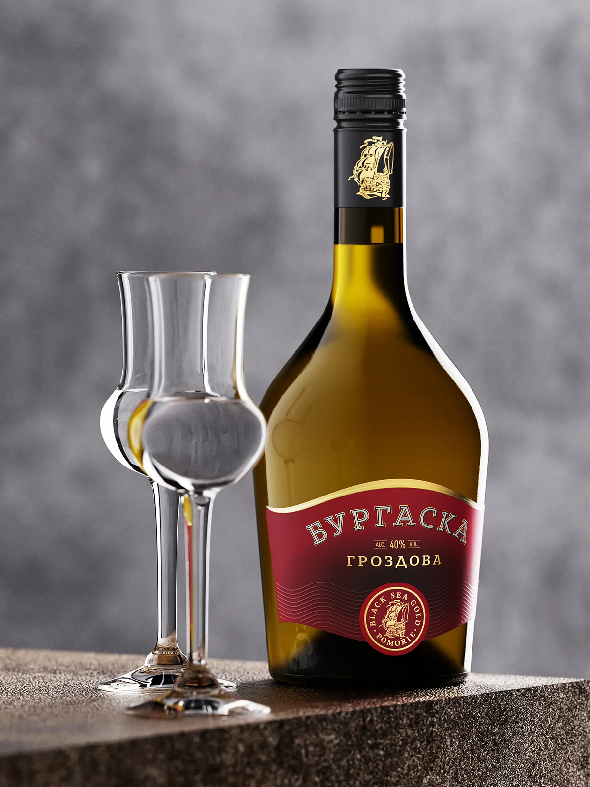
The goal is for the new design to be in line with the times while reflecting the undeniable qualities of the rakias themselves. We have chosen to keep the current bottle, as it has been an integral part of the series’ character. Previously, some of the bottles had a matte finish, but this often resulted in surface scratches, diminishing the aesthetic appeal of the product. In the new series, all bottles feature dark antique green glossy glass color and screw cap closures.
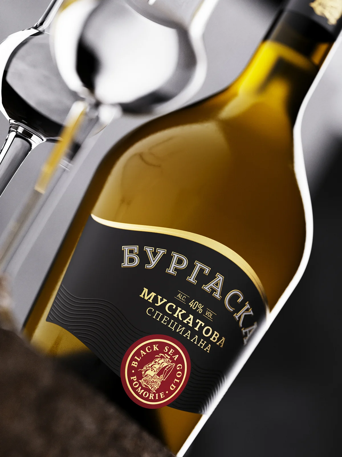
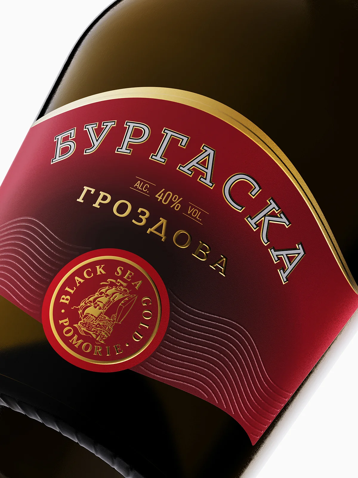
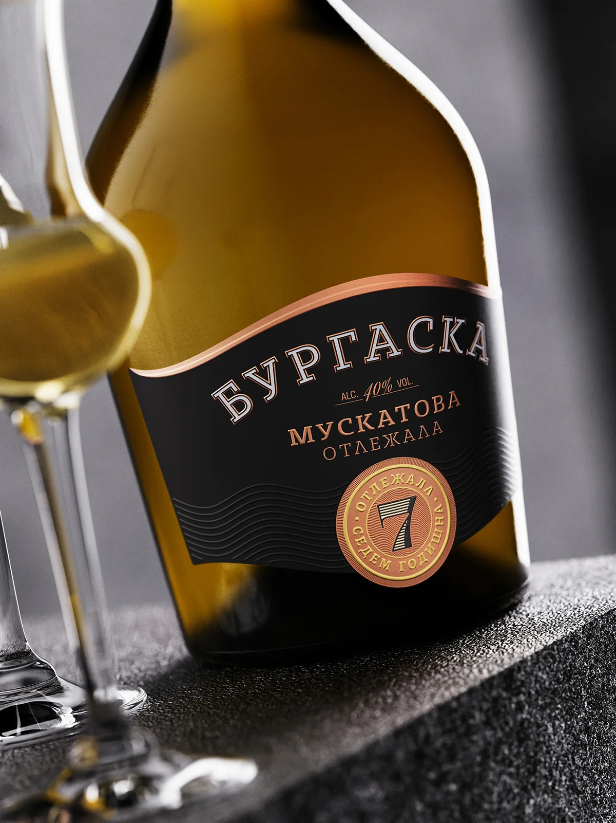
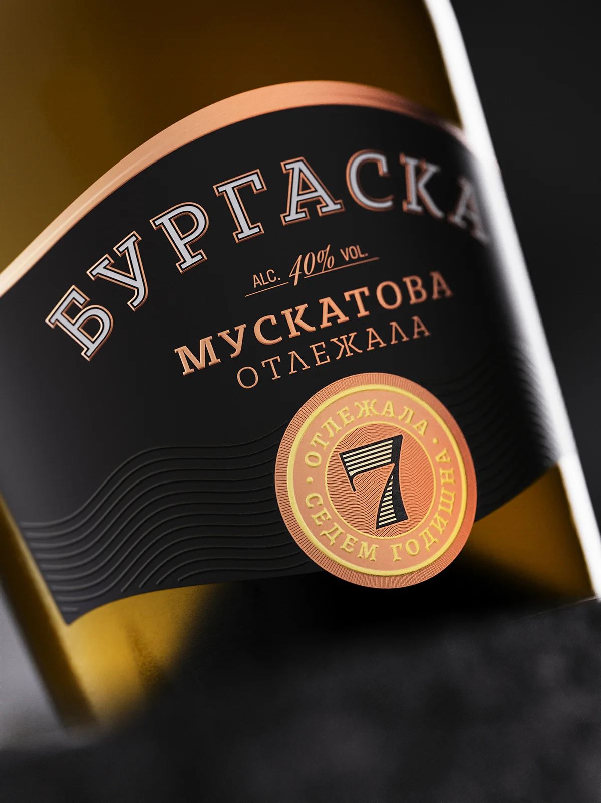
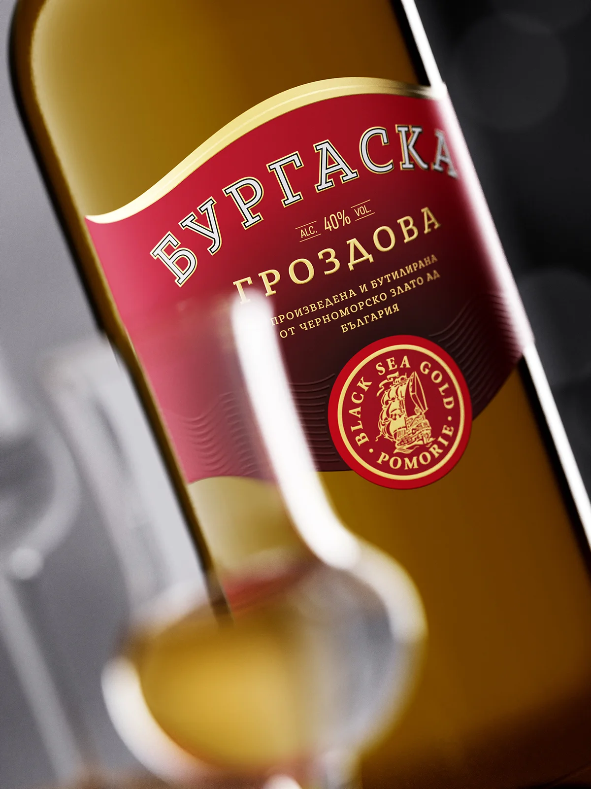
The current labels largely resemble the old ones in terms of shape and size. In the new design, I have added a more distinctive form with soft curves that gracefully embrace the bottle’s contours. Undoubtedly, the most important focus was placed on the BURGASKA brand, employing a clear and legible typography with subtle effects. The contour created by hot stamping, enhanced by discreet relief, adds depth and tactile sensation.
Right below the brand, I positioned the information for each of the product variations, while beneath them, I placed the winery logo, stamped in rich domed gold. On either side of it, I decided to repeat a distinctive motif of relief waves that I have used in other designs for Black Sea Gold, gradually establishing it as a characteristic element in the visual identity of many of their products.
For the entire series, I selected a very fine yet intriguing paper with a smooth texture, turning it into an elegant background for the entire design.
Traditionally, the series is represented by three types of rakia, with the 7-year-aged rakia being the most notable achievement.
Credits:
Client: Black Sea Gold – Pomorie
Designer: the Labelmaker
Print: Dagaprint
Fonts in use: BASIL by Vassil Kateliev
CGI: Jordan Jelev