
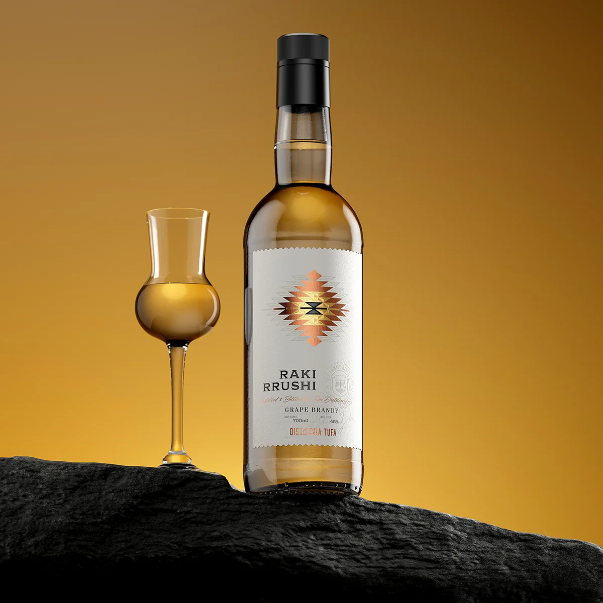
Tufa Distillery Raki Rrushi
The project for Tufa Distillery’s Raki Rrushi presented an ideal design challenge: creating a Craft Spirit Label Design for a highly accessible, authentic grape distillate, positioning it as a premium product purely through packaging and material science. Tufa Distillery is fiercely dedicated to quality, and the label needed to reflect this commitment without making the spirit prohibitively expensive or pretentious. The goal was to establish a new aesthetic standard for Albanian Raki Rrushi Packaging — a fusion of contemporary design discipline and profound regional tradition.
The Canvas: An Interactive Paper Substrate
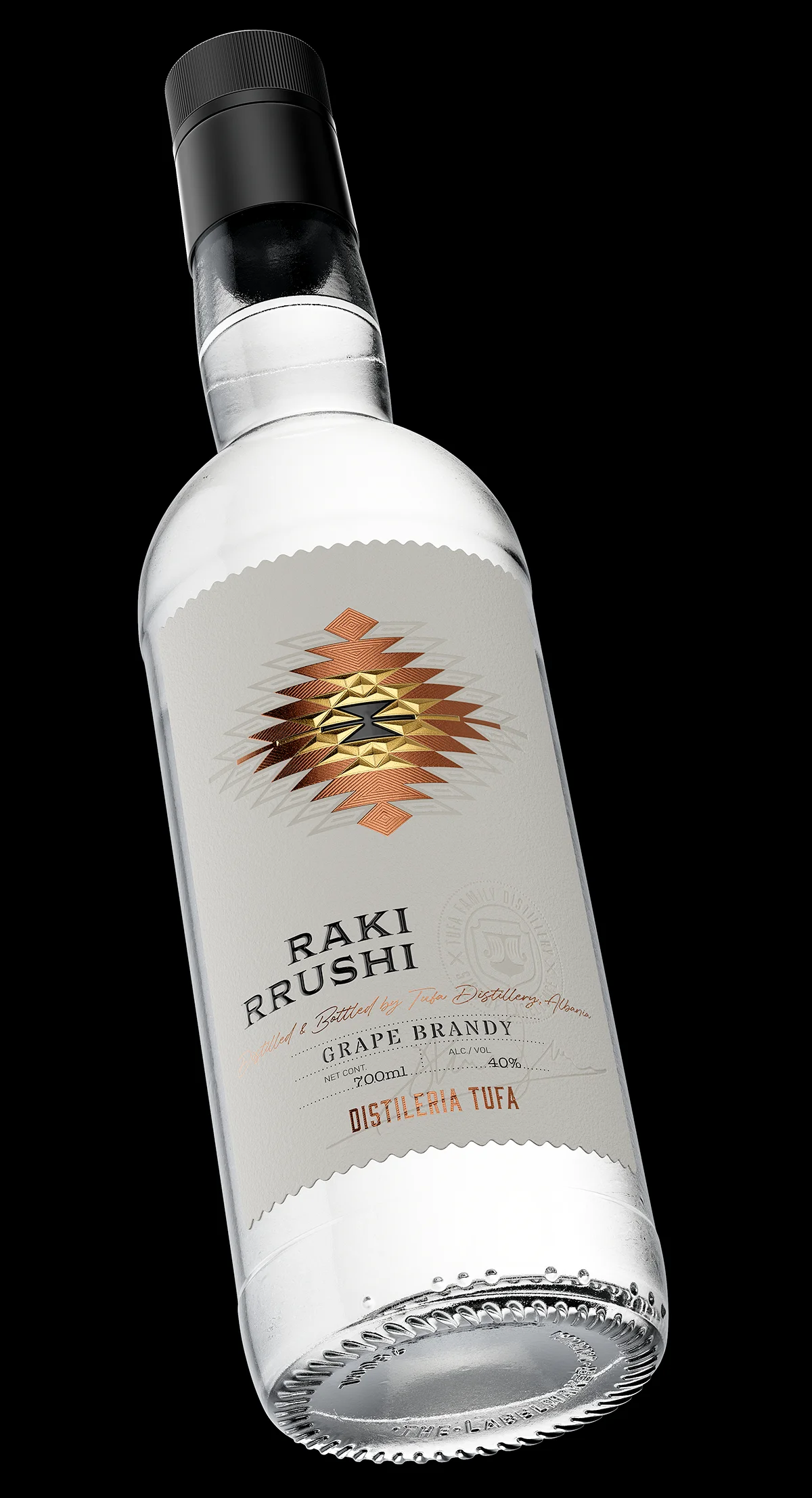
The foundation of this design relies on an extremely unique material choice. We selected a specialized paper composed of acrylic fibres. This paper acts as an interactive canvas, engineered to enhance the tactile experience:
Upon pressure and high heat, the fibres in the zones of pressure partially melt and sink, creating an incredibly sensitive Debossing effect. Crucially, this process causes the affected areas to darken slightly and become semi-translucent, adding visual depth and textural contrast that is impossible to achieve with conventional paper stocks. Every detail applied to this paper is not just on the surface, but within it.
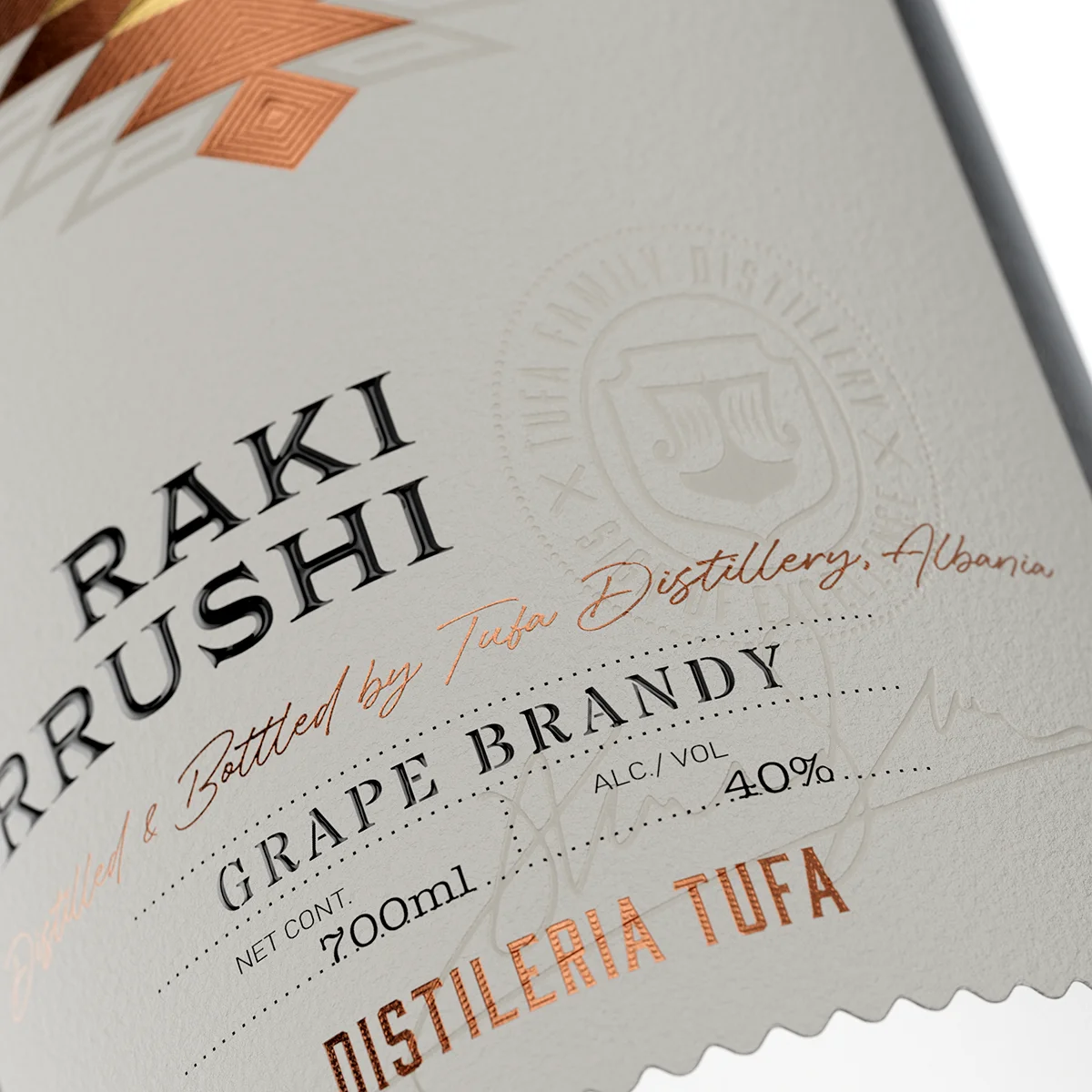
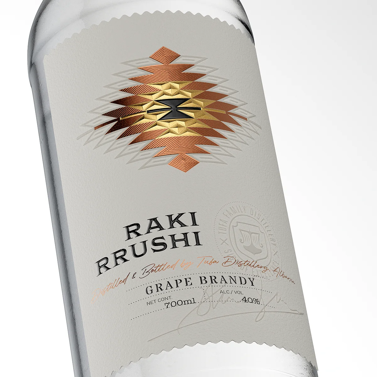
The Focal Point: A Multi-Layered Folkloric Motif
The core of the label is a stylized geometric motif, inspired by traditional Albanian needlework. This symbol anchors the brand to its cultural roots. To articulate this element, I employed a high degree of technical complexity:
- Multi-Color Hot Foil: The motif is brought to life using Hot Foil Stamping in two distinct metallic finishes—bright gold and rich copper.
- Specialized Embossing: The gold foil features a unique “roof embossing” with reinforced edges. I developed this method specifically to increase visual sharpness and ensure the gold graphic is exceptionally crisp and impactful, capturing and refracting light dramatically.
- Manual Micro-Embossing: The copper foil areas were further enhanced with fine, patterned micro-embossing, manually designed to add subtle, detailed linear texture, giving the copper a hand-crafted, textile-like quality.
This intricate interplay of multi-layered foil embossing ensures the folkloric symbol feels substantial, ancient, and luxurious.
Subtle Detailing: Creating Sensory Depth
To prevent the bold central motif from overwhelming the label, softer, more restrained techniques were used for supporting elements:
- Tactile Varnish: The main text, “RAKI RRUSHI” and “GRAPE BRANDY,” is highlighted with a thick, raised spot UV varnish, adding gloss and tactile contrast against the matte paper texture.
- Aura of the Motive: Surrounding the central element, geometric rhombus patterns are applied using the special acrylic fibre Debossing technique. This creates a ghosted, semi-transparent aura around the main symbol, reinforcing the soft, inherent texture of the paper.
- Brand Credentials: Lower down, the Tufa Distillery logo (the ship) and the subtle signature beneath are also rendered using the same heat-induced Debossing, creating deep, shadow-casting relief that communicates authority and heritage.
The Form: A Nod to Tradition and Craft
The label’s unconventional shape is a deliberate feature. Both the top and bottom edges are cut with a decorative, wavy pattern, imitating the sewn edge of a piece of fabric or embroidery. This choice reinforces the “Craft” positioning and provides an organic, tactile contrast to the paper’s refined texture.
The overall package uses a classic, functional spirit bottle with a conventional screw cap. This was a deliberate choice: the entire budget and design focus were channeled into creating the most impactful label possible, proving that true luxury and attention to detail can be concentrated entirely on the primary communication element.
Flawless Execution: The Standard Set by Dagaprint
A design relying so heavily on the precise manipulation of paper fibres, the simultaneous application of multi-colour foils, and the perfect registration of complex embossing dies requires exceptional technical skill.
Once again, Dagaprint.com demonstrated their industry-leading capability. The flawless execution of the multi-layered foil embossing on the folkloric motif and the controlled, perfect sinking and darkening of the acrylic paper in the debossed zones are technical feats. The resulting labels embody my vision, proving that when collaborating with the best in print technology, no design detail is too complex to realize. This project sets a new benchmark for Craft Spirit Label Design globally.
Credits:
Client: Kantina Tufa
Design: the Labelmaker
Print: Dagaprint.com
CGI Photo: Jordan Jelev