Searching for a Harmony between Design and Function
In the world of premium wines, where each bottle tells a story of tradition, craftsmanship, and innovation, the label plays a pivotal role in communicating these values. For Erzetic Amfora Premium Wines, the challenge was to design a sleek wine label that harmonizes seamlessly with their custom amphora-inspired bottle while exuding elegance and sophistication. This case study delves into the creative process behind this remarkable design, showcasing how every detail contributes to the wine’s identity.
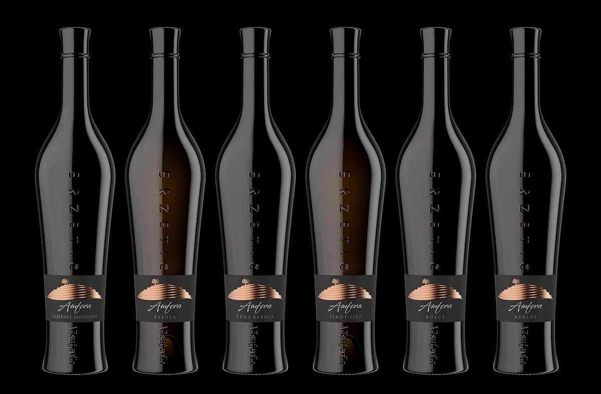
An Elegant Simplicity in Design
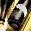
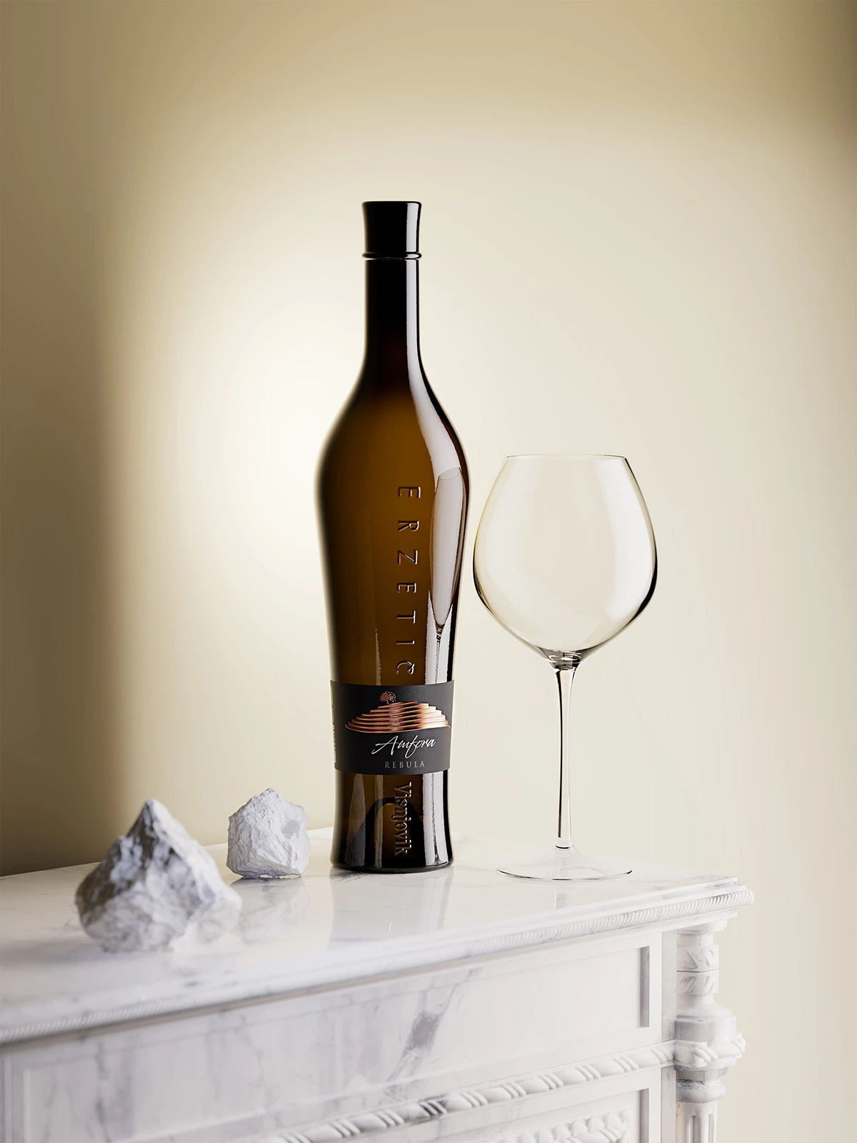
The Erzetic Amfora wine label is a study in minimalism and refinement. Designed to wrap around the bottle’s slenderest part, the label’s form aligns perfectly with the unique contours of the custom amphora bottle. This thoughtful integration creates a visual and tactile harmony, ensuring that the sleek label design enhances rather than competes with the bottle’s striking silhouette.
The primary canvas for this design is a black paper with a fine, smooth texture that subtly catches the light, exuding understated luxury. The label’s centerpiece is an artistic depiction of Veliki Vrh, a mountain that holds significance for the Erzetic brand. This visual element ties the Amfora series to the winery’s broader identity, as seen in their other labels for the Classic Wines and Orbis series.
The Focal Element: Veliki Vrh
The mountain motif on the label is a masterpiece of printing precision. Rendered in matte copper foil, Veliki Vrh’s silhouette is accentuated with embossed lines that trace the mountain’s contours. Additional microembossing creates elegant, textured details within the lines, inviting touch and adding depth to the design. The mountain’s peak transitions seamlessly into a stylized tree, embossed for a natural, three-dimensional effect. This feature ties the label’s visual story to the winery’s deep connection with nature and heritage.
Typography and Finishing Details
Beneath the mountain, the word “Amfora” takes center stage. Set in a modern yet timeless typeface, the lettering is treated with transparent embossing varnish, which adds a subtle sheen and a raised texture that invites interaction. This tactile element enhances the label’s premium feel, making it as satisfying to touch as it is to behold.
Finally, the wine’s varietal is displayed at the base of the label, completing the design with clarity and elegance. This structured hierarchy ensures that the label communicates essential information while maintaining its visual appeal.
The Amphora Bottle: A Unique Canvas
While this sleek label is the hero of this design, it owes much of its impact to the bottle’s distinct shape. The custom design, reminiscent of an elongated amphora, speaks to the wine’s artisanal roots and historical inspiration. Embossed vertically along the bottle are the words “ERZETIC” and “Vishnjevik,” subtle yet defining details that enhance the bottle’s premium feel.
Although the bottle itself is not my creation, its role in elevating the label cannot be overstated. The interplay between the bottle’s tactile surface and the sleek label creates a cohesive, luxurious experience.
The Expertise of Dagaprint
Bringing this design to life required technical precision and craftsmanship, which is why I entrusted the printing process to my colleagues at Dagaprint.com. Their expertise in premium label production ensured that every element, from the copper foil to the microembossing, was executed flawlessly. The result is a label that not only looks stunning but feels extraordinary, meeting the highest standards of quality and artistry.
A Testament to Thoughtful Design
The sleek wine label design for Erzetic Amfora Premium Wines is a testament to the art of balancing tradition and innovation, where every detail—be it the textured black paper, embossed mountain silhouette, or the bottle’s amphora-inspired shape—works in perfect harmony. Together, they create a holistic experience that not only elevates the product but also tells a compelling story of craftsmanship and elegance. The seamless integration of the label and bottle ensures that this premium wine stands out as a masterpiece of design and functionality.
Credits:
Client: Erzetic Winery
Wine Label Designer: the Labelmaker
Printer: Dagaprint.com
CGI: Jordan Jelev