A Perfect Blend of Tradition and Modernity
Designing Oriachovitza Winery’s new wine label was a journey of honoring tradition while embracing a modern touch. Here’s a straightforward look at what makes this label stand out.
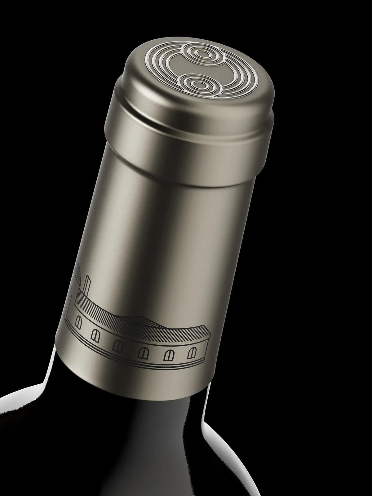
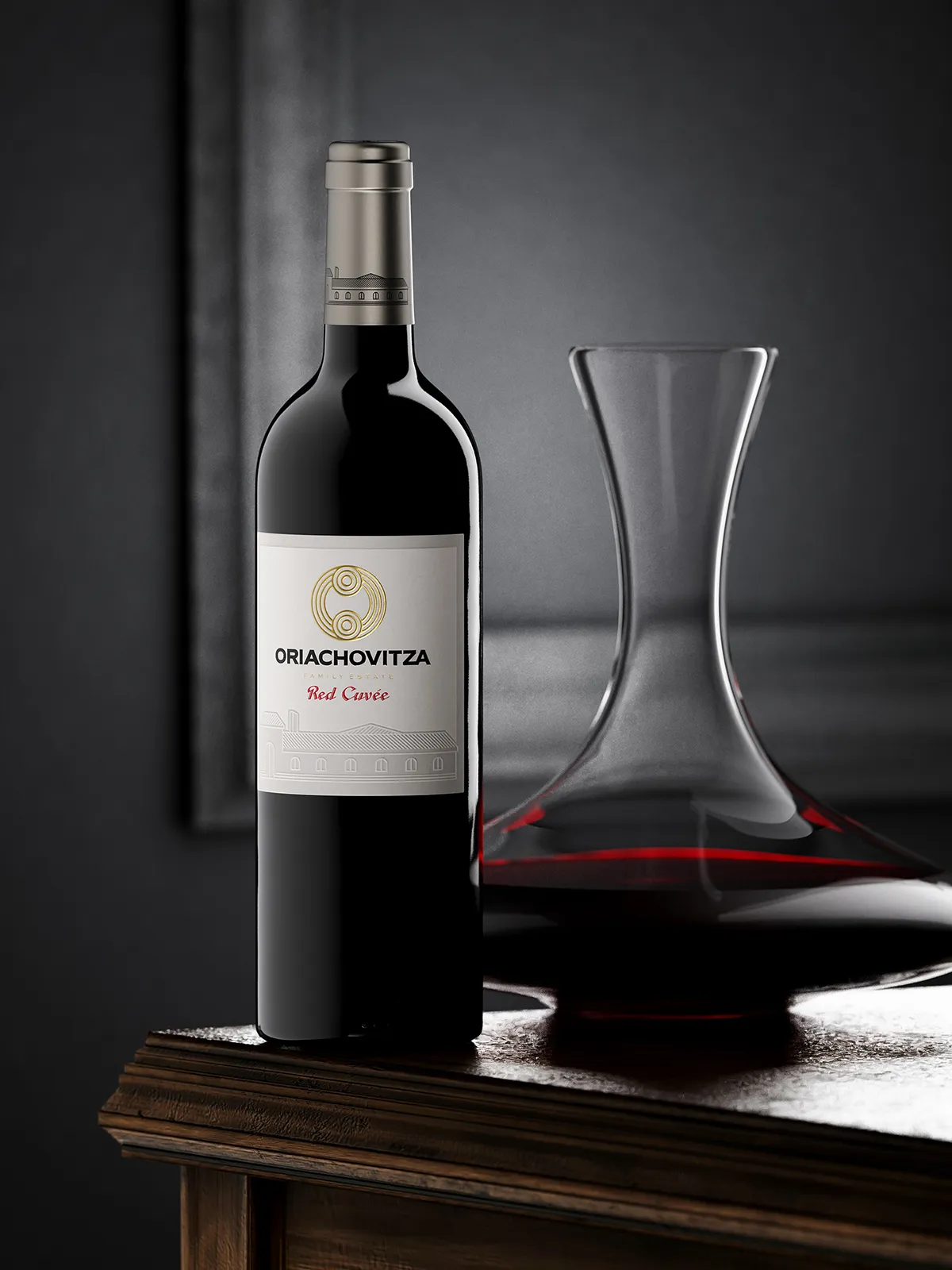
The Capsule: Attention to Detail
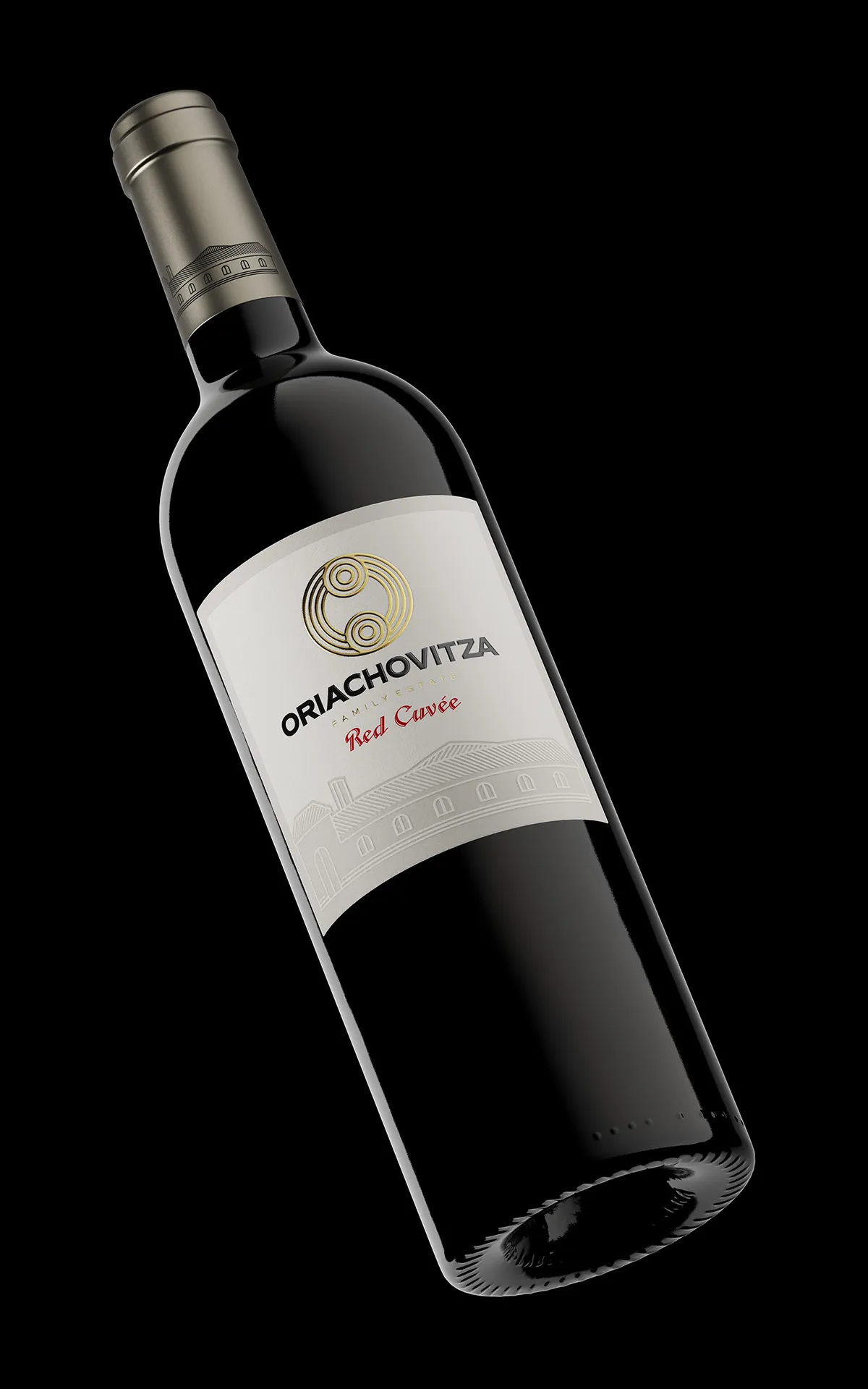
The cork sealing capsule is a standout feature. It boasts a graphite silver semi-matt finish with pale brown hues, and the embossed dark grey winery silhouette on top adds a touch of class.
The Label: Sturdy and Elegant
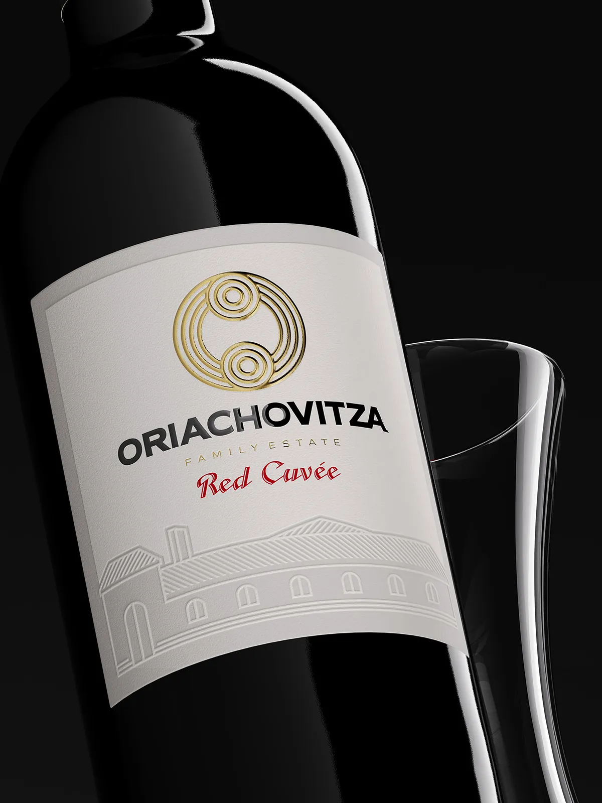
We chose a thick, solid label paper that screams classic wine. The debossed frame and winery silhouette not only catch the eye but also invite a tactile experience, emphasizing the label’s quality. Precisely printed by Dagaprint.com.
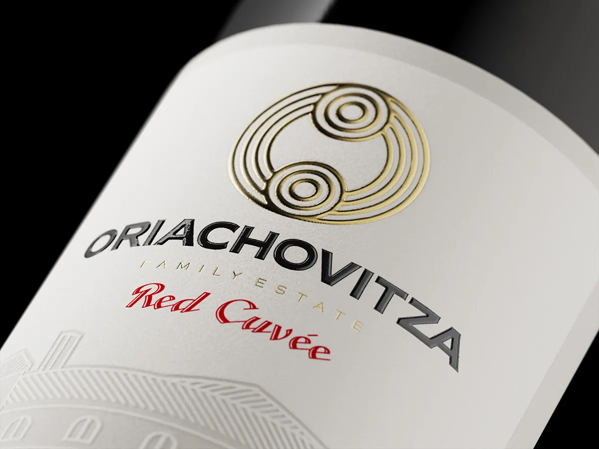
The Winery’s Emblem: A Mark of Opulence
At the label’s pinnacle sits the winery’s logo in embossed rich gold. It’s not just a symbol; it’s a promise of the high-quality wine concealed beneath the cork.
Simplicity is Key: Classic with a Modern Twist
We aimed for a clean, simple design with a modern print approach. The label is a perfect balance between classic composition and contemporary embellishments.
Reviving Tradition: Oriachovitza’s First Step
This label isn’t just a design; it marks Oriachovitza Winery’s initiative to revive the renowned Oriachovitza Red Wine. It’s a blend of tradition and modern innovation.
When you open a bottle with this label, you’re not just getting wine; you’re getting a piece of tradition and a sip of timeless elegance. It’s a label that speaks of the legacy that lives on in every pour.
Credits:
Client: Oriachovitza Winery
Design: the Labelmaker
Print: Dagaprint
Photo CGI: Jordan Jelev


