The Genesis: Defining the Visual Identity of the Flagship COZZI Nizza DOCG Wine Label
Designing the COZZI Nizza DOCG Wine Label Design for the flagship wine of Cantina Val di Luna is a profound responsibility. It is not merely about aesthetics; it is about encapsulating the essence and aspirations of a world-class product. Having previously collaborated with Val di Luna on projects that balanced tradition and modernity, I understood the brand’s trajectory. COZZI demanded a visual identity that transcended the existing portfolio—it needed to be an immediate statement of uncompromising quality and sophistication.
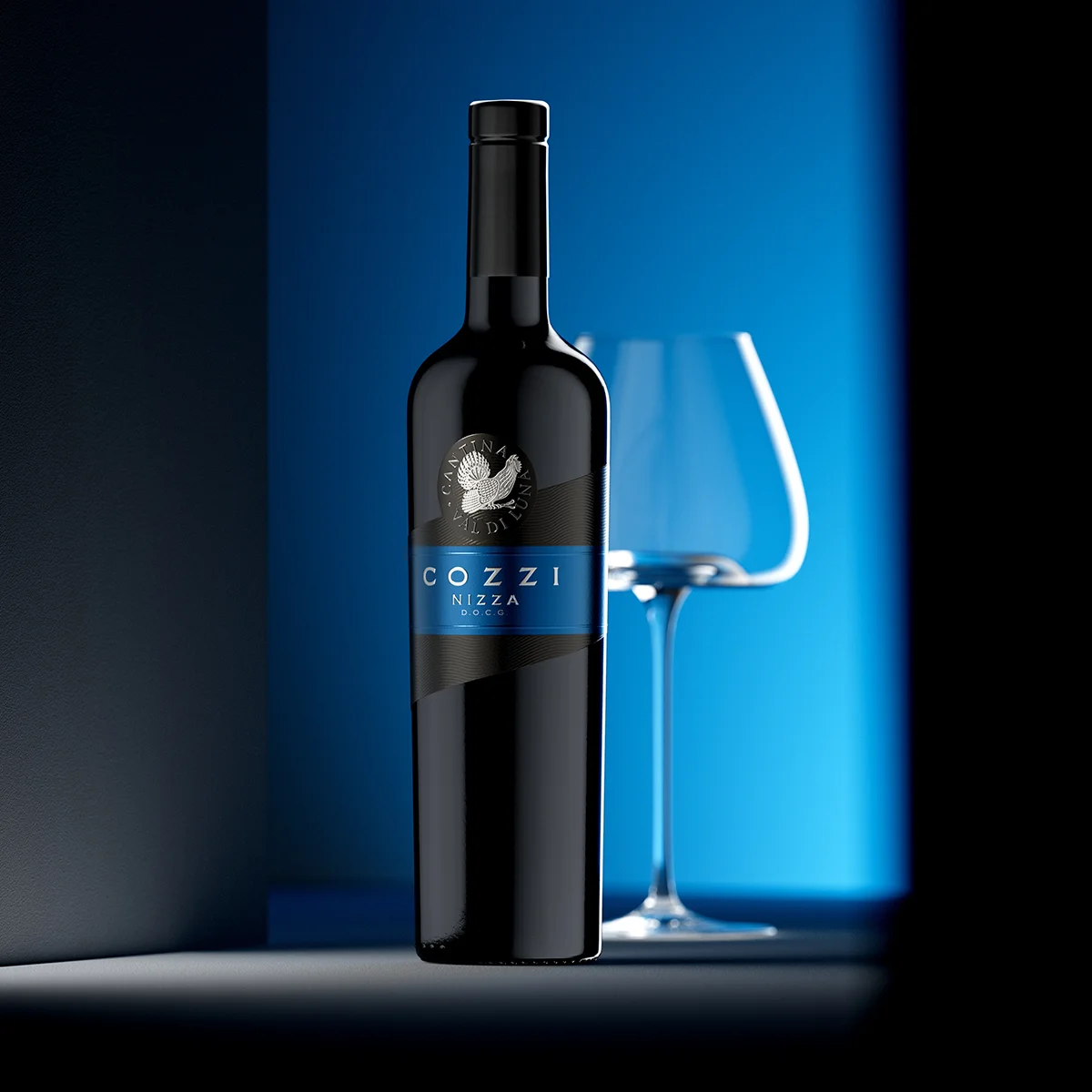
My concept for the COZZI Nizza DOCG Wine Label was rooted in a philosophy I call “Assertive Minimalism.” The design had to be spare, almost deliberately reductive, yet every element had to be technically flawless and conceptually rich. This is a wine that possesses gravitas, and the label must mirror that—exuding a quiet, undeniable sense of audacity.
The Symbolic Core: The Capercaillie and the Brand’s Heritage
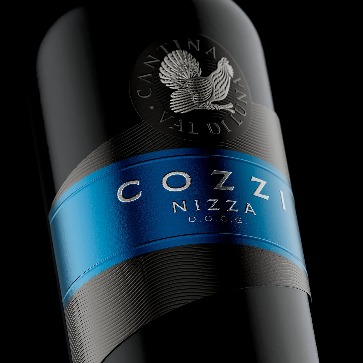
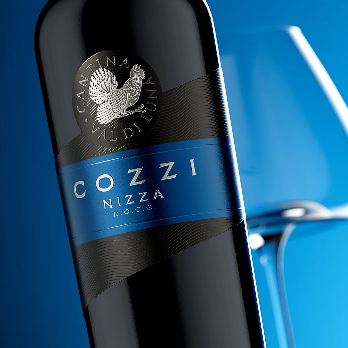
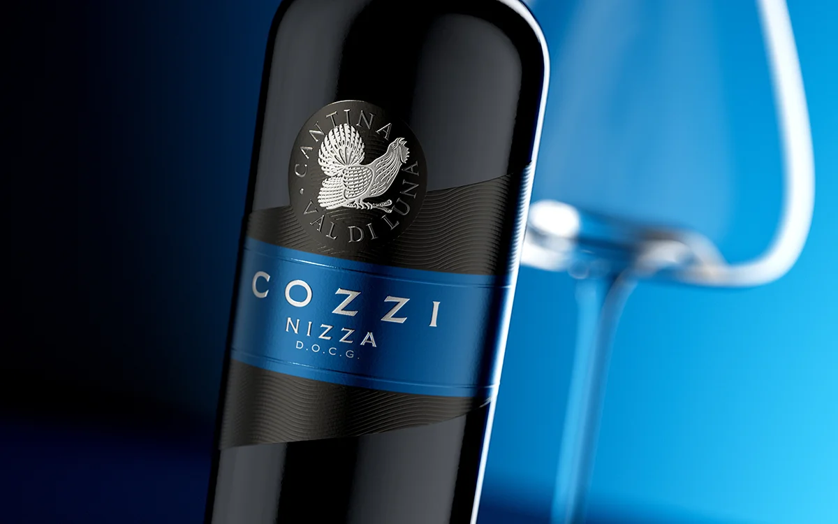
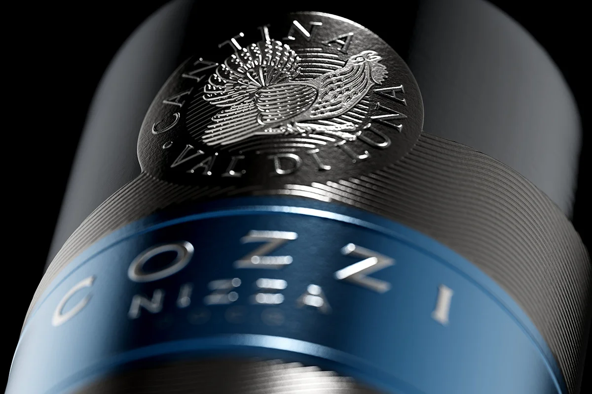
The Capercaillie (Tetrao urogallus), an impressive and distinctive bird, is the crucial emblem in the circular logo of Cantina Val di Luna. In this context, it functions as a potent symbol of rarity, regional pride, and a wild, untamed quality. In the COZZI Nizza DOCG design, I sought to elevate the Capercaillie to a near-sculptural status.
The logo is precisely positioned on a raised, circular black field at the top of the main label. By using a high-precision, multi-level embossing die, we created a detailed relief of the bird and the surrounding circular text, “CANTINA VAL DI LUNA”. This deep embossing, paired with the brilliant silver metallic foil, transforms the logo from a simple flat mark into a highly tactile, metallic medallion—the undeniable seal of the wine’s distinction.
Colour and Texture: Engineering a Tactile Experience
The main visual impact of the COZZI label stems from the strategic interplay of colour, light, and texture—a multi-sensory approach to luxury packaging.
The choice of deep, matte black as the dominant background was intentional. It provides the perfect, non-reflective canvas to make the central colour band and the metallic foil pop. This black field is achieved using a specialist Soft Touch varnish, which provides an incredibly satisfying, almost velvety texture upon contact. This tactile detail is essential for a premium product; the consumer experience begins before the cork is even pulled.
Layered over the Soft Touch finish is the subtle Debossing Pattern. I chose a wavy, linear texture that gently undulates across the black field. This pattern subtly introduces movement and a sense of luxury that can only be felt, not just seen. It is a sophisticated detail that speaks volumes about the care invested in the packaging.
The Central Focus: Metallic Blue and Precision Typography on the COZZI Nizza DOCG Label
The wine’s name, COZZI, and its appellation, Nizza D.O.C.G., are positioned within a strikingly bold metallic blue band. This blue is not just a colour; it is a highly reflective metallic surface that catches the light and immediately establishes the modernity of the design.
To maintain the overall assertive aesthetic, the text elements are defined by:
Embossing: The lettering for “COZZI” and “NIZZA D.O.C.G.” is meticulously raised from the blue metallic surface, giving it palpable dimension.
Silver Foil Stamping: The raised typography is then finished with the same brilliant silver foil used on the Capercaillie logo, ensuring a powerful visual and material coherence across the entire label.
Frame Detailing: The blue band itself is structurally framed by two fine horizontal lines, also embossed and foiled, adding structure and clean, defined edges to the central focus.
A Tribute to Execution: Partnering with Dagaprint.com
A design of this complexity, relying on the perfect registration of deep debossing, sharp embossing, and multiple hot foil applications, demands a printing partner with uncompromising skill.
I must unequivocally highlight the exceptional quality of the print achieved by Dagaprint.com. The flawless execution of the Soft Touch application, the depth and consistency of the wavy debossing, and the pin-point precision with which the metallic foil was stamped onto the various embossed elements is truly world-class. The combination of black Soft Touch with metallic foil is notoriously challenging, yet Dagaprint delivered a result that is technically masterful and aesthetically spectacular. This label is as much a testament to their printing capabilities as it is to the design vision.
The Outcome: Redefining Luxury Packaging with the COZZI Nizza DOCG Wine Label
The COZZI Nizza D.O.C.G. Wine Label is a cohesive statement. It successfully marries tactile luxury—through the Soft Touch and debossing—with visual prestige—through the metallic foil and precise embossing. It is a label that doesn’t just contain information; it embodies the premium status of the wine inside. If you are seeking a COZZI Nizza DOCG Wine Label Design or a similar high-end packaging solution, this project demonstrates the pinnacle of print and design synergy. It is assertive, elegant, and, ultimately, a genuine piece of packaging artistry.
Credits:
Client: Cantina Val di Luna
Design: the Labelmaker
Print: Dagaprint
CGI Photo: Jordan Jelev