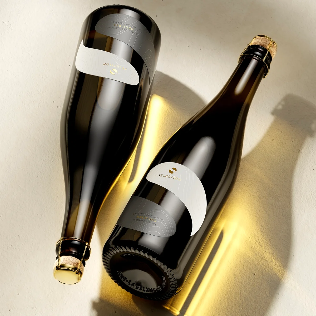
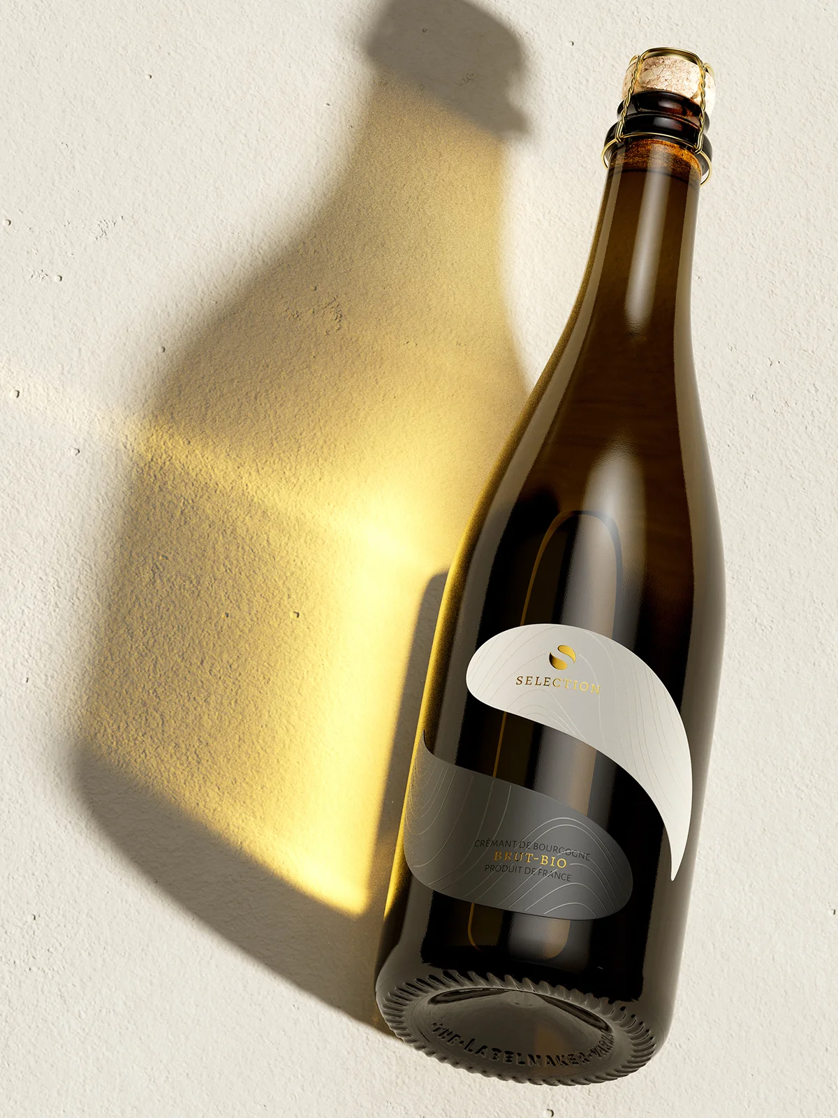
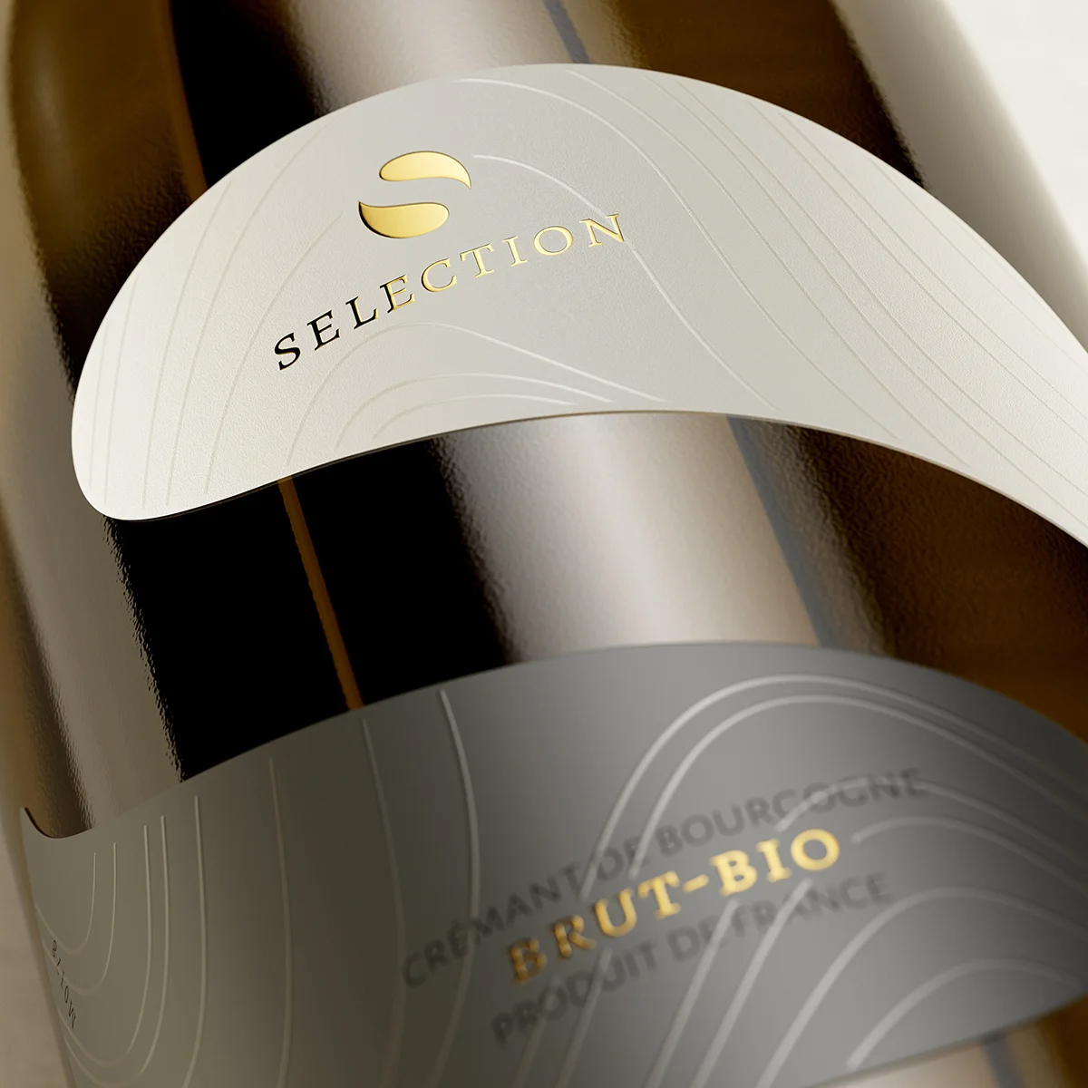
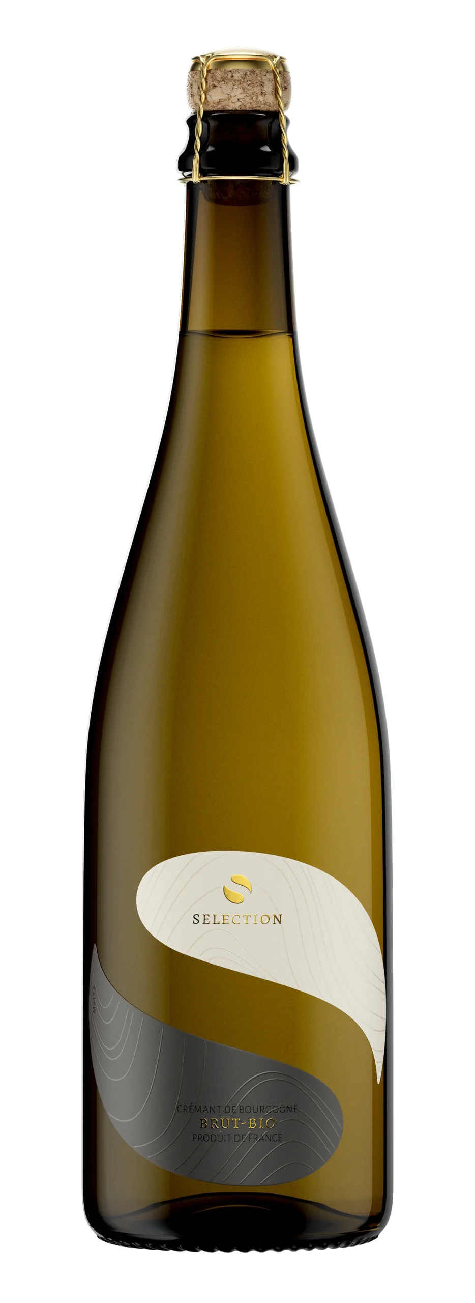
A label built from a logo. A logo built from an idea. And an idea that refuses to let you look away

Staro Oryahovo Winery needs no introduction in Bulgaria. Their whites and rosés are among the most recognized and consistently loved in the country – wines that have built a genuine following not through marketing spend, but through the straightforward method of being very good, year after year. When a winery like this asks for something new, the brief carries a specific weight. The existing audience trusts the brand. The new design cannot afford to betray that trust. It has to earn a place alongside what is already there – and then go further.

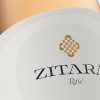
The Selection series is that further. A sparkling wine made in the Crémant method, and a white blend that leaves no doubt about its origin. Two wines that represent a deliberate step up in ambition – and a label designed to make that step immediately visible from across the room.

Staro Oryahovo Selection distinctive wine label design - two Crémant bottles on warm surface with dramatic light and shadow, two-tone label with gold foil

Design at a Glance

A Logo That Contains the Whole Idea The new Staro Oryahovo logo is a negative image of the letter S placed within the letter O – two forms that intersect, overlap, and complete each other. You see O. You see S. You sense both at once, without effort.

Yin and Yang, Applied Honestly The label is divided into two halves – white above, near-black silver below. Not as a styling choice, but as a direct visual argument about what good wine actually is: the harmony of opposites held in balance.

A Silver That Does Not Exist in Any Catalogue The dark semi-matte silver on the lower half of the label was developed by Dagaprint specifically for this project. It is not a standard colour. It behaves differently under every light.

Gold Foil With Restraint Selection, Brut Bio, and the winery logo are printed in gold foil with fine relief – present, but never loud. Exactly the right weight for what surrounds them.

The Wave Motif Returns The characteristic wave elements that have run through Staro Oryahovo’s design language since the beginning appear here in transparent semi-matte relief – felt more than seen, woven into the silk-matte surface of the label.

Eco-Conscious Closure No capsule on the sparkling wine – a deliberate choice to reduce the carbon footprint of the packaging. The gold muselet and cap speak for themselves.

1. A Winery That Already Knows Who It Is

There are wineries that are still searching for their identity, and wineries that have already found it. Staro Oryahovo belongs firmly in the second category. Their whites – particularly the Chardonnay and the rosés – have a loyal following that spans casual wine drinkers and serious collectors without contradiction. That breadth of appeal is not accidental. It is the result of consistent quality over a long period, communicated through a visual identity that has evolved steadily without losing its thread.

The Selection series required a design that acknowledged this history without being limited by it. It had to feel like a natural progression – something that could sit beside the existing range without visual conflict, while simultaneously signalling that this is a different tier. That is a genuinely difficult brief. The temptation is always to make the premium range louder. The correct answer is almost always to make it more precise.

Staro Oryahovo Selection Crémant sparkling wine bottle - distinctive two-tone label with white upper half and dark silver lower half, gold foil Selection text, studio light

2. The Logo: S Inside O, and Everything That Implies

The new Staro Oryahovo logo is deceptively simple. The letter S, rendered as a negative space, sits inside the letter O – the two forms intersecting so that the S appears to pass through the O rather than sit on top of it. The result is a single unified figure that contains two distinct identities, each legible without the other being obscured.

I spent considerable time with this form before I understood what it was doing beyond the initials. The S and the O are not simply two letters sharing a space – they are two halves of a whole, each defined by the boundary of the other. The filled and the empty. The present and the absent. In Eastern philosophy this would be recognized immediately. Karl Marx described it precisely when he wrote about “the unity and struggle of opposites.” Both readings are available here, simultaneously, without effort.

This is what I mean when I talk about a logo that sends you in many directions without trying. The form is resolved and visually quiet. The implications are not. And crucially – you do not need to think about any of this to find the mark beautiful. That is the standard a logo like this has to meet.

Staro Oryahovo Selection wine label macro - S and O logo, Selection and Brut Bio in gold foil relief, wave motif in transparent varnish on silk-matte surface

3. The Label: Two Halves, One Surface

The logo gave me the structure for the label directly. Two halves – divided at the centre, differentiated by colour, held together by the shared form of the logo itself. The upper half is white with a discreet soft-touch finish, clean and luminous. The lower half is a very dark, near-black silver – a semi-matte colour developed specifically for this project by Dagaprint, mixed to a formula that does not exist anywhere else. Under direct light it carries a metallic depth. Under ambient light it reads almost as a dark grey. In candlelight at a restaurant table, it does something else entirely.

The division between the two halves is not a hard line so much as a threshold – the logo sits precisely at that boundary, belonging equally to both zones. Gold foil with fine relief carries the essential text: Selection, Brut Bio, and the winery emblem. The foil is warm rather than flashy, present without demanding attention. It does what gold foil should do at the premium tier – it confirms quality rather than claiming it.

Running across both halves, applied in a transparent semi-matte relief varnish, are the wave elements that have been part of the Staro Oryahovo visual language since the beginning. These are not decorative additions to this design – they are a thread of continuity connecting the Selection series to everything the winery has built before it. On the silk-matte surface of the label, the waves are felt as texture before they are read as ornament. That sequence – touch before sight – is one of the things I was working toward throughout this project.

Staro Oryahovo Selection Crémant bottle base and gold muselet detail - distinctive wine label design viewed from below, warm golden light

4. The Closure: An Argument for Less

The sparkling wine in the Selection series is closed without a capsule. This was a deliberate decision made early in the process and not revisited. A traditional muselet with a gold cap is, in purely visual terms, one of the most elegant closures available for a sparkling wine – it requires nothing additional to look considered and complete. Adding a capsule over it would have been adding weight, both literal and carbon, to a packaging that did not need it.

The white blend takes a different approach. For this wine, the new Stelvin screw cap makes its first appearance – finished in the same dark metallic silver as the lower half of the label. The continuity is intentional. The screw cap does not introduce a new visual element; it extends the existing one upward, so that the bottle reads as a single composed object from the muselet or screw cap to the base. That kind of top-to-bottom visual coherence is rarer than it should be in wine packaging, and when it is achieved, it is immediately felt even by people who cannot explain why.

Staro Oryahovo Selection wine label full bottle macro - S and O logo on two-tone label, white and dark silver halves, iconic wine label design Bulgaria

5. Distinctive Wine Label Design as a Commercial Argument

A label that stops someone at distance and draws them closer is doing something that most labels do not do. Most labels communicate at close range – you have to be standing in front of them to read them, and by the time you are reading them, someone has already made a selection for you. The Staro Oryahovo Selection label works from further away than that. The two-tone structure, the proportions of the logo, the contrast between the white upper half and the near-black silver below – these things register as a shape and a presence before they register as text. That is distinctive wine label design in the most literal sense: the bottle is distinct before it is legible.

What happens next is a layered sequence of discovery. The closer you get, the more there is to find. The wave relief. The behaviour of the silver under changing light. The precision of the gold foil. And finally, when the bottle is in your hands, the question that the logo poses – S and O, full and empty, two things that are also one thing – arrives without explanation. By that point, the design has already done most of its work. The wine answers the question the label asked. With the Selection series, Staro Oryahovo has given it something serious to answer.

Staro Oryahovo Selection Crémant sparkling wine bottle full view - distinctive two-tone wine label design with S and O logo, gold muselet, white background

Credits:
Client: Staro Oryahovo Winery
Design & CGI Photo: the Labelmaker
Print: Dagaprint