Barbera d’Asti Superiore in Stylish New Look
The Story
Monferrato, Southern Piedmont, Italy.
One of the most interesting Italian wine regions is the birth place of a family Dream. Antonio had always been wanting to have own vineyards and produce wine. Unfortunately his life path ended up before he could see his dream come true. Luigi, his grandson, brought his Grandfather’s dream to life. He purchased the vineyard which Antonio dreamed of and created Cantine Val di Luna paying tribute to his ancestor.
The Label
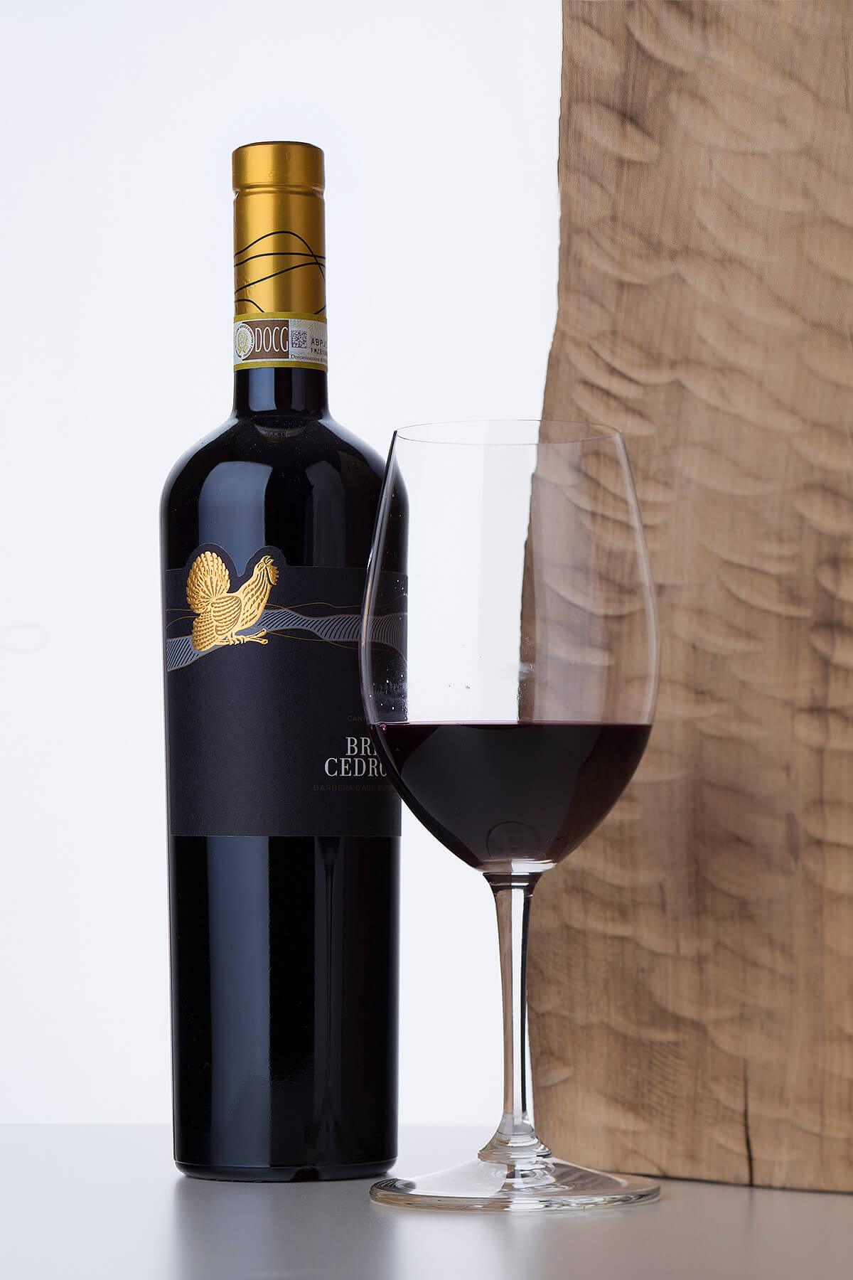
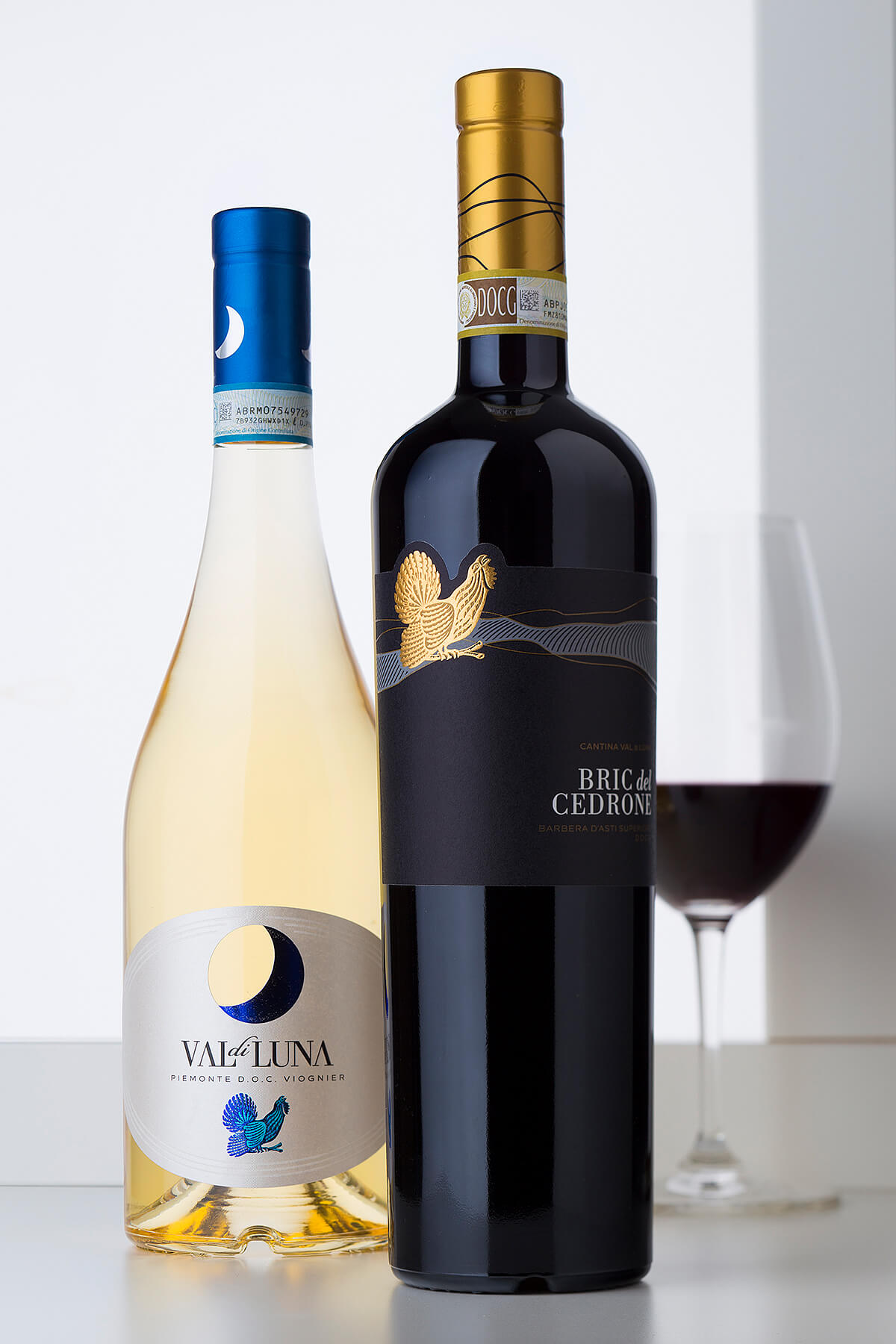
Bric del Cedrone is the first red wine of Cantna Val di Luna. In this new classy wine label design I was looking for more seriousness and conservative look. Like in the Val di Luna label for Viognier I paid special attention to winery’s logo – the amazing capercaillie bird. This time it is stamped with rich gold hot foil. I also wanted to create 3D effect over it so we used strong embossing to enhance every detail. On the background is situated an abstract image of the vine rows at the vineyard printed in dark gray. I did not want to use hot foil or embossing on them so I decided to ad elegant lines in high build transparent varnish. They produce elegant glittering effect restoring the balance between the fore- and background images in my wine label design.
The Result
As a result I received a very classy tailored new look for Bric del Cedrone. The overall elegance of the packaging is strongly influenced by the elegant Sommelier bottle by ESTAL and the fine golden capsule repeating the asymmetric lines taken from the vineyard image.
Credits:
Client: Cantine Val di Luna, Italy
Wine Label Designer: the Labelmaker
Bottle: ESTAL
Paper: Arconvert
Photo: Jordan Jelev