Grand Sovereign’s top wine released
The Project
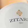
The Individual Selection of Grand Sovereign wines is the premium and most exquisite wine in Red Church Estate’s expanding portfolio. Currently this is probably the best wine they could create in their winery.
The Challenge
Every step with Alex is a challenge. This project was a one too! The family was growing, we had to keep same visual concept but somehow enhance it, add more intricate details, make it different and stronger without ruining its visual connection with the other two wine brands of Red Church Estate.
So we had to keep everything the same and make it look very different at the same time – what a challenge!
The Execution
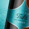
Bottle – A classic tapered bordolaise bottle lacquered with high gloss almost black varnish. Made by Vetreria Etrusca, Italy this bottle really stood out and was excellent background for my new wine label design.
Sealing – we decided to use black sealing wax.
Paper – like in many our top projects we picked our favorite Ispira Nero paper by Arconvert for its premium class look and excellent performance on bottle.
Print – printing this label was in fact the real solution of the challenge how to keep its visual roots and make it look different at the same time. First what really change the game was the turquoise hot foil we decided to use in combination with Ispira Nero paper. This color shines differently on the label and in fact changed the whole character of the packaging by making it stand out on the shelf among the other wines. The other significant change was the replacement of doming effect with roof embossing with microengraving on the dagger. We used linear pattern for microengraving and separated the dagger into three different zones – each with own lines orientation. When the embossing was done, we achieved very strong roof effect enhanced by different angles of light reflection produced by the linear pattern of the microengraving.
We repeated this technology to print the circular element around the dagger but this time we applied roof embossing and microengraving replacing the turquoise foil with glossy black one.
Finally we printed the three concentric lines at the label border with high build raised varnish.
The Result
Black and turquoise is always crazy combination – we expected it but the real miracle came when we did the embossing. It really brought the whole design to life. Microengraving was our hidden weapon to get even more compelling details.
As a result, thanks to the amazing print, we created very bold and attractive packaging following the challenge from the brief – be the same but also very different.
We suggest to check the other two projects we did for Grand Sovereign wine brand to understand better how we tried to upgrade this current project:
The Sovereign of Red Church Estate
Grand Sovereign Wine Packaging Design
Credits:
Client: Red Church Estate
Wine Label Designer: the Labelmaker
Printer: Daga Printing House
Bottle: Vetreria Etrusca
Paper: Arconvert
Photo: Jordan Jelev