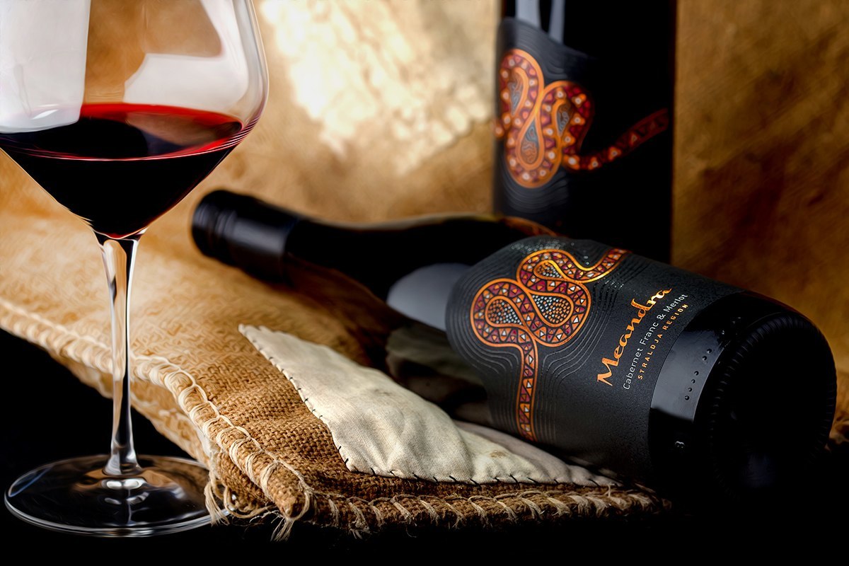


Meandra wine label – the year of the snake
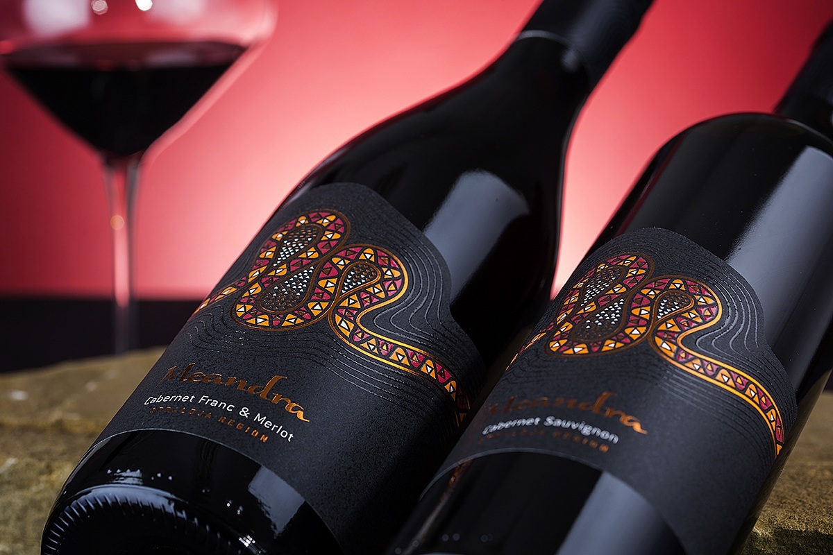
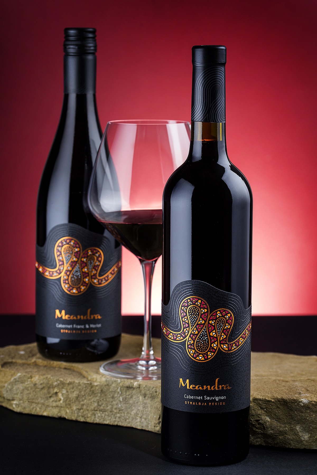
Meandra wine label was designed in 2013 for Domain Marash. According to Chinese calendar that was the year of the snake. Initially we started looking for a memorable, distinguished and specific brand name. Meandra was a good one – feminine, elegant, possessing own vocal harmony. Meandra is coming from the word ‘meander’ which in general is a bend in a sinuous watercourse or river. Rivers do meanders eroding the banks, making large loops on their way down the valleys – just like a snake moving in the sands of the desert. It’s evident that snake body and river meanders look almost the same that’s why we decided to show them both on our labels. River and river banks are presented by two thick outlines following the shape of the meanders overprinted with copper hot foil. The surface of the river banks is depicted by elegant smooth outlines printed with transparent tactile varnish. The small apertures created by the move of the water are like small islands covered with sand – lots of tiny triangles simulate the sand grains.
The body of the snake is filled with artistic pattern of large triangles printed in color or copper hot foil and overprinted with tactile varnish.
The result is very artistic and colorful high-contrast abstraction showing a fusion between river meander and snake body.
The top part of the Meandra wine label follows the shape of the gentle curves of varnish while the bottom part is rectangular and is used as a foundation of the whole composition.
Credits:
Client: Domain Marash
Brand Naming: the Labelmaker
Design: the Labelmaker
Photo: Jordan Jelev