Sparkling Wine Label Series: Zlaten Rozhen

A shield that speaks of method. A diamond that speaks to everyone. And a series that needs both

Zlaten Rozhen makes wine in the Struma Valley, and we already knew the winery well from its Classic Cars metal wine label. Their new sparkling wines are made by the traditional method: second fermentation in the bottle, riddling, disgorging, the whole long ritual.

The brief asked for something rarer than it sounds. A design more striking than the category usually allows, but rooted firmly in the classics that define the product itself. So the series rests on two elements that pull in different directions and agree on everything that matters. A pewter shield that authorises. And a diamond-shaped label that seduces.
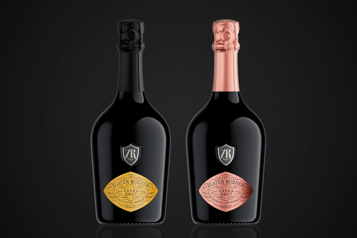
Zlaten Rozhen sparkling wine label series: Blanc de Blancs with a yellow diamond label and black capsule beside the Rosé with a pink metallic label and pink capsule, both under a pewter ZR shield

Design at a Glance

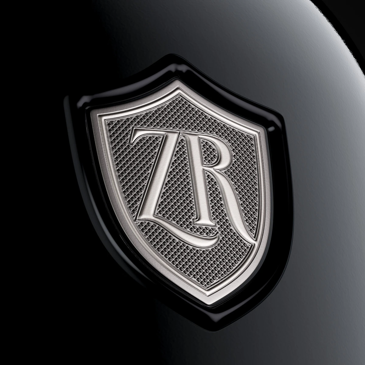
  • A Pewter Shield, Sculpted From Scratch. The ZR monogram sits on a pewter emblem with reliefs and textures I developed myself. Special micro-embossing turns most of its surface semi-matte.
  • A Frame Poured in Resin. A thick black resin edge gives the shield real volume, as if it had been cast out of the glass itself.
  • A Diamond That Breaks the Rectangle. Both labels share one distinctive diamond silhouette that reads from across the room.
  • Ornament Drawn by Hand. Every flourish of the vintage frame was drawn element by element in Procreate on iPad Pro, then set against stencil typography.
  • Two Wines, Two Surfaces. Blanc de Blancs on soft-touch paper in warm, saturated yellow. Rosé on soft-touch metallic foil in pink.
  • Printed in Several Passes. A complex multi-pass print by Dagaprint, with every element brought together on a single roll for labelling.

1. A Classic Method, Read in a Bulgarian Accent

Traditional method sparkling wine has a fixed vocabulary. Second fermentation in the bottle. Long contact with the lees. Riddling, disgorging, dosage. Champagne wrote that vocabulary, and everyone who uses it is, in some way, writing back to Champagne.

Zlaten Rozhen writes back in its own language. The Blanc de Blancs is made from Sandanski Misket, the Rosé from Shiroka Melnishka: two varieties found almost nowhere outside south-western Bulgaria. That is the tension at the heart of this series. A French method, an unmistakably local material, and a winery confident enough to put both in the same bottle. Our own reading of the classical theme, and a knowing wink towards Champagne.

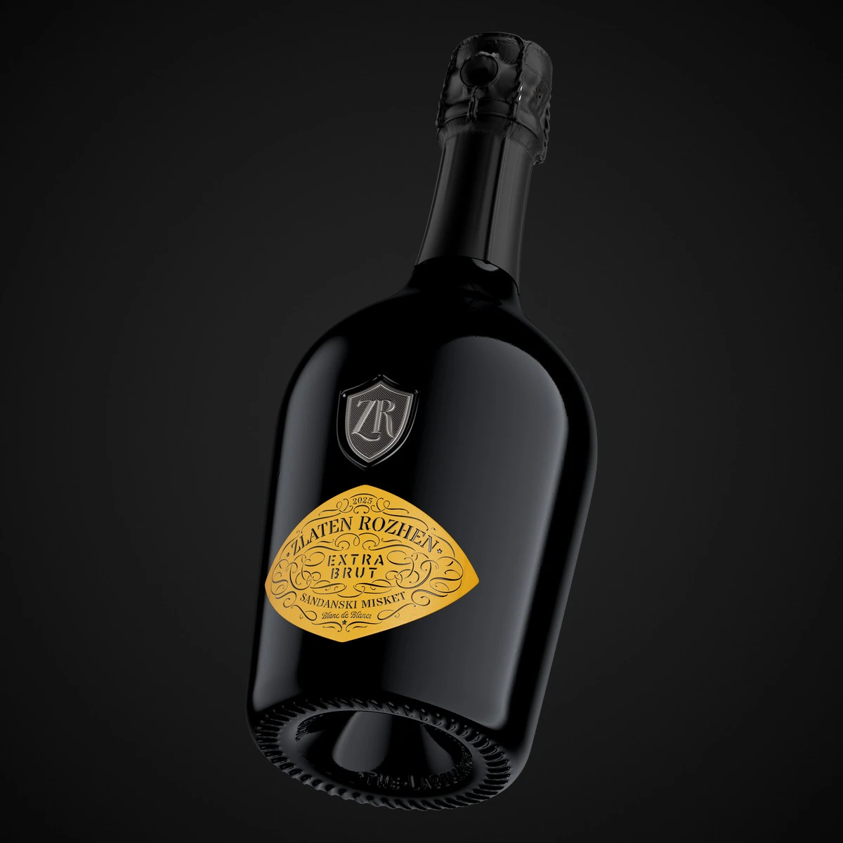
The packaging had to hold that tension without explaining it. The bottle is very heavy and very solid, with a silhouette that leans towards Italy rather than France. The punt is deep. The shoulders are generous. Nothing about it whispers “entry level”.

My task was to dress that glass so that a sommelier would respect it and a first-time buyer would reach for it. Two audiences, one label system. The answer came in two parts.

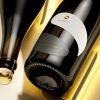
A Zlaten Rozhen Blanc de Blancs bottle tilted against black, showing the heavy Italian-style bottle, deep punt, black matte capsule and diamond-shaped yellow label

2. The Shield: Pewter, Micro-Embossing and a Frame of Resin

The serious part of the story is told by the shield.

The ZR monogram sits on a pewter emblem whose reliefs and textures I developed from scratch. Layered, intricate, deliberately demanding. A special micro-embossing covers most of its surface and turns the metal semi-matte, so light does not bounce off it. It slides across it. Only the highest edges of the monogram catch a clean highlight.

Around it runs a thick frame of black resin. It is the detail people touch first. The resin builds real volume and depth, and against the dark glass it almost disappears. The shield looks as though it was cast out of the bottle rather than applied to it.

This is the conservative signature of the design. It says, quietly and without exception, that the wine inside was made the long way. Every bottle riddled. Every bottle disgorged. A shield is an old promise; here it is kept in metal.

It also does a commercial job. The shield is the mark that authorises the whole series. Whatever the colour of the label below it, the monogram above guarantees where the wine comes from and how seriously it was made.

Macro of the pewter ZR monogram shield with micro-embossed semi-matte texture and a thick black resin frame on a dark sparkling wine bottle

3. The Diamond: Serious Typography on a Bolder Stage

If the shield is the signature, the diamond is the invitation.

Both labels share the same distinctive diamond-shaped silhouette. It breaks the rectangle that dominates the shelf and gives the bottle a recognisable outline long before anyone can read a word.

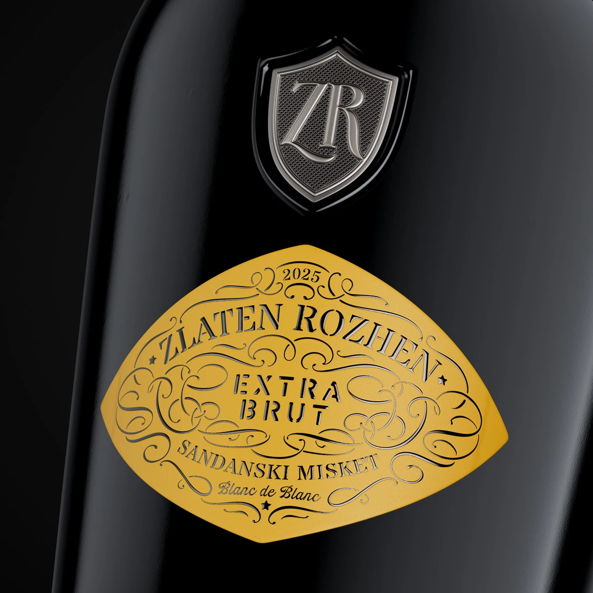
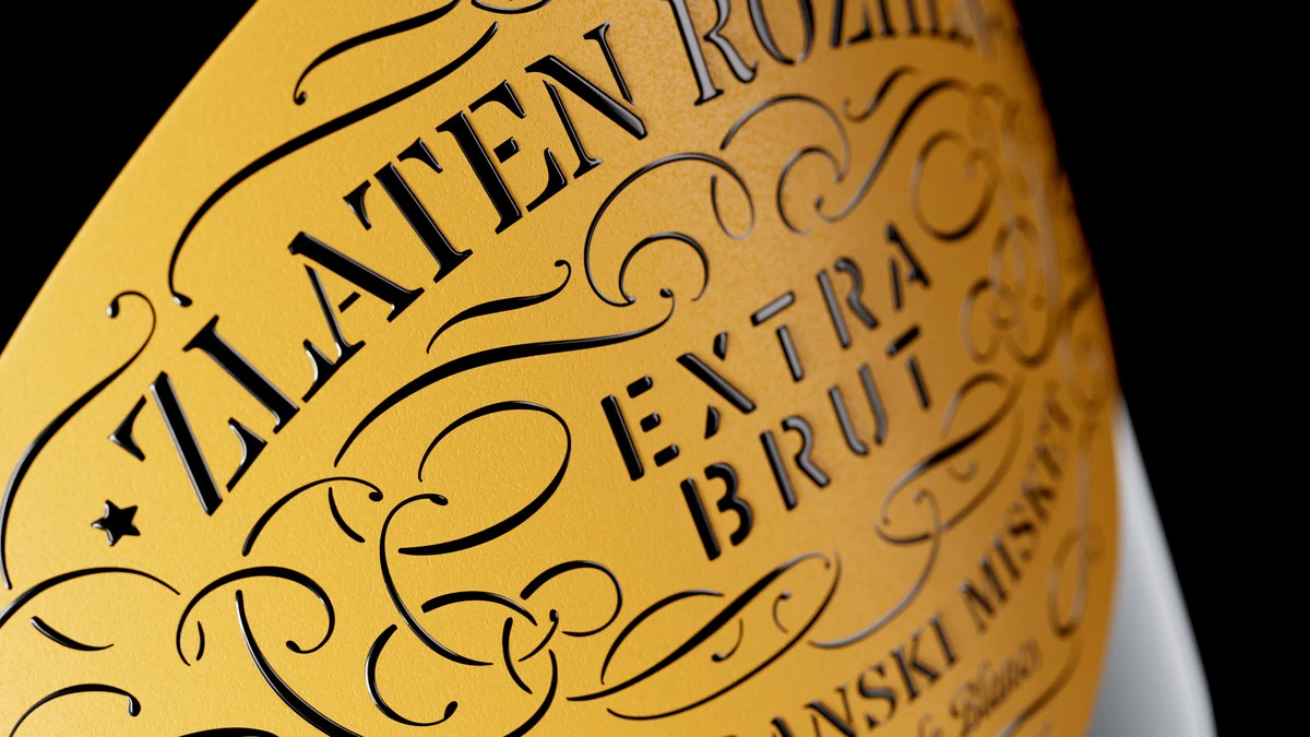
Inside that shape, everything is classical. The stencil typography carries the name with the authority of an engraved plate. The ornamental frame gives the label its vintage pulse, and I drew every flourish of it myself, element by element, in Procreate on an iPad Pro. No stock ornaments, no borrowed curls. Each loop was built to meet the edges of the diamond at exactly the right tension.

Then comes the turn. That serious composition is placed on very bright, characterful backgrounds and finished with a pronounced relief varnish that lifts the ornament off the surface. You see the lines first. Then you feel them.

These details make the design more attractive and noticeably less conservative than the shield above it. That was the point. A label that is only serious speaks to people who already know. A label that is only striking speaks to people who never come back. This one is built to do both, and to widen the audience of the brand without lowering its voice.

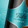
Close-up of the Zlaten Rozhen Extra Brut Blanc de Blancs diamond label with stencil typography, a hand-drawn ornamental frame and relief varnish on yellow soft-touch paper
Diagonal macro of the hand-drawn ornaments and stencil lettering on the Zlaten Rozhen sparkling wine label, with relief varnish catching the light

4. Two Wines, One Series

A series lives or dies on the discipline of its differences. The Zlaten Rozhen Blanc de Blancs and Rosé share the same design and the same idea. What changes is the surface, and that one change does a lot of work.

The Blanc de Blancs is printed on soft-touch paper with no metallic effect at all. Its warm, saturated yellow reads like sunlight held in glass, and the relief varnish gives the ornament a tactile, velvety contrast. It is closed with a black matte capsule: restrained, almost formal.

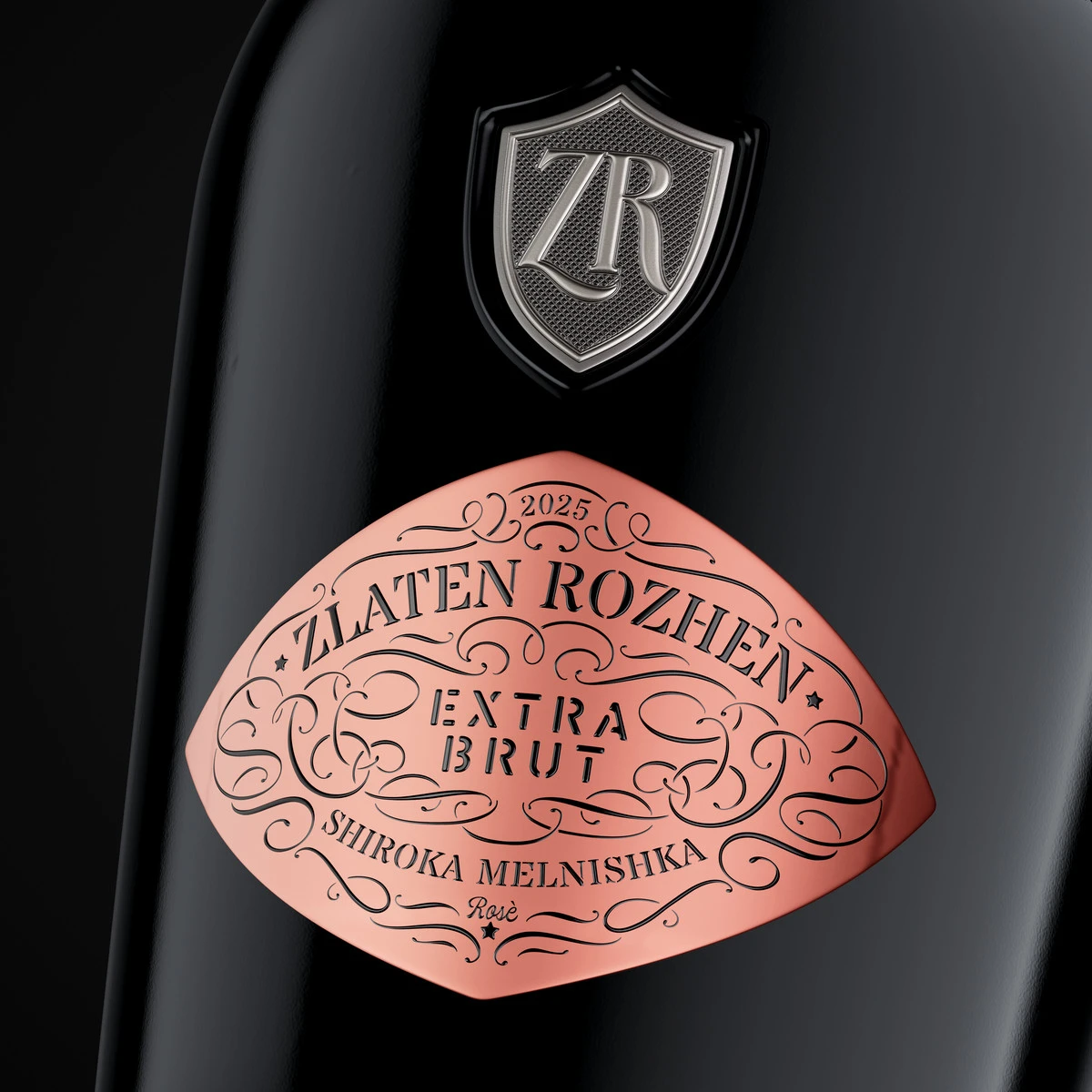
The Rosé is the only one printed on soft-touch metallic foil. The pink takes on a soft, shifting glow that changes with every movement of the bottle, while the soft-touch finish keeps it from turning loud. A semi-matte pink capsule completes it.

The printing itself is complex. The labels are produced in several passes, and the separate elements are brought together on one final roll for labelling. Precision of that kind is never a given. Dagaprint and their teams, who also printed our Staro Oryahovo Selection, are among the very few who could deliver it.

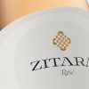
Close-up of the Zlaten Rozhen Extra Brut Rosé diamond label printed on pink soft-touch metallic foil, with the ornamental frame and the pewter ZR shield above
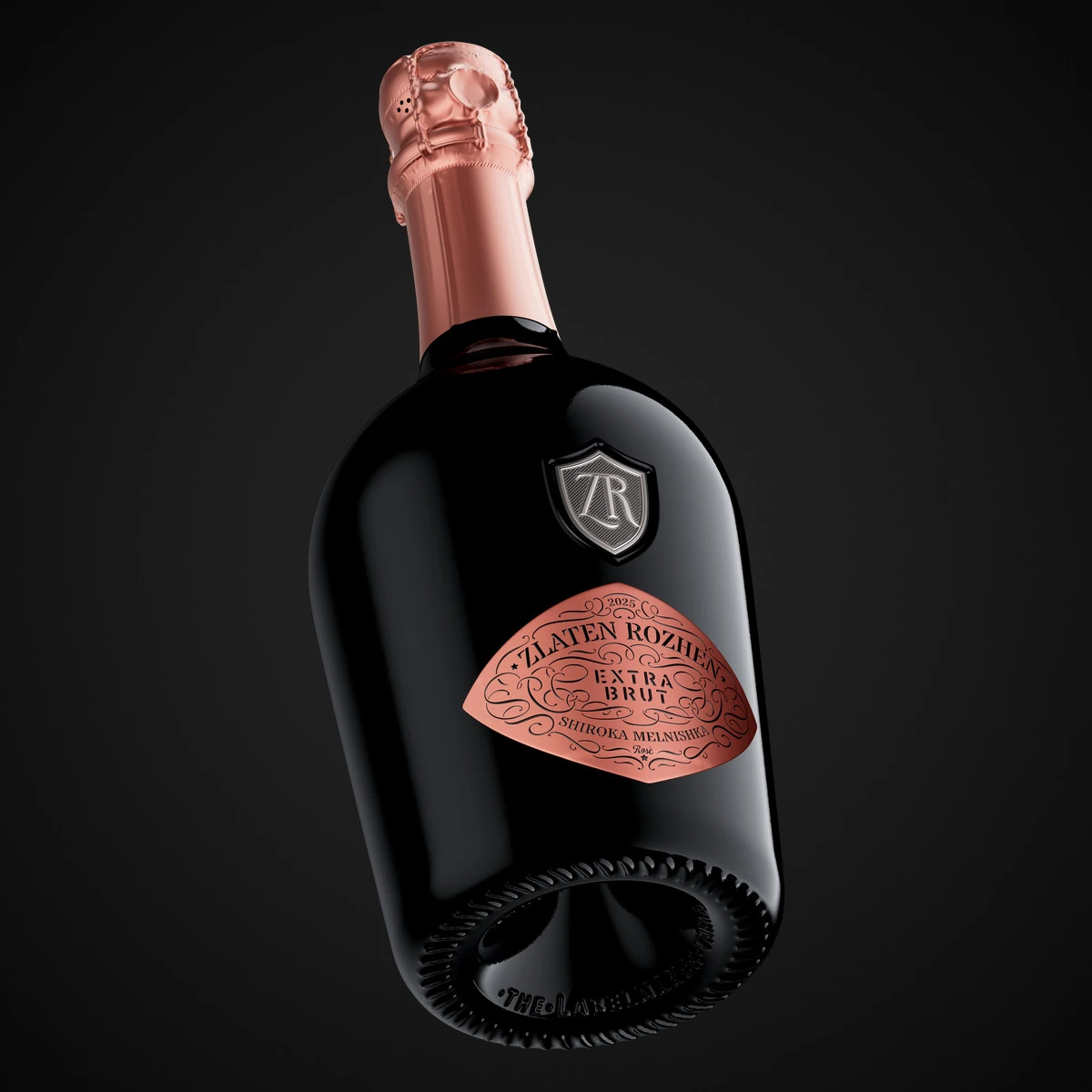
A Zlaten Rozhen Rosé sparkling wine bottle tilted against black, with a semi-matte pink capsule and a pink metallic diamond label

5. A Sparkling Wine Label Series as a Commercial Argument

Premium sparkling wine is bought with the eyes before it is bought with the palate. The shelf is crowded with gold and black, crests and scripts, and most of it blurs into one polite, expensive-looking wall.

A sparkling wine label series has to solve a harder problem than a single label. It must read as one family from three metres away, as distinct wines from one metre away, and as something precious in the hand. Zlaten Rozhen gets each of those from a different layer of the design. The diamond silhouette works at a distance. Colour and finish separate the wines. Pewter, resin and relief take over at the moment of touch.

The system also leaves room to grow. A new cuvée can join the family with a new colour and a new finish, without needing a new idea. The shield stays. The diamond stays. The brand keeps its authority while each wine keeps its own personality.

For a winery, that is the real value of a series: every new bottle strengthens the ones already on the shelf. For the people who choose wine, it is simpler. It is a bottle they remember, and the one beside it that they want to try next.

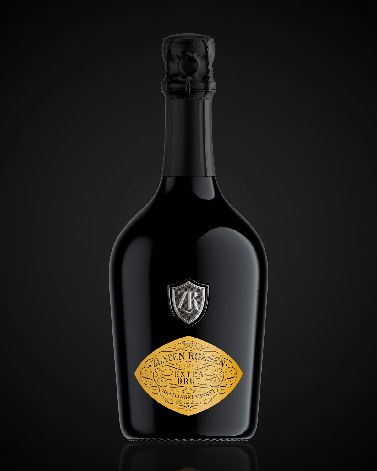
Premium sparkling wine label for Zlaten Rozhen Blanc de Blancs: the full bottle with pewter ZR shield, yellow diamond label and black matte capsule, CGI photo by the Labelmaker

Credits:
Client: Zlaten Rozhen Winery
Design, CGI Photo & Film: the Labelmaker
Print: Dagaprint

Frequently Asked Questions

Who designed the Zlaten Rozhen sparkling wine labels?

The Zlaten Rozhen Blanc de Blancs and Rosé labels were designed by the Labelmaker, a wine label design studio based in Varna, Bulgaria. The studio created the label series, the pewter ZR shield, the CGI photography and the film.

What makes a sparkling wine label series work?

A strong sparkling wine label series reads as one family from a distance, as distinct wines up close, and as something precious in the hand. For Zlaten Rozhen, a shared diamond silhouette and ZR shield hold the family together, while colour, paper and foil separate the wines.

How is the ZR shield on the bottle made?

The shield is a pewter emblem with custom reliefs and textures. Special micro-embossing makes most of its surface semi-matte, and a thick black resin frame gives it volume, so it looks as if it was cast from the glass.

What is the difference between the Blanc de Blancs and the Rosé labels?

Both share the same design. The Blanc de Blancs is printed on soft-touch paper in a warm yellow with a black matte capsule. The Rosé is printed on soft-touch metallic foil in pink, with a semi-matte pink capsule.

Who printed the labels?

The labels were printed by Dagaprint. Production runs in several passes, and the separate elements are brought together on one final roll for labelling.

Can the Labelmaker design a label series for my winery?

Yes. The Labelmaker designs wine and spirits labels, label series and complete packaging for wineries and brand owners across Europe and beyond. You can see more about the studio or browse the sparkling wine projects.

Share