Seamless Wine Label Design: Cin·Cin by Ezimit Winery

Where one shape ends, the other already begins

Cin·Cin is a brand I built from nothing — the name, the concept, the whole label system — for Ezimit Winery. That is not the usual way I work, and it is not the easier way either. Most projects hand me a winery that already has a name and a history, and my task is to translate what exists into a label. Here there was no such shortcut. Just a blank page, a winemaker who wanted a genuinely new range, and the quiet responsibility of getting the starting idea right, because there was nothing else to fall back on. I have built brands this way before — SOULMATEs, Picky Magpie — and each time, the discipline is the same: find the one true idea the brand doesn’t have yet, then build the label so that idea is the first and only thing anyone remembers.
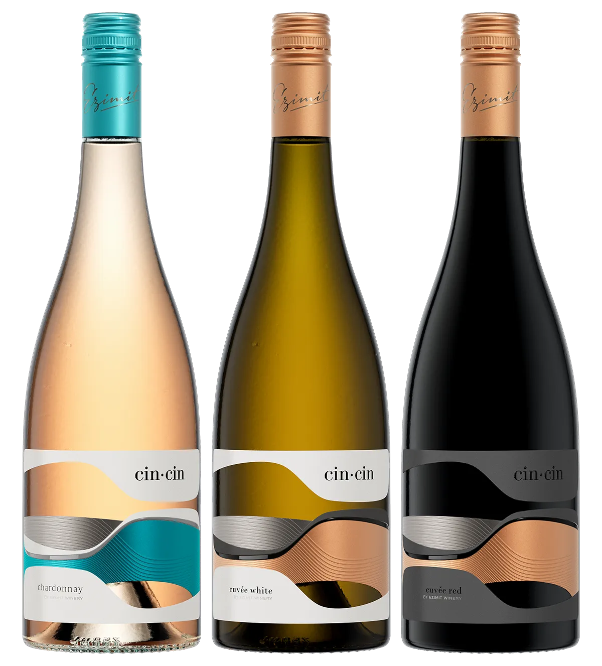
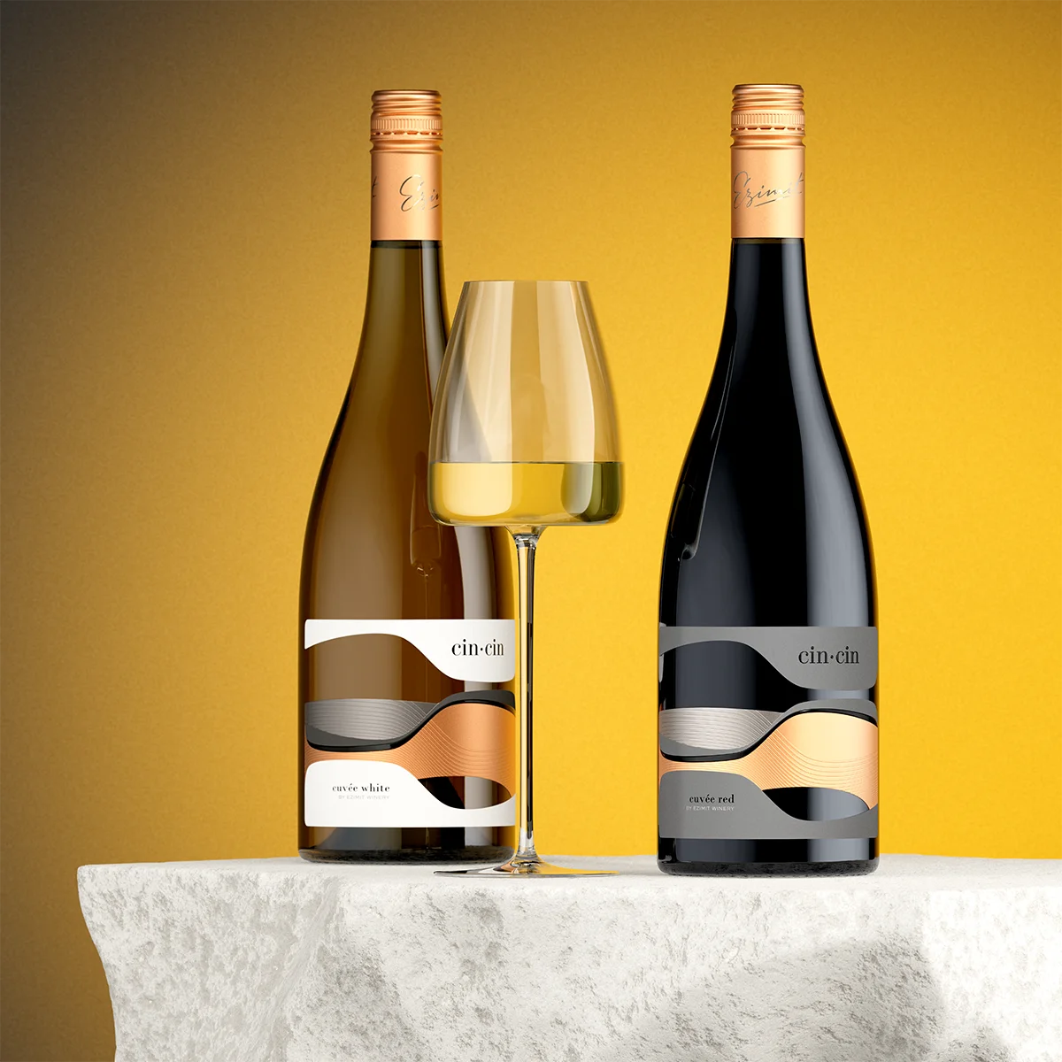
cin cin range hero white red rose wine

Cin·Cin is not a single wine. It is a range — a white, a red, and a rosé so far, each built on the same seamless idea, with only one variable changed at a time. Smoked silver sits in the same place on every label, in every colour of the range — the one constant the eye can always find. Copper is the second constant: every white and every red in the series carries the same copper, paired against the same smoked silver. The rosé is the one exception, where that copper is swapped for teal, kept cool against the same silver. The background then splits the range in two — white for the whites and the rosé, graphite grey for the reds. Same rule throughout: two forms, two finishes, no visible seam between them — just enough changed, each time, to tell one wine from the next without ever breaking the family resemblance. That consistency is what turns a single clever label into an actual brand system — one a customer can recognise on a shelf of white, red, or rosé without ever having seen that particular bottle before.

The idea itself came from the name before it came from anything I sketched. Cin cin — the sound two glasses make when they meet. I did not need to invent a story around it or dig for a hidden meaning. It was already there, complete, in the two syllables. My task was simply to give it a shape worthy of what it already meant.

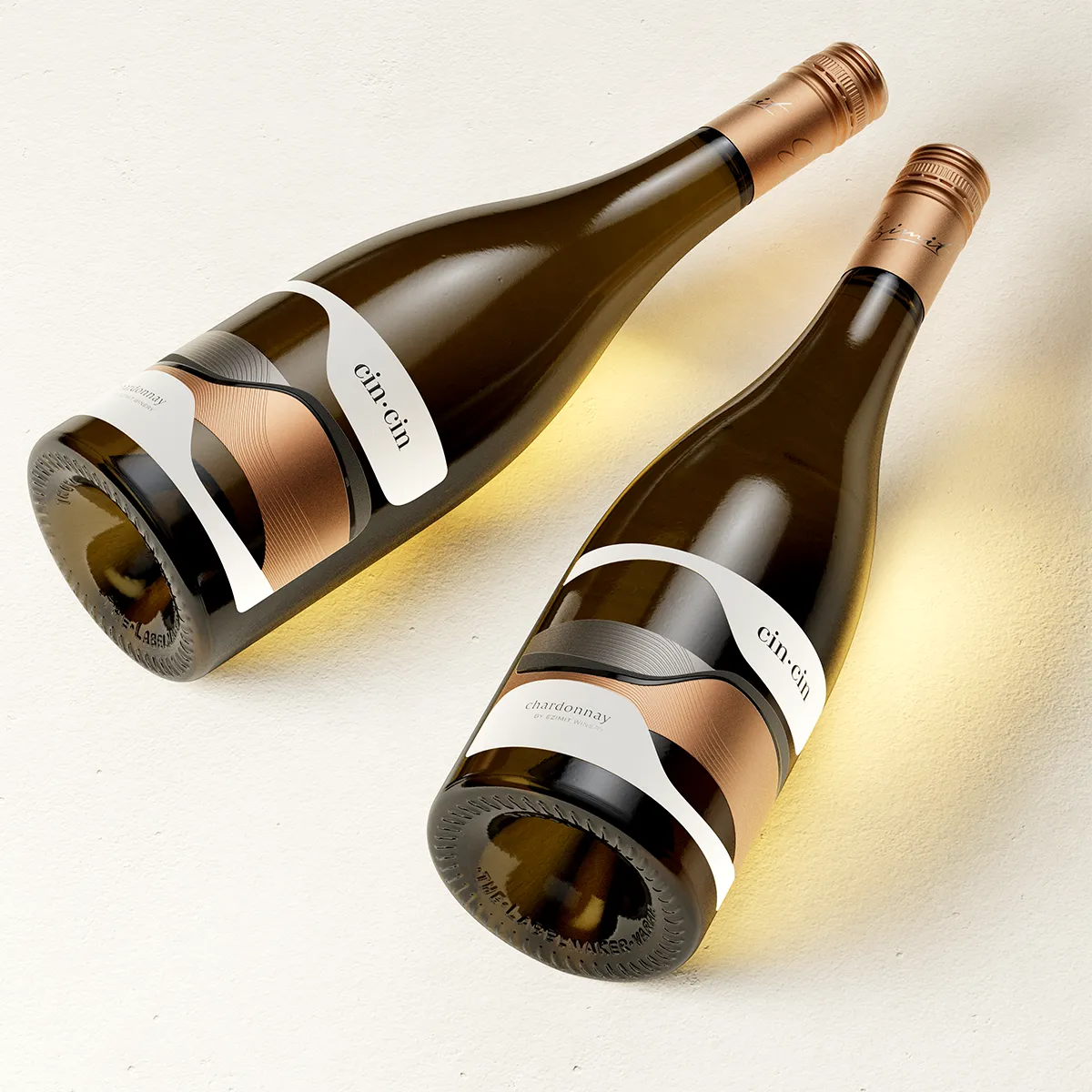
cin cin pair bottles lying

Design at a Glance

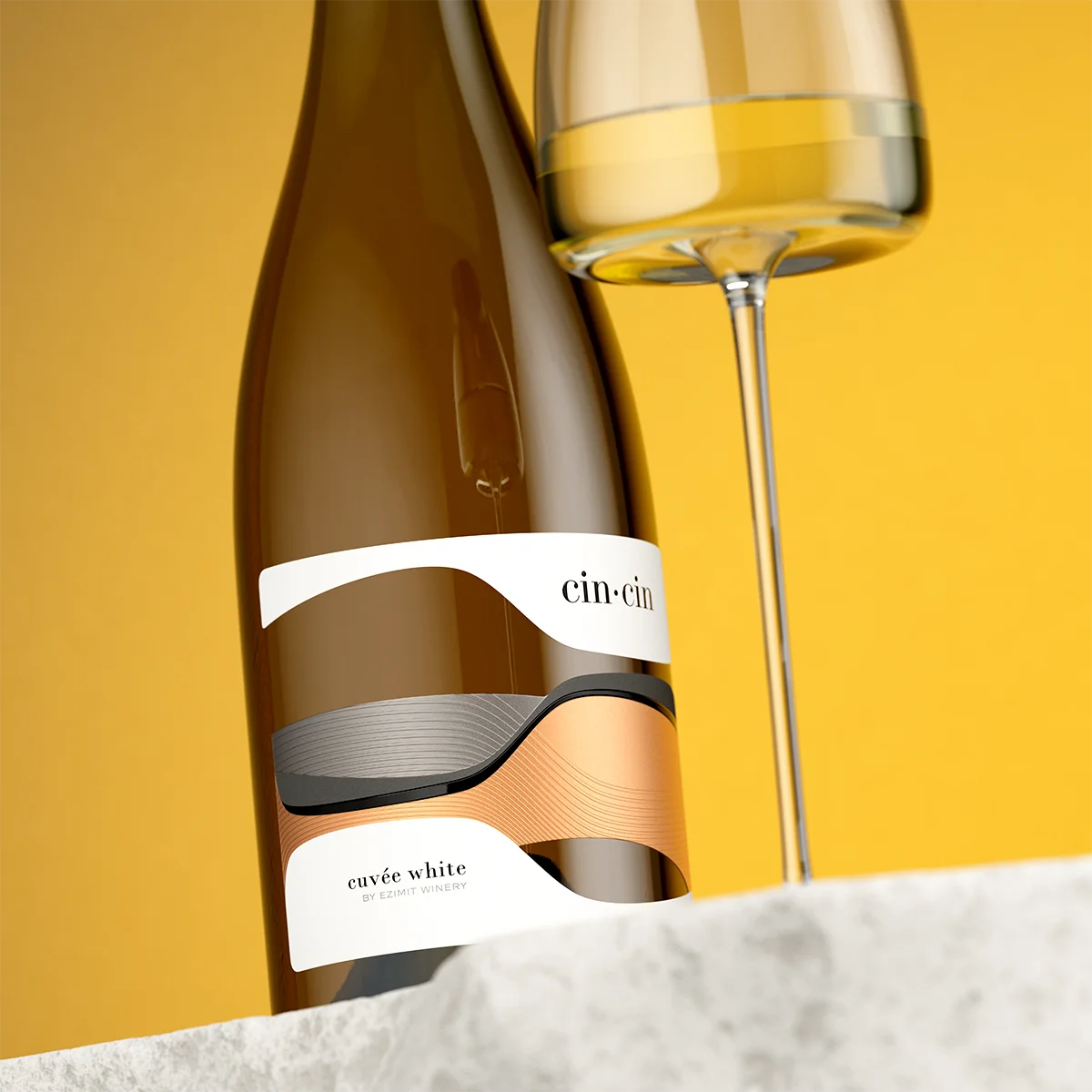
Two Forms, One Continuous Surface The label reads as two reclined silhouettes meeting at the centre — an abstraction of two glasses leaning toward each other, joined so precisely the eye cannot locate a seam.
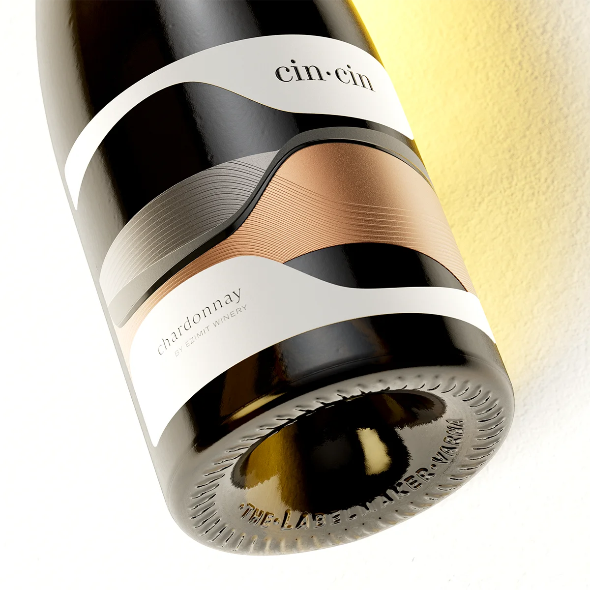
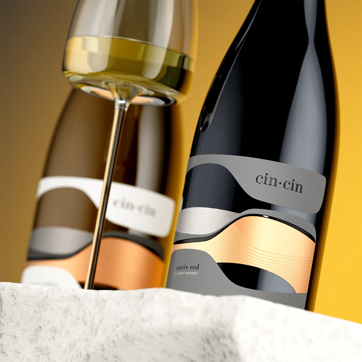
Two Warm Foils, No Visible Border Copper and smoked silver, each carrying its own micro-embossed grooves — engraved lines that pass through the boundary between the two metals rather than stopping at it.
Relief Where It Matters The cin·cin wordmark is lifted with a raised varnish, giving the name a tactile presence before the eye has even finished reading it.
Openings Instead of Ink Cut-outs interrupt the paper itself, letting the glossy black glass show through — depth that print alone could never produce.
Colour Kept Deliberately Quiet No accent colour anywhere on this label. Copper, smoked silver, and the restraint to leave it there.
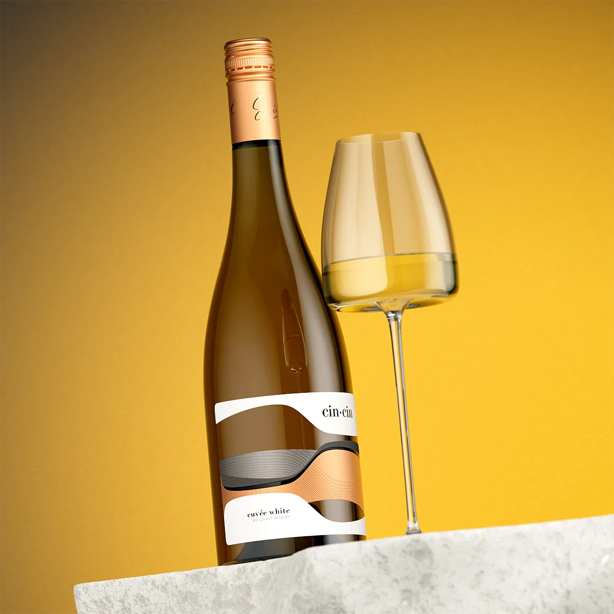
A Bottle Chosen to Support the Idea A classic Burgundy shape, its rounded shoulder allowing the label’s own seamless line to carry the composition without competing for attention.
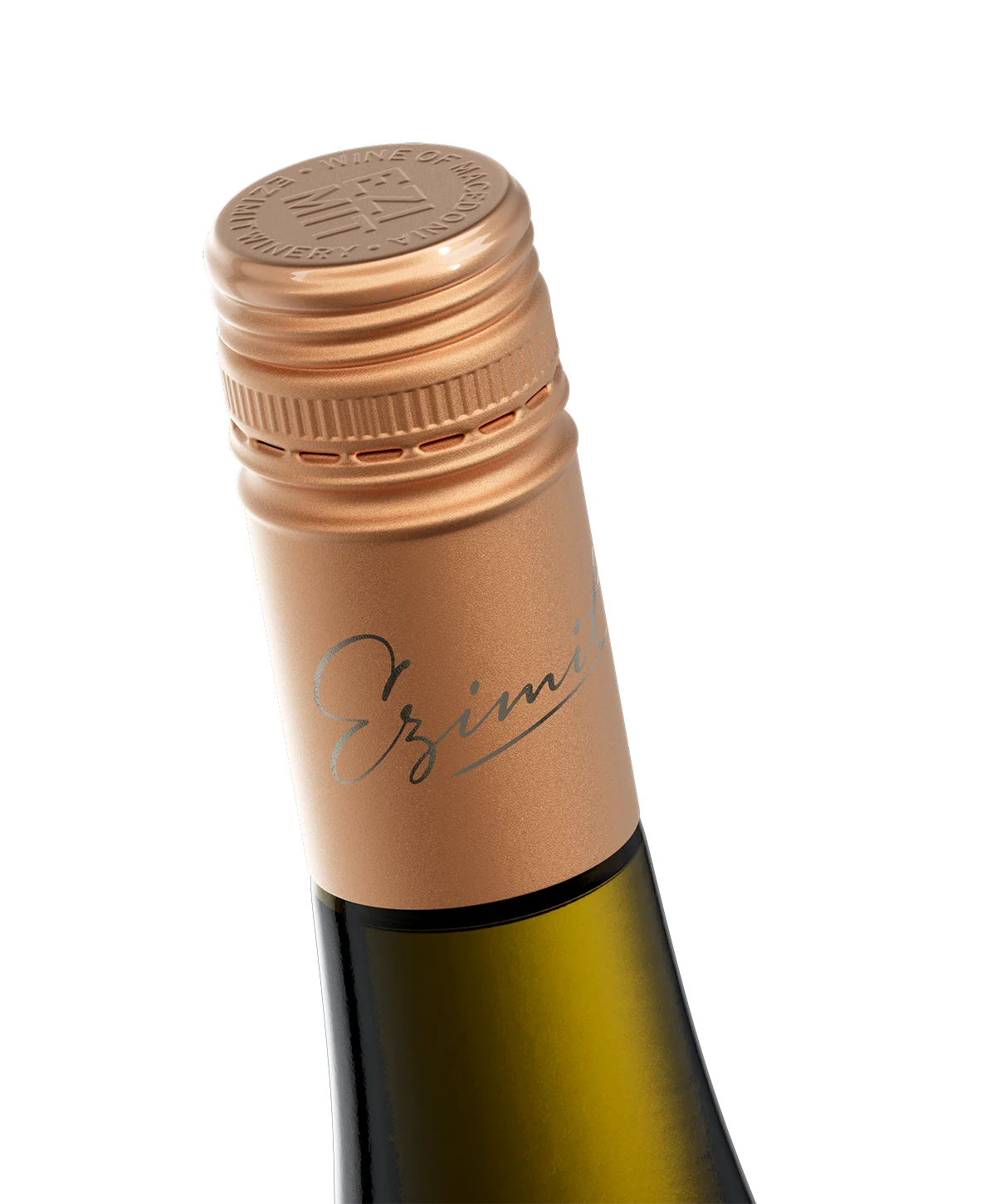
A Capsule That Finishes the Sentence A custom Stelvin screw cap in the same copper tone, the Ezimit logo embossed in silver on the top disk — the last detail, and one I never treat as optional.

1. A Brand Built From a Sound, Not a Sketch

Most of my projects begin with a winery’s existing name and history, waiting to be translated into a label. Cin·Cin began with neither — a blank page, and a winemaker at Ezimit who wanted a new range with real character behind it. I find this the harder brief and, most years, the more honest one, because there is nowhere for the name to hide. It has to come from something true, not from a shortlist of words chosen because they sound pleasant together.

“Cin cin” arrived before I had finished asking myself the question. It is a toast, a sound, a moment of connection people already say without thinking, in a dozen languages, at a dinner table somewhere every night. A name a customer half-recognises before they have read a single word of the label is a rare gift in this work. I was not going to let it go to waste.

cin cin single bottle toast

2. Why Design a Label With No Visible Seam?

Because a toast has no seam either. The moment two glasses touch is a single instant, not two separate ones placed side by side. And in truth it is not even an isolated instant at all — a toast, to my mind, is simply the one moment where a much longer evening happens to become visible. The wine, the conversation that led to it, the company gathered around it — all of it flows into that moment and continues flowing past it, one uninterrupted experience without a real break anywhere in it. That is the idea behind the visual structure of this label: two reclined silhouettes, an abstraction of two wine glasses tilted toward each other, positioned so they meet precisely at the centre of the composition — and meet so exactly that the join disappears. The label is seamless because the evening it belongs to is, too.

Nothing on the label is a literal illustration of a glass; I have never had much patience for that kind of shortcut. The shapes are pure form, cut and layered so that the meeting point between them is where the whole composition resolves. This is what I mean when I say I wanted a genuinely non-traditional label — one where the label and the logo are effectively the same object, so that seeing it once is enough to remember all of it. There is no separate mark sitting on top of a background pattern here. The seamlessness is not a decoration applied to the identity. It is the identity.

cincin label macro tilt

3. How Do You Make Two Different Foils Read as One?

The answer sits in the micro-embossing, and it is the detail I am proudest of in this project. Each silhouette is finished in its own warm foil — a soft copper on one side, and a smoked silver from Kurz on the other, a foil I reserve for work that calls for a metal with restraint in it rather than shine. Both surfaces carry a fine engraved groove pattern, and the line has to run in the same direction straight across the seam between the two foils, rather than stopping at it the way two separate prints naturally would. The grooves do not belong to the copper zone or the silver zone. They pass through both, so the eye reads a single continuous surface rather than two prints placed beside each other.

That continuity was the entire point. A toast is not two static objects — it is the instant they meet. Had the grooves stopped cleanly at the border between the foils, the label would have shown two glasses standing apart. Because the lines run through, unbroken, it shows them at the moment of contact instead. It is a small technical decision with a considerable effect on how the whole label is read.

The cin·cin wordmark sits above this surface in raised varnish, lifted just enough off the black background to register by touch as readily as by sight. Below it, cut-outs interrupt the paper at several points, exposing the glossy black glass beneath. These openings are not an ornament added afterward — they are the reason a label built entirely from flat metallic foil still reads with volume. Without them, the composition would be rich but flat. With them, set against glossy glass, it has genuine depth, of a kind no additional printing could otherwise supply.

cin cin capsule macro copper

None of this is a simple print job, and I want to say plainly that Dagaprint earned every bit of this label’s finish. A composition that depends on two foils meeting without a visible seam, engraved grooves running in register across that same seam, raised varnish, and precisely placed cut-outs leaves almost no room for error at any stage — one misaligned pass and the whole idea collapses back into two separate prints sitting next to each other. They handled a genuinely difficult brief and delivered exactly what the design needed.

4. Why So Little Colour?

Because colour is the easiest thing on a shelf to imitate. Every decision on this label works against the impulse to reach for colour. There is no accent palette here, no attempt to make the label “pop” through contrast — that is the more obvious route, and it is also the first thing another designer lifts and reuses on the bottle standing next to yours. Copper, smoked silver, black. That is the entire colour story, held there deliberately.

The same restraint carries across the whole range. The rosé takes on teal in place of copper, and the white shifts toward graphite, yet neither ever becomes a bright accent colour competing for attention. Each wine holds its own identity within the family without the family’s rule ever being broken.

The Burgundy bottle follows the same logic. Its rounded shoulder and classic profile keep the attention on the label’s own seamless line across the lower section of the bottle, rather than competing with an unusual bottle shape for the same attention. The most considered decision in a design is, more often than not, the one that makes the least noise.

cin cin bottle pair glass wide

5. Seamless Wine Label Design as a Commercial Argument

What does a wine label actually need to do on a shelf? Two things, at two different distances, and this one was built with both in mind. From a genuine distance, before a customer has walked close enough to read a word, it needs to register as something apart — something that quietly makes the bottles around it recede. Shape and material contrast are read before text is, and from far enough away, this bottle should not appear to belong to the same category as the ones beside it.

cin cin shelf distance wide

The second stage only begins at close range. As the customer approaches, the eye’s resolution begins to catch what distance had concealed — the micro-embossed grooves running unbroken between the two foils, the raised varnish on the wordmark, the cut-outs revealing the glass beneath. None of this is visible from across a room. It reveals itself in layers, exactly as the distance closes.

By the time the bottle is in someone’s hands, it has already asked more questions than most labels manage in their entire time on a shelf. Where does one foil actually end? Why can no seam be found? What is that opening in the paper showing me? A label capable of raising this many questions through presence alone leaves a customer no longer searching for a reason to set it back down — they are searching, instead, for the answer inside the bottle itself. At that point, price has stopped being the question. The wine is.

cin cin closeup detail

Frequently Asked Questions

What makes a wine label “seamless” in design terms?
A seamless wine label design uses continuous line work, matched material transitions, or a single unifying form to remove any visible break between distinct printed elements — so two different materials or shapes read as one uninterrupted surface rather than as separate parts placed next to each other.

Why use two different foils instead of one on a premium wine label? Two foils create material contrast and depth that a single metallic finish cannot achieve on its own. The challenge lies in making the transition between them feel intentional rather than accidental, typically through a shared pattern, engraving, or motif that runs across both.

Does a minimalist wine label design work for a mid-tier or entry cuvée, not just ultra-premium wine?
Yes. Restraint in colour and message is often more effective at this tier than decoration, because it signals confidence rather than compensating with visual noise. A seamless, quietly executed label can outperform a busier design specifically because it does not compete with the wine for attention.

Who designed the Cin·Cin label and brand for Ezimit Winery?
The Cin·Cin name, concept, and label were created by the Labelmaker for Ezimit Winery, following the same from-scratch brand development process used for other original projects such as SOULMATEs and Picky Magpie.

Credits:
Client: Ezimit Winery
Design: the Labelmaker
Print: Dagaprint
CGI Photo: Jordan Jelev

Share