What defines a high-conversion luxury wine label?
A high-conversion label transitions from an aesthetic object to a brand narrative. By utilizing “sensory complexity” – ranging from Victorian-inspired micro-textures to bespoke heraldry and 3-D planned embossing – the design creates a multi-layered experience. This “Macro-to-Micro” strategy ensures a bottle is attractive from a distance and irresistibly detailed at close range, significantly increasing brand perceived value and consumer trust.
The Weight of Heritage – From Heraldry and Victorian Age to Cigar Aesthetics
In luxury branding, the design must act as a visual anchor. Projects like Colloca Classic Tawny and Ezimit Wine Label represent the pinnacle of “complex classicism” – a style where density of detail serves as a barrier to entry for competitors.
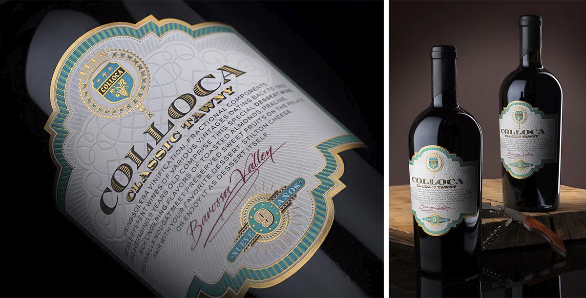
Colloca Classic Tawny Wine Label: A Masterclass in High-Relief Heraldry
Drawing deep inspiration from the chromolithography of premium antique cigar bands and traditional heraldry, this design is an exercise in “visual density.”
- The Technical Core: The label features bespoke typography and hand-lettered elements (like “Barossa Valley”) framed by complex decorative motifs. The tactile narrative is built through the interplay of sculptural high-relief textures and deep debossing, creating a physical presence on the bottle that is almost impossible to replicate.
- The Power of Scalability: The commercial success of the Tawny design was so profound that the estate adopted this visual identity as their Global Brand Standard. Whether produced in Barossa Valley, Australia, or the USA, the design remains a universal gold standard for the brand’s luxury positioning.
Ezimit Wine Label: The Victorian-Inspired Sensory Reward
While appearing minimalist from a distance, Ezimit reveals its “Victorian-inspired soul” upon closer inspection, targeting the consumer’s tactile senses.
- The Hidden Layers: The background utilizes a complex system of micro-textures and intricate patterns that act as a sensory reward. These layers are engineered to prove that true sophistication lies in the depth of execution, not just surface-level graphics.
- The Signal of Expansion: Originally a dominant force in the Macedonian market, the label’s ability to maintain shelf-dominance during its expansion into Bulgaria serves as a key metric of its “commercial vitality.” Ezimit’s successful expansion is the ultimate proof that a strategic design delivers real commercial value and a measurable return on investment (ROI).
The Silent Dominance – Modern Classics and the Power of “Originals”
There is a specific category of design that balances traditional composition with a contemporary soul. Solinar and Villa Vellis occupy this high-ground of “Super-Significance.”
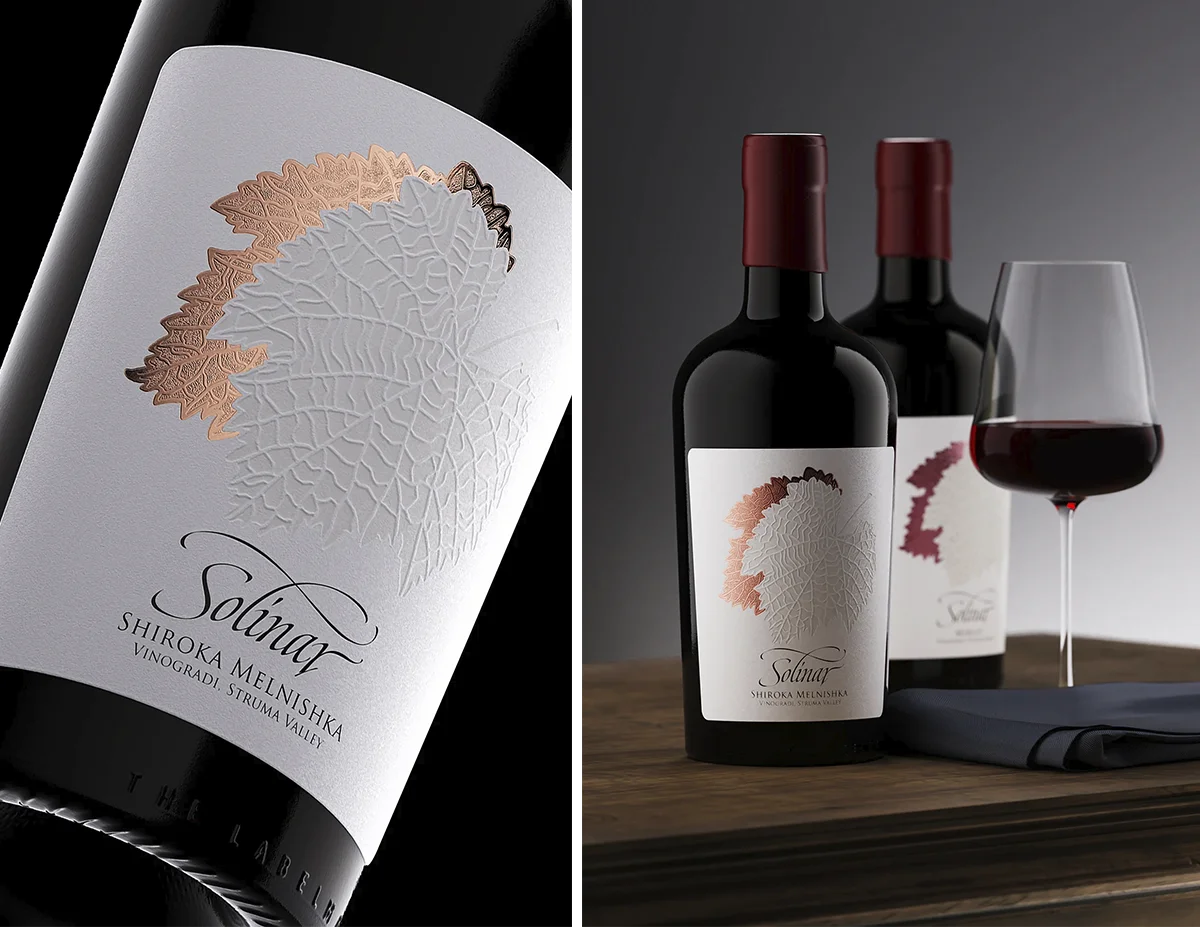
Solinar Wine Label: Engineering the “Visual Magnet”
Solinar is a benchmark for Tactile Branding ROI, often cited (and plagiarized) for its high-impact presence.
- The Technology: The label utilizes a Modern-Classic hybrid approach, featuring an unconventional Shiroka Melnishka Loza vine leaf motif. It is brought to life through extreme debossing on extra-heavyweight paper stock, creating a physical sculptural dimension.
- The Finishing: A secondary leaf layer is integrated via copper hot foil with a bespoke micro-texture, engineered to manipulate light reflection.
- Packaging Synergy: The silhouette is defined by a short, wide Bordeaux bottle and a sophisticated wax closure, ensuring the brand is felt as much as it is seen.
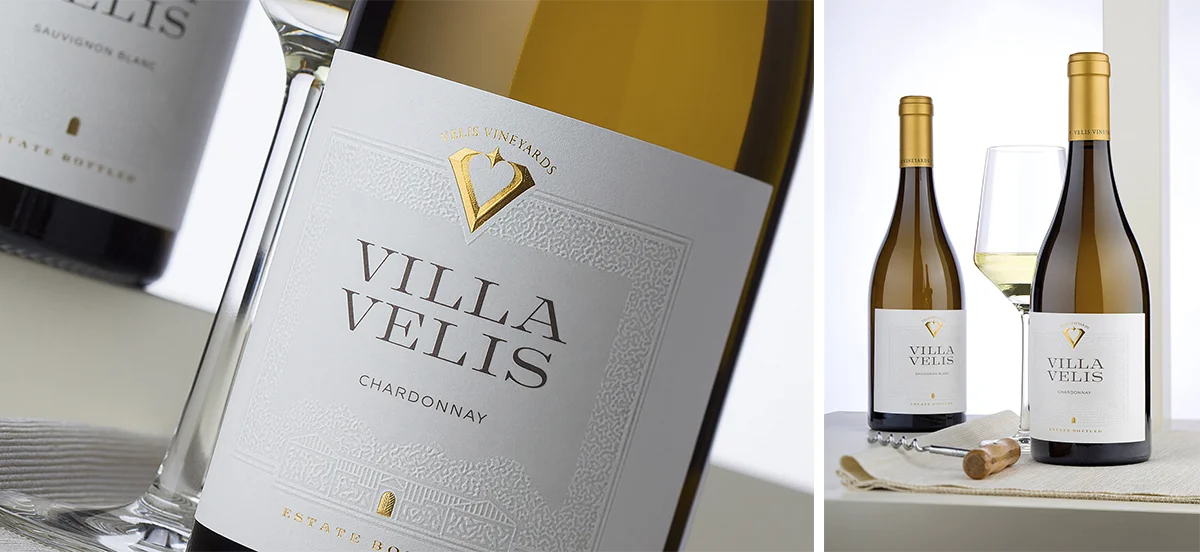
Villa Vellis Wine Label Design: The Geometry of Luxury
Villa Vellis eliminates shelf competition through “Quiet Strength”—a masterclass in spatial harmony and technical relief.
- The Technology: The design utilizes an ultra-heavy paper stock to support a deep mechanical transformation. The winery silhouette is rendered through a bespoke debossing die, creating structural depth.
- The Finishing: The visual hierarchy is anchored by a logo applied with special roof embossing, a technique that maximizes multi-dimensional light catch.
- Scale & Trust: The commercial success of the Villa Vellis identity directly led to the total redesign of the owners’ German estate, Weingut Zehe, proving that Technical Brand Authority scales across international borders.
The Modern Edge – Attracting from Afar, Captivating Up Close
On the opposite end of the aesthetic spectrum lie Dragomir Special Selection and Weingut Zehe. These represent the “Modern Line”—designs that appear minimalist at first glance but are technologically loaded with “hidden” complexity.
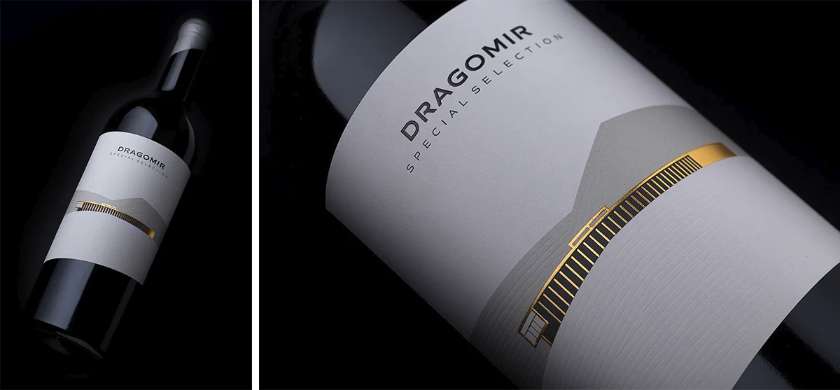
Dragomir Special Selection: Geometric Abstraction and Architectural Depth
Dragomir serves as a case study in Contemporary Minimalist Wine Label Design. The visual anchor is a high-fidelity rendering of the winery’s iconic facade, executed through hot foil stamping and heavy embossing to enhance its 3D presence.
- The Technical Nuance: The design utilizes a debossed linear pattern on light gray mountain silhouettes, which remains invisible from a distance. Up close, these lines produce subtle, minimalist reflections against the deep black glossy surface of the heavy bordolaise lacquered bottle.
- Material Synergy: The even texture of the Sorolla paper by Arconvert is contrasted with high-build raised varnish on the Dragomir heading and sealed with a silver wax finish, creating a multi-sensory “discovery” experience for the consumer.
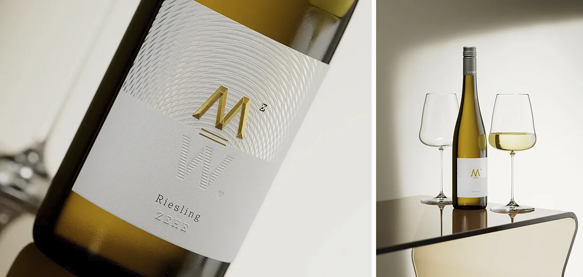
Weingut Zehe: A Packaging Between Spirit and Science
Weingut Zehe is an exercise in Cerebral Branding, balancing analytical precision with emotional resonance through its “Spectrum” concept.
- The Scientific Metaphor: The label architecture features a spectral map interpretation, stamped with a special semi-matte transparent foil by Kurz. This creates a shifting visual play under different lighting conditions, mimicking a color spectrum.
- Sculptural Hierarchy: The central “M” monogram is engineered with a deep roof emboss, hot foil stamping, and a refined micro-embossed texture. Beneath it, a perfectly mirrored “W” is executed through a custom-made, deep deboss form.
- The Macro-to-Micro Finish: A hidden, debossed heart nestled within the “W” and a custom-branded Stelvin screwcap on a fluted Rhein bottle complete a design that is both structured and deeply personal.
The Technical Blueprint: Precision through 3D Visualization
The complexity of these “Macro-to-Micro” labels is only possible through precise 3D planning (Cinema 4D & Redshift). By building these designs in a virtual environment, we calculate the exact behavior of Kurz foils and Arconvert stocks under the light. This ensures that every line and layer carries intent, transforming a technical challenge into a flawlessly engineered brand asset.
Design as a Strategic Asset
Creating a luxury wine label is a complex journey from a unique story to a market-proven icon. At The Labelmaker, we provide a complete arsenal of expertise that bridges the gap between artistic storytelling and industrial science. By utilizing a “Macro-to-Micro” strategy and high-fidelity 3D visualization through Cinema 4D and Redshift, we eliminate the guesswork of production.
Ultimately, a well-executed label is a tailored investment designed to increase perceived value and drive massive sales. It is a proven engine for ROI that ensures your brand not only captivates the consumer’s touch but also scales successfully across international borders.