A packaging between Spirit and Science
Creating an individual wine label design that captures both identity and innovation is always a satisfying challenge. For Weingut Zehe — a new project under the trusted name of Velis Vineyards — we set out to craft a visual language that reflects not only the precision and heritage of German winemaking but also the personal philosophy of its founder, Michael Zehe.
This label had to speak science and soul, tradition and transformation. A family name turned into a concept. A spectrum turned into substance.
A Design Rooted in Precision and Passion
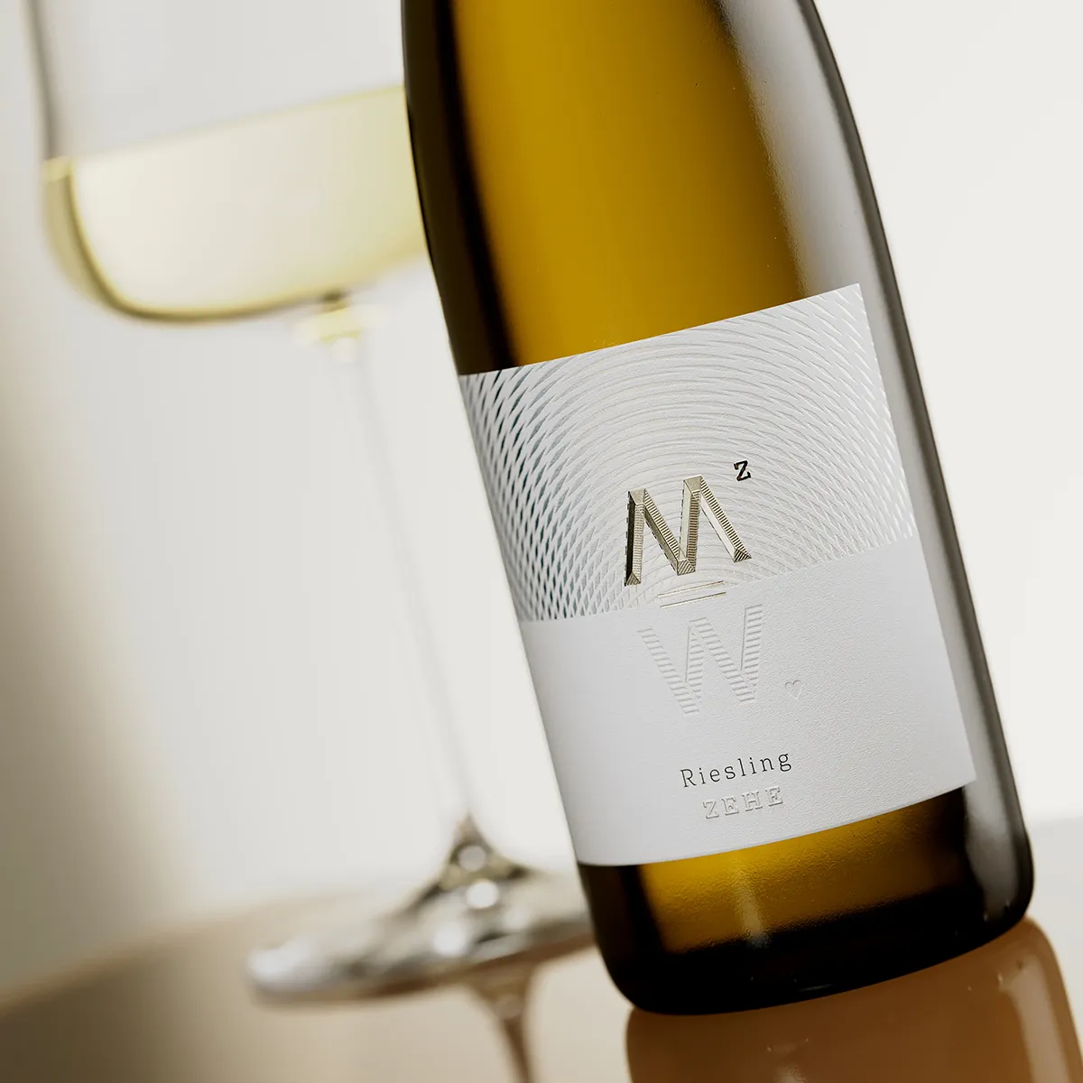
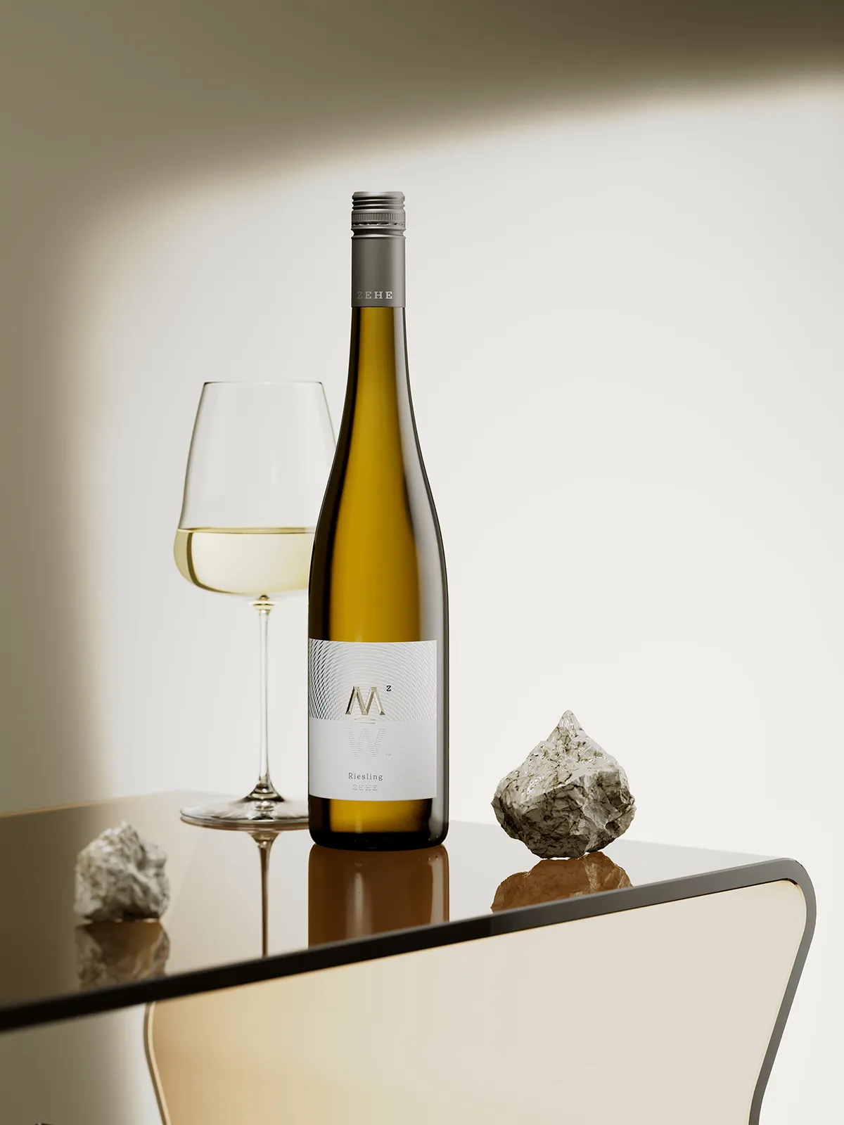
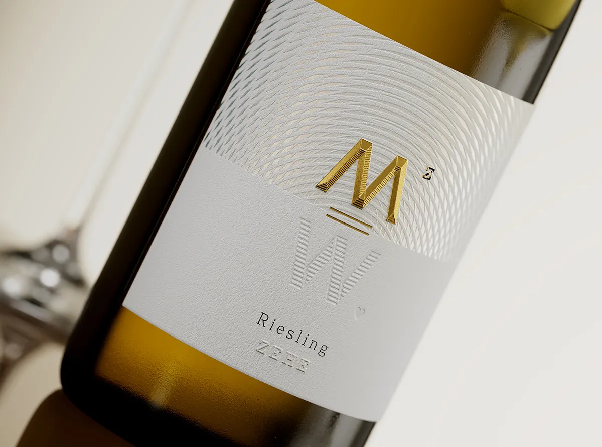
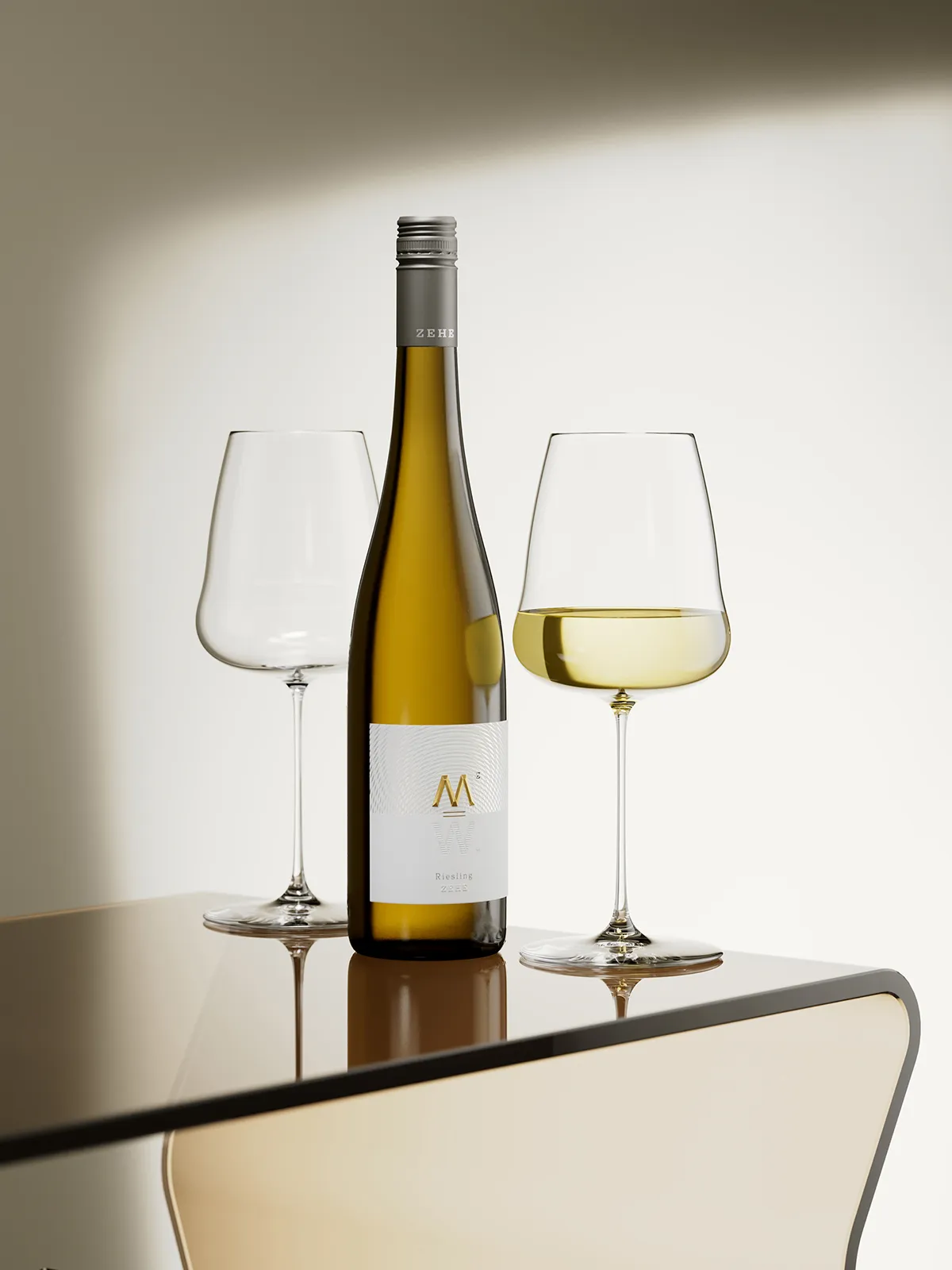
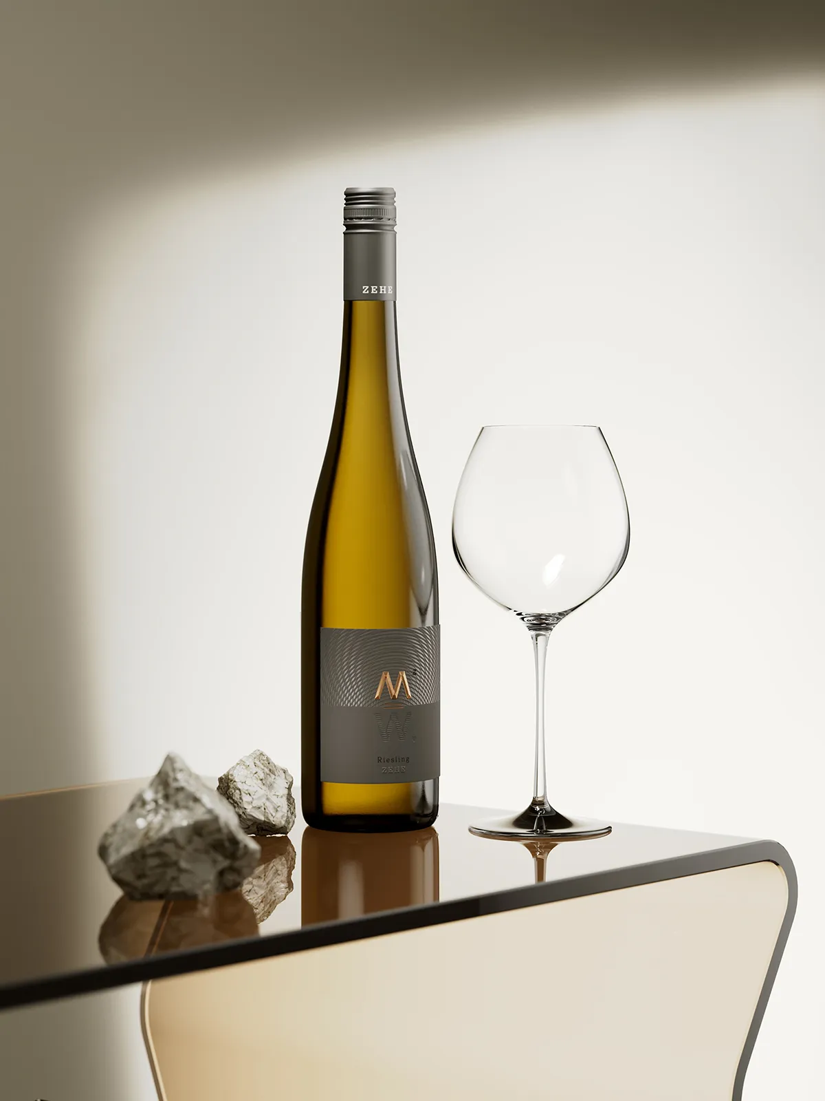
The central symbol on the label — the letter M — anchors the identity. It represents Michael, but subtly evokes “MZ,” the initials present in the broader brand story. We treated the M with a deep roof emboss and hot foil stamping, topped off with a refined microembossed texture that enhances its tactile feel. There’s a quiet boldness in its depth, almost sculptural, like the mathematics that inspired it.
Beneath it, mirrored perfectly, is a W — for Weingut — executed through a custom-made, deeply debossed form. Together, M and W form a vertical axis of meaning. Between them lies a unique equal sign—two parallel strokes in metallic foil — suggesting balance, equivalence, and symmetry. It’s these kinds of details that give the design its quiet confidence.
The Science of Spectra
The top half of the label features a custom pattern — our interpretation of a spectral map. Stamped with a special semi-matte transparent foil by Kurz, it subtly shifts under light, mimicking the ever-changing nature of a color spectrum. This visual play ties directly into the brand’s conceptual foundation: Spectrum—a reflection of variation, complexity, and the full bandwidth of emotion and technique in winemaking.
This scientific metaphor allowed us to explore individual wine label design not just as a decorative surface but as a tool for storytelling. The result is a label that feels analytical and emotional at once.
The paper is understated — a fine stock with a smooth, discreet texture. Nothing flashy, just elegant restraint. At the bottom, the brand name “Zehe” is stamped with the same embossed transparent foil used above, linking the design from top to bottom in a loop of light.
And down at the lower right corner of the “W” letter, nestled like a whispered sentiment, is a small heart — debossed into the paper. A nod to the brand’s motto: Aus Liebe zum Wein.
Built for Clarity — Across All Levels
The label architecture adapts seamlessly to three wine tiers. The base series pairs white with silver accents, the mid-tier shifts to white and gold, and the premium range goes bold with dark grey and copper tones. Same label concept, different expressions — like light through different prisms.
This kind of layered hierarchy is what makes individual wine label design such a meaningful process — it requires flexibility without losing the core identity.
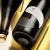
Each bottle is capped with a Stelvin screwcap, custom-branded with the ZEHE name. The chosen fluted Rhein bottle is a regional classic, deeply tied to the German wine tradition and immediately recognisable to connoisseurs.
Printing was entrusted to Dagaprint, and the execution — foil precision, emboss depth, register accuracy — was impeccable.
Part of a Larger Story
Weingut Zehe continues the creative partnership I’ve enjoyed with the Velis Vineyards family over the years. For those curious to see where this journey began, feel free to explore our previous projects together:
Both designs share a thoughtful approach to storytelling through texture, symbolism, and structure. But Weingut Zehe is distinct—more cerebral, more structured, yet still deeply emotional.
Designing individual wine label design solutions like this one is about more than aesthetics. It’s about resonance. At Weingut Zehe, every line and layer has meaning. Every technique carries intent.
And that’s the kind of design I strive to create—tailored, respectful, and quietly powerful.
Credits:
Client: Velis Vineyards
Design: the Labelmaker
Print: Dagaprint.com
CGI Photo: Jordan Jelev