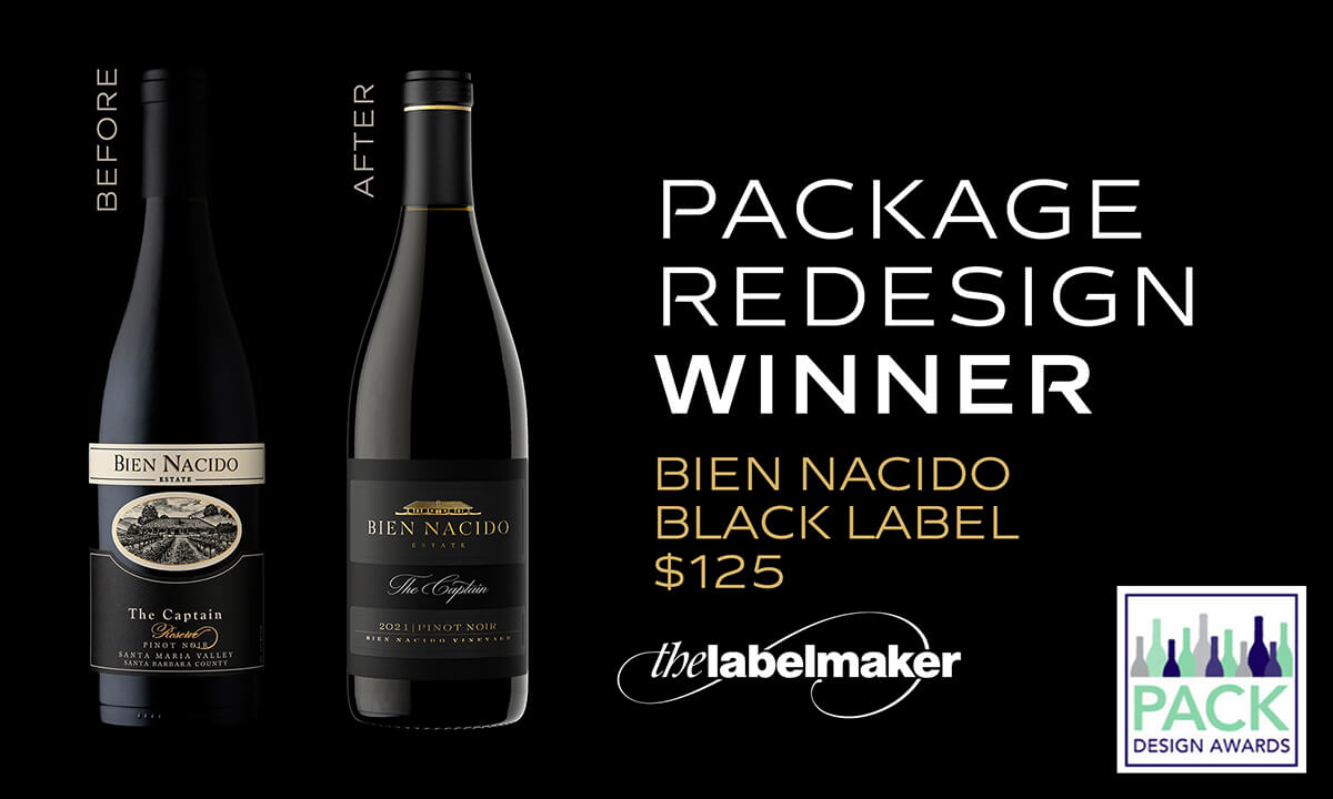
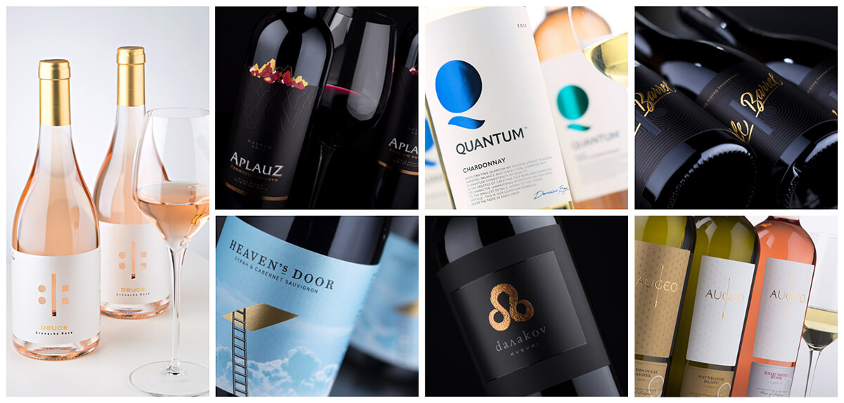
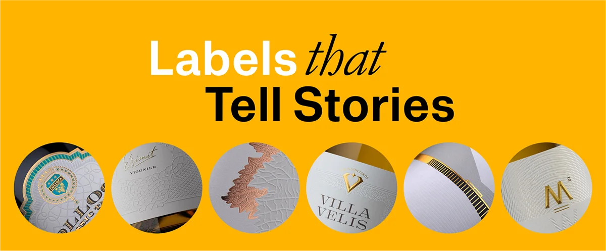
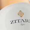
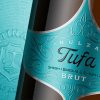
Category

blog

bien nacido

M_use: A deep-dive interview on Bien Nacido Estate’s Black Label

By blog

We’re thrilled to present our latest in-depth interview for M_use, featuring the Black Label Design of Bien Nacido Estate. In this engaging discussion, we had the pleasure of sitting down with Elisabeth Rodrigo, Brand Manager at Bien Nacido Estate, alongside the M_use team, as we delved into the intricacies of our captivating collaboration.

“In projects of this magnitude, it’s crucial to bring on board someone with expertise beyond our in-house capabilities and, more importantly, someone who offers a fresh and innovative perspective. Jordan didn’t just bring design skills; he brought a strategic vision that aimed to elevate our brand’s packaging, making it stand out in a competitive market, especially within our price bracket. All this while beautifully intertwining our rich history and the vineyard’s heritage in the design. What he delivered was a unique, distinctive look that not only gives our brand a competitive edge on the shelf but does so in a manner that’s both elevated and genuinely representative of what we stand for.”

Elisabeth Rodrigo, Brand Manager at Bien Nacido Estate

Read full interview here.


no paperwhite

No Paperwhite

By blog

Arconvert Interview on Ispira Nero Mistero paper

Do you know what’s in common between 6 of the most successful wineries in Bulgaria?
Well It’s not only the good wine itself.
Together with Arconvert’s team we have started a row of publication dedicated to my personal experience with their game-changing Ispira Nero Mistero paper. This brand new interview is the beginning and also an introduction to the rest of the articles.

Jordan Jelev:

“It was the magic to work on black background. The black paper and almost every pulp-colored paper destroys the foundations of a “paperwhite” world. This is the real challenge here – no white basis, everything you know about photorealistic color reproduction doesn’t count. It’s all black now and I have to leave my comfort zone, change the way I think and use this ‘discomfort’ as my major advantage. This is why I chose Ispira Nero Mistero.”

Read full interview here.

m_use interview

Interview for M_use

By blog

This is my latest interview for M_use. We discuss some interesting topics like sustainability, work process, inspirations, materials and other details that will help you understand better the hidden picture behind every wine label design.

The world is trying to get green, or at least greener than it is now. Sustainability is a word we started using more and more frequently in our daily speech. For me, as a wine branding professional, I believe that sustainability is not only just a word, a material, a trend, or a fact. It is something more regarding the whole creative process, as it is without any doubt a real theme, a motive, and an inspiring source for a new type of creativity. Sustainability is a new key that will unlock new concepts in my design work…”

Read the whole interview here.

A Wine Christmas Tree by Cantine Minini

By blog

My friends from Cantine Minini have created amazing Wine Christmas Tree using the Tank wines I designed for them back in 2015. I was pretty much surprised to see how good the bottles were arranged and decided to share it with everyone who likes my work.

Three of the wines and a crown from the Christmas Tree by Cantine Minini.

Photos are made by Giorgio Minini and I keep them since end of 2019 but couldn’t find the right time to create this post.
I know that it is not the right time for a Wine Christmas Tree right now but I feel so happy every time I see this photos that I wanted to share them with a larger audience.
I started working with Cantine Minini in 2011 as far as I remember and by now we have created several successful wine packaging designs including a full revamping of Minini’s winery logo. You could search the website for Corte dei Mori wine project, Governo Toscano wine, and the flagship of the winery, Minini wine range.
Click HERE to read the full story of Tank wines.

No Labels

By blog

Interview with Jordan Jelev aka The Labelmaker for Fifty-Five Magazine


If it is true that a picture speaks a thousand words, then a wine label would be the equivalent of a business plan in images – including the area of activity, the marketing plan and the financial projections. Figuratively speaking – about a thousand pages. Actually, when it comes to figures, Jordan Jelev is an expert in talking in images. Officially, he designs labels in and outside Bulgaria. If you don’t know him – he is among the most interesting faces in the wine industry, though wine is not exactly his specialism. If you do know him – then I hope you will discover something new about him in this interview.

What do you do?
JJ:
I’ve been trying to do credit to my pseudonym, The Labelmaker… for just over 20 years now. I learn how to understand the people I work with, so I can build a connection between them, their product and their customers. Complex relationships, but thankfully united by a common denominator – wine. In less pretentious terms – we create wine brands and design wine labels.

How do you approach new projects?
JJ: With attention and respect – like all else in life. If I don’t see the future of a project within a split second – its success, its reflection on the others, the horizons it opens – I call it quits before I’ve started. Not all new things have the energy to become a successful beginning. I have developed an instinct to spot that and I tend to trust it.

What is the main part of your work – digital or intellectual?
JJ: Frankly, I don’t know. I’d like to say intellectual, but that’s not true at all. You sit quietly on a night, with all the leisure you need to come up with something clever, it actually works and you go to bed happy. You get up the next morning and get down to it, and then you realise it’s the daftest thing ever. All the ‘intellectual’ heroics disappear into thin air and you turn into one very digital animal indeed – out comes the shovel as you desperately try to save yourself from your own hare-brained ideas by sheer hard graft in front of the monitor. Thank goodness it works for me… At the end of the day, it all comes down to who you are dealing with – our work and we ourselves are a reflection of the people who come to us. The more charged they and their ideas and desires are, the more rewarding the final result.

How do you add value to what you do?
JJ: Once I see myself in a project, I am in gear to show everything I’m capable of. The space between calligraphy, typography and photography is where my designs truly come to life.

Do you sometimes get a creative block?
JJ: Why, sure! Who doesn’t? I get blocks on a regular basis, but it doesn’t faze me because I know how to pull myself out of it. I resent those moments, they do bug me, but they have their restorative benefits as well.  Perhaps for some people they are just hitches, I’m not keen on them either, but I’ve learned to turn them to my advantage. I distract myself with something totally different which would occupy at least 50% of my mind. The remaining resource keeps tossing the subject around though. This often untangles the situation. Blocks make you think and analyse and give you a comprehensive view – you can see where and what is tripping you up, so you push it aside and then there’s no stopping you. At least that’s how it works for me.

Does your work change with time?
JJ: Yes and no. It changes in my take on the details, on the philosophy, in fact on everything but the basics. They are the same everywhere. You always start there and then each project takes its own course. They are the visual denominator which unites all my designs. I try to keep up with the times and the technology. This often brings untraditional results, but a closer look will tell you that every one of my designs rests on the same foundations.

Would it be fair to say that labels have changed your life?
JJ: When I was little I wanted to be a rubbish collector or a minister – I ranked them the same. Then, to everybody’s dismay, I took a long time studying to be an accountant. At the same time, I was making my first labels – I was drawn to it! And so, thanks to them, I knew where my life was going. You could say that labels, wine and design pretty much set my direction. Then came the family, kids, the usual ups and downs, but the labels remained. I happily rise up every morning to give them my all. I don’t know if they have changed my life, but I certainly owe them a lot. The best thing is, I feel like I’m only now starting out. Just finished warming up.

for ArtConvert

The Labelmaker for Arconvert

By blog

I am thrilled to announce my latest interview for Arconvert. We talked about art, creativity, inspiration and… paper of course.

“Inspirations, challenges and goals of Jordan Jelev: One of the most famous label designer
Q: How did you make the switch from Economics to Design and Lettering and become “The Labelmaker”?
A:
Well after graduating from Varna High School of Maths I decided to study Economics at the University in my hometown. I was looking for future prosperity thru education. Right after my first year I…

Read more on Arconvert Blog.

wooden wine box

A Wooden Wine Box for Orbelia Winery Decorated with Laser Engraving

By blog

This new update is for a recent project I did with my friends from Laser Varna – a wooden wine box for Orbelia Winery decorated with laser engraving.
Just like in the previous project I shared with you for Velis Vineyards we used same technology for this brand new design. I wanted to have really huge logo engraved on the top of the box, wrapping around left and right sides. Being already experienced in laser engraving I filled the whole logo with diagonal linear pattern and thus I received really huge size on one hand and on other I shortened half the time for laser work. If the logo was solid it would have taken probably hours to engrave it all.

wooden wine box

I was also pretty much surprised by the quality of small texts like “WINERY”. Written in thin sans serif typeface with height of 4.5mm the letters were surprisingly sharp and detailed. Same thing noticed in hidden serifs of “ORBELIA” text – there was so much detail and precision in sharp terminals of the letters that you somehow want to touch them and see for your self if it was really that sharp.
Again the overall quality of the final product was beyond any doubt – solid, but light at the same time, precisely engraved, this wooden box would surely become a perfect container for Orbelia’s top wines.
Warm thanks to Laser Varna who did the whole job the best way thou I am sure they want to burn me alive on pile of my engraved boxes:-)

wooden wine boxCredits:
Laser Carving: Laser Varna
Client: Orbelia Winery
Box Design: the Labelmaker
Photo: Jordan Jelev


packaging design

My latest packaging design experiment with laser carving on wood

By blog No Comments

This post is about my latest packaging design experiment with laser carving on wood. After being in wine industry for more than 20 years I have always been enchanted by wood boxes for wine and especially by the carved logos of different wineries. For all these years many winery logos I did for my customers have been used for such boxes, but I have never designed one myself. Finally, I decided to make an experiment after I found an old friend of mine who left printing, purchased laser machine and started wood carving family business. He called his company Laser Varna and I am happy that we re-established professional contact – they really made my dreams come true with great precision and unsurpassed perfection and quality.

There will be several new posts on my blog about this packaging design experiment. In short – I picked in no particular order some recent logos I did for my wine clients and with their permission I did designs for wood boxes. Each one of them is unique, complex and, I might say, very difficult and even challenging for production. Of course, my friends from Laser Varna did their best to make everything look awesome and I am more than pleased with the final result.

laser carving on wood

The photos here show the wooden box packaging design I did for Velis Vineyards. Everything Laser Varna did is extremely precise without losing the feeling of craftsmanship and hand-made work. In fact, I believe they achieved great integrity between modern digital technology and the authenticity of crafts that is very organic to wine industry in all of its aspects. All edges are very sharp and clean which makes the whole box look extremely classy. I personally like very much the burned part of the wood because its dark brown color is very rich with different details depending on density of the wood. The logo I placed on both sides of the box is real eye-candy too. It is very big and I did not want to spend decades carving its inner part so I decided to replace it with linear pattern. The result was simply beyond my expectations though from the very first moment I knew that lines were a smart move.

packaging designSee for yourself the final results with this experimental packaging design – all photos are made in my studio with nearly no post processing, so everything is very natural looking the way it is in real life. The production video is taken while boxes were carved in Laser Varna factory.

Enjoy the result and feel free to contact Laser Varna on their Facebook page in the credits at the footer of the post – you will be surprised by the quality they could give to make your wines look even more special and shine among the others on the shelf!

laser carving on wood

Credits:
Laser Carving: Laser Varna
Client: Velis Vineyards
Box Design: the Labelmaker
Photo: Jordan Jelev